Elements of UI Design
Explore the elements that shape intuitive, consistent, and visually captivating UI experiences
UI design is the visual representation of a product created with elements like typography, color, microcopy, imagery, and layouts. Good UX and UI are both essential for a successful product. In this analogy, UX is the foundation and location of a building, while UI is the walls, furniture, and interior design. Understanding UI elements is crucial for creating a consistent, intuitive, and aesthetically pleasing product interface.
New designers may mistakenly believe that color only has a decorative function. In reality, color is one of the most critical elements of branding.
Here are some of the impacts color has on design:
- Showcase a product's personality
- Convey messages
- Influence user behavior
- Influence users' emotions
- Draw users' attention to certain elements
Understanding color theory is crucial for building any
In design, positive space represents the area of interest. Any space taken by design elements is called positive. Negative or white space is the empty area between, around, and even inside design elements.
Negative space improves readability and makes vital elements easier to scan and discover. It creates breathing room for elements and content groups and makes designs look neat and clutter-free.[1]
Negative space can also contribute to the overall feeling of a website or an app. Websites with large amounts of macro white space appear more minimalistic, elegant, and luxurious.
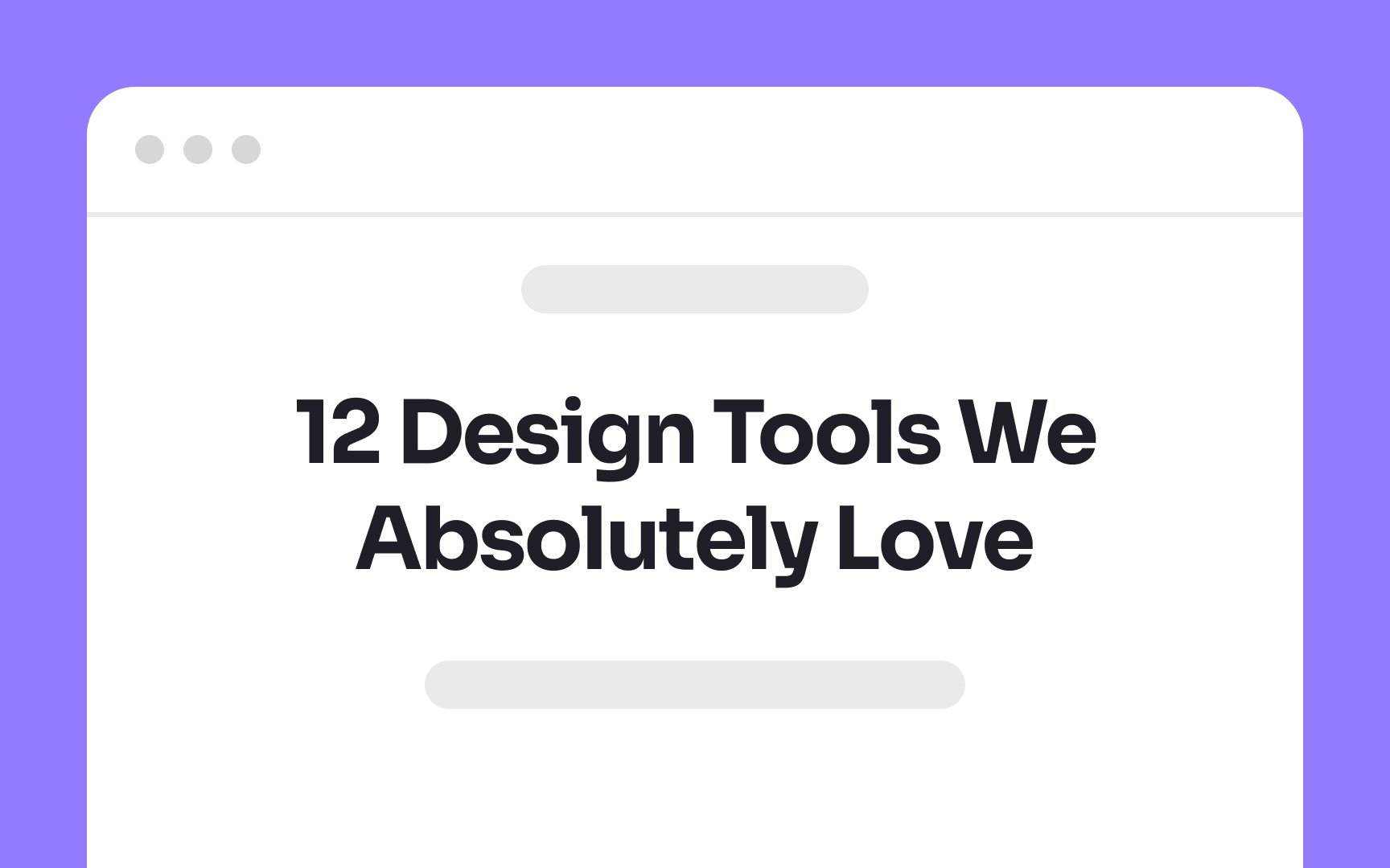
Typography encompasses selecting and adjusting:
- Typefaces
- Point sizes
- Line lengths
- Line spacing
- Letter spacing
- Paragraph spacing
- Kerning
- Text alignment[2]
Good typography has several benefits. It establishes a strong visual hierarchy that helps users navigate
Microcontent is a type of
Examples of microcontent include:
Microcontent is different from
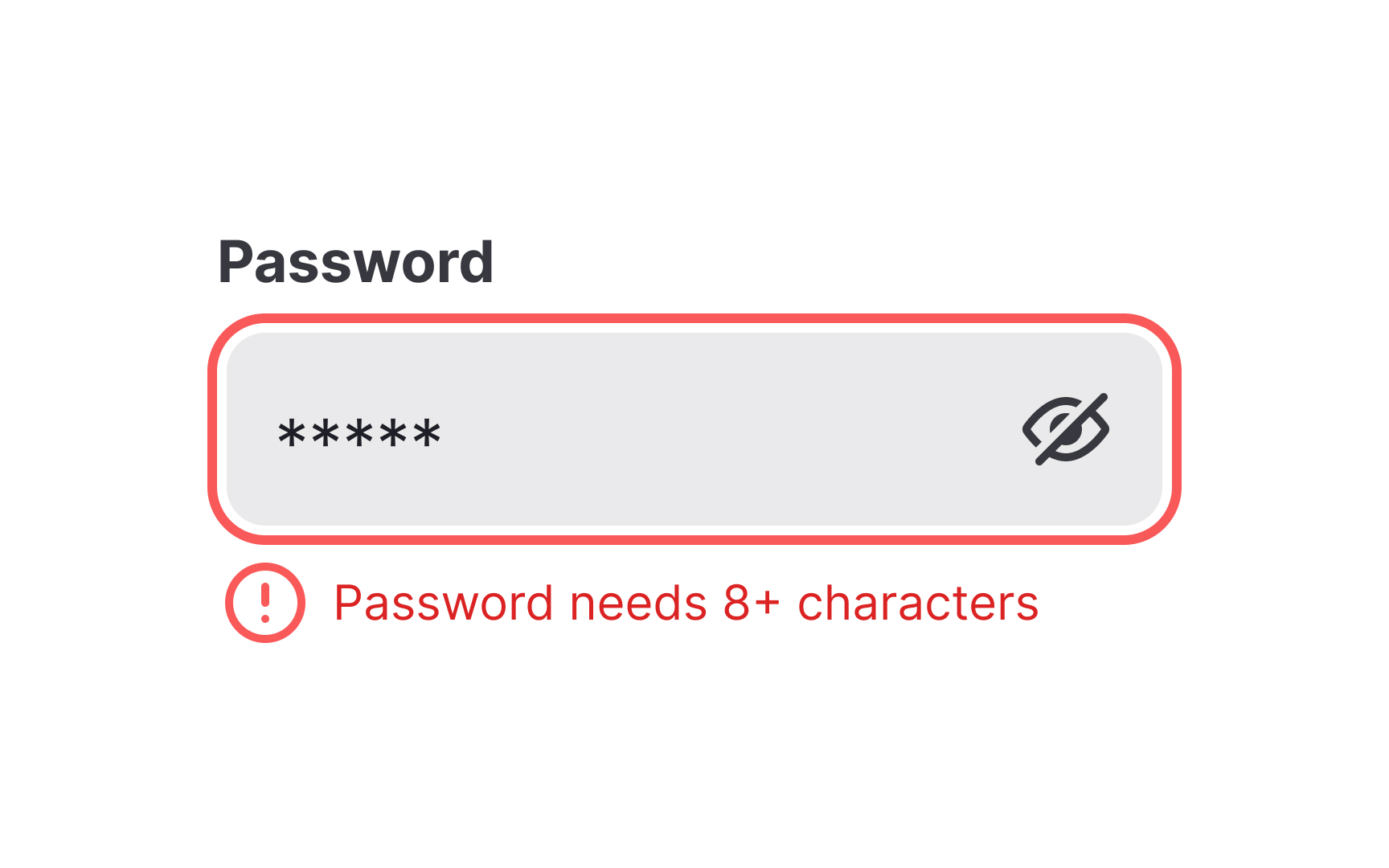
Effective microcopy appears everywhere. For example, "Save as draft" clarifies what happens next, "Password needs 8+ characters" prevents
Pro Tip: Read microcopy aloud. If it sounds robotic or unclear, rewrite it to sound human and helpful.
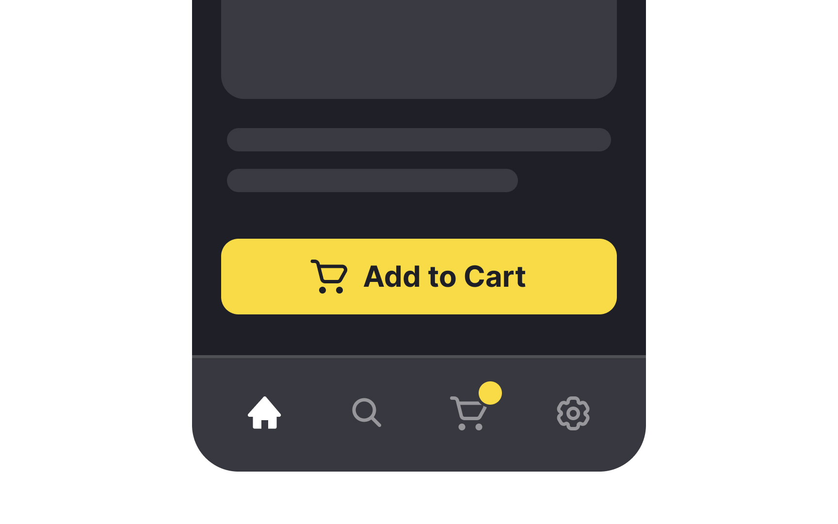
Motion refers to animation and other moving visual effects that designers add to
Motion serves several key functions in design:
- It provides feedback for microinteractions. For example, an animated spinner indicates a
page is loading or a success state animation. - It attracts user attention as our eyes are drawn to moving objects. For example, adding a radiating halo to the
button encourages users to click it. - It guides users on a page. For example, smooth animation of accordions and anchor
links helps users understand their position on the page. - It indicates interaction, especially on mobile. For example, a short animation can show that users can delete or archive a chat when they swipe across it.
And, of course, it makes a
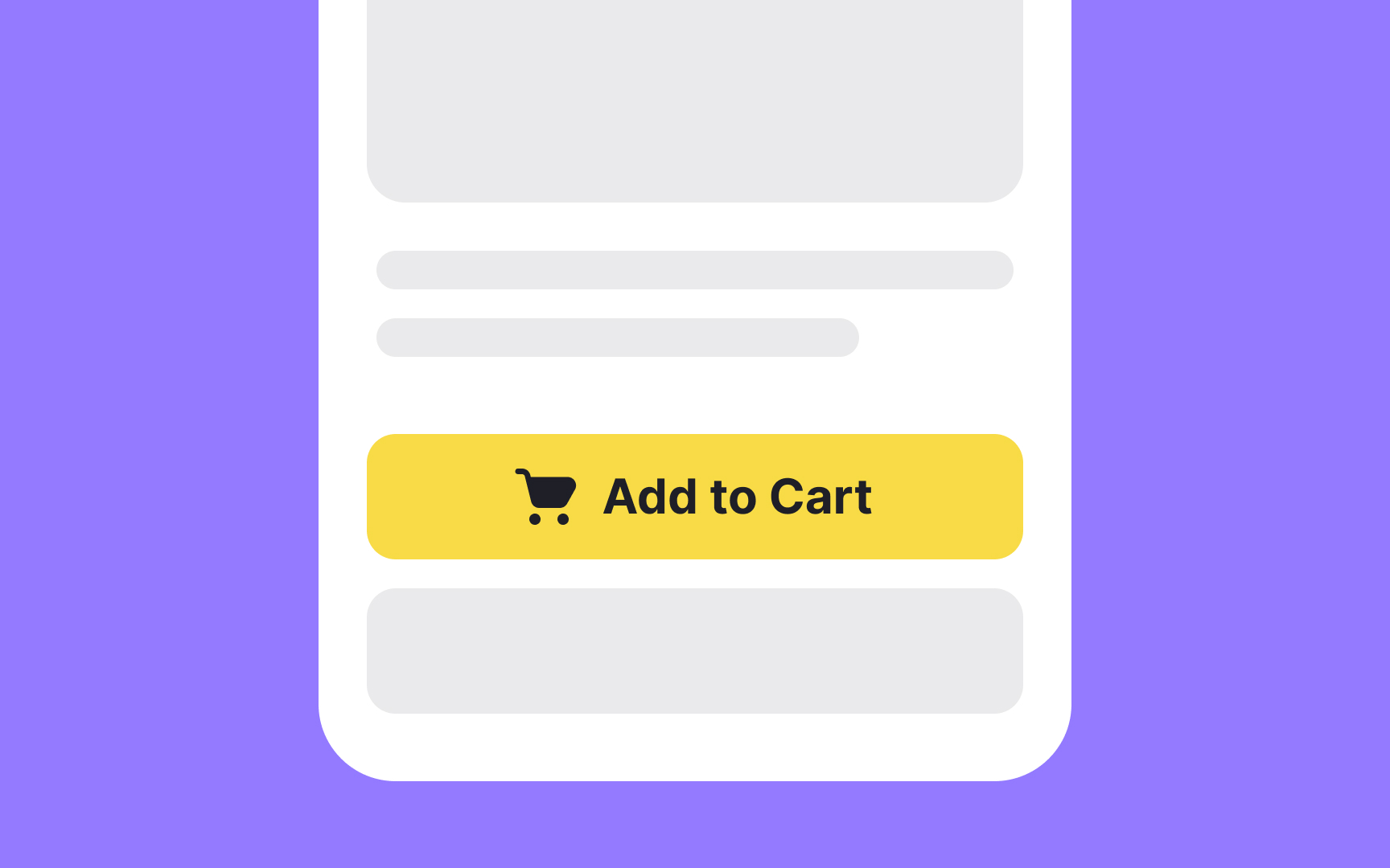
Elevation creates hierarchy in digital interfaces. It shows which elements sit above others in the visual stack, helping users understand relationships between different parts of the screen. Modern interfaces use multiple elevation levels, with higher elements appearing to float further from the background. Designers achieve elevation through shadows, subtle
Elevation also improves usability. Elements at higher elevations naturally draw attention, making interactive components easier to identify. When a
Pro Tip: When overused or used improperly, elevation can add visual confusion to a design and hurt its usability.
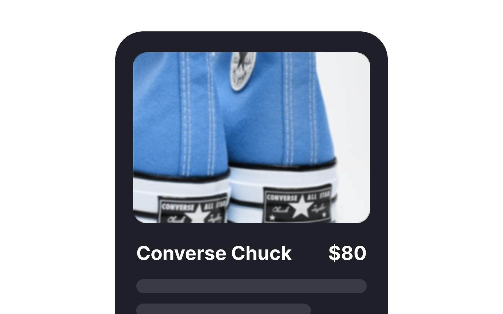
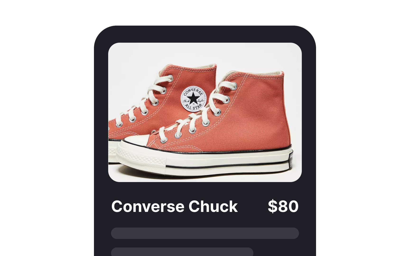
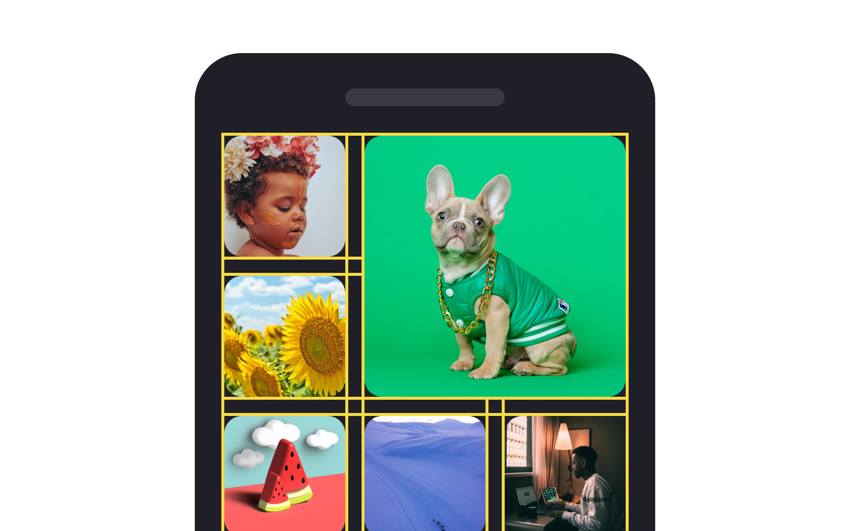
Imagery refers to the use of photos, illustrations,
The decision of whether to apply imagery to your designs depends on your goals:
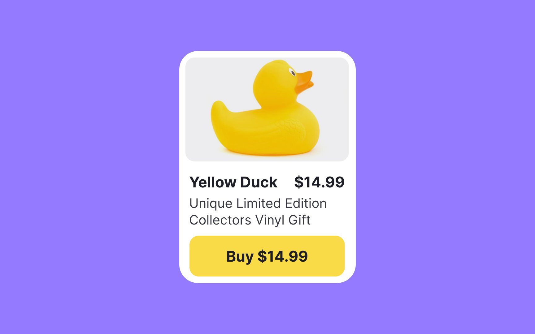
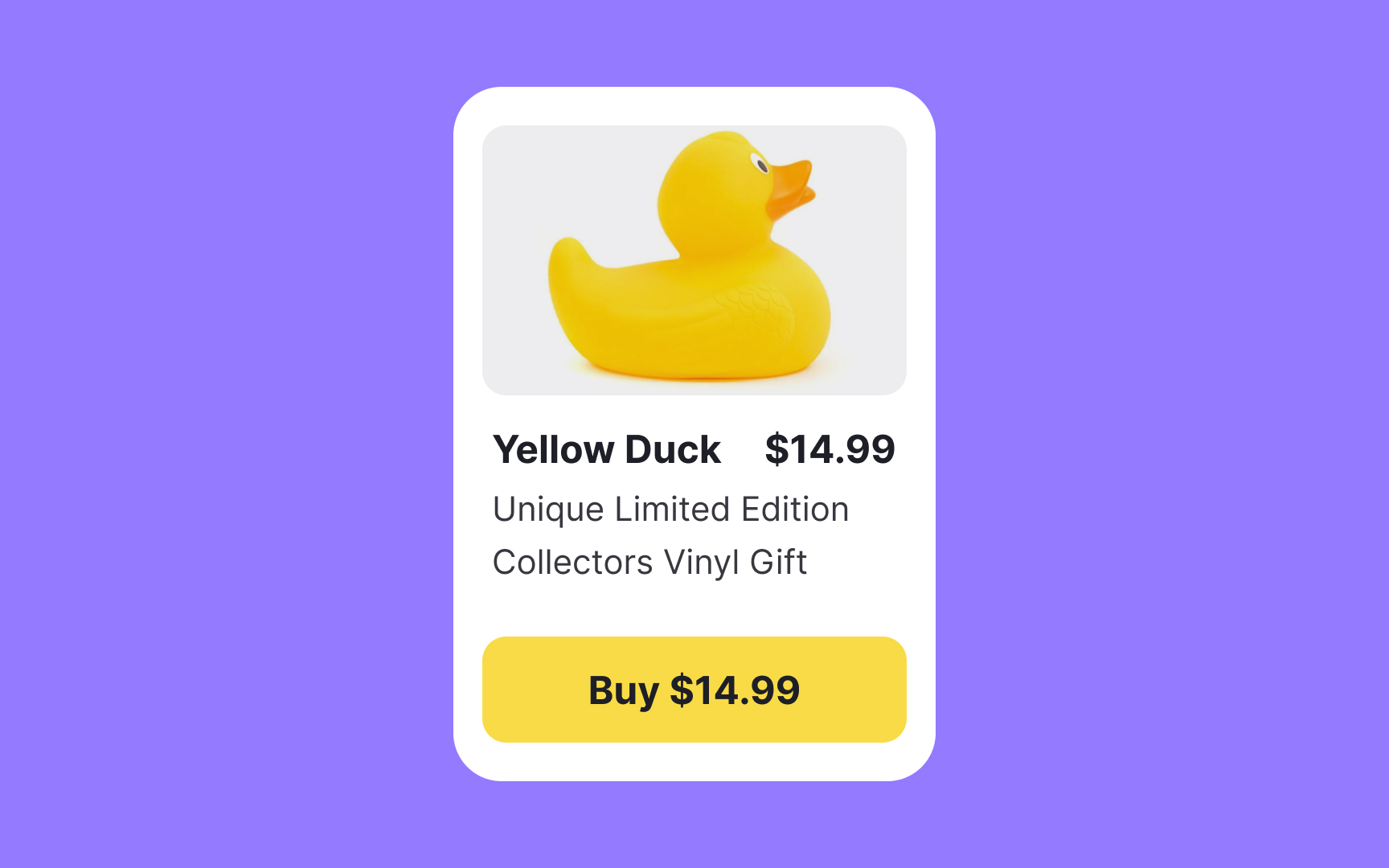
- Photographs and videos are more effective when you have something specific in mind or something that exists in reality. Product photos help users make a decision faster and encourage buying.
- Illustrations are a better fit for representing concepts and abstract things. They help establish an emotional connection with users, tell a story, and add personality to a product.
Pro Tip: From the accessibility perspective, imagery should have a good color contrast ratio, contain alt text, and serve more than just a decorative purpose.
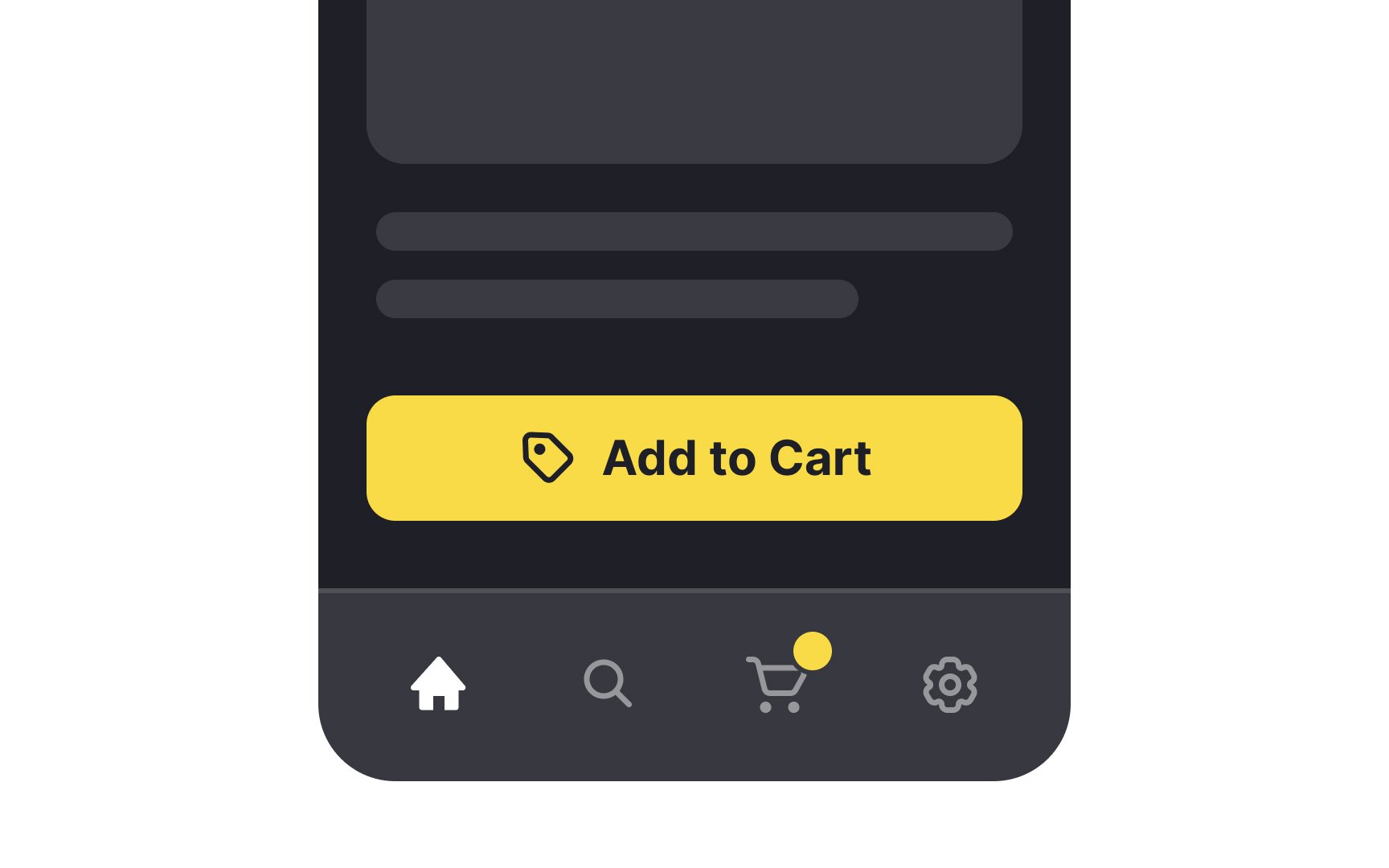
Icons are pictograms broadly seen in web and mobile interfaces. They visually represent ideas, objects, or actions and help users understand how they can use an element (a
When designed correctly, icons help users complete tasks. To apply icons correctly, follow common best practices:
- Stick to universal icons to reduce cognitive load. For example, choose a magnifying glass for the search function.
- Use consistent designs to improve recognition. For example, if you use icons with rounded edges on one
page , keep this styling everywhere. - Avoid overdoing icon style. Icons should be simple and functional; complex icons are difficult to interpret, especially for users with visual impairments.
Pro Tip: Accompany icons with labels to remove any confusion about the intended meaning.
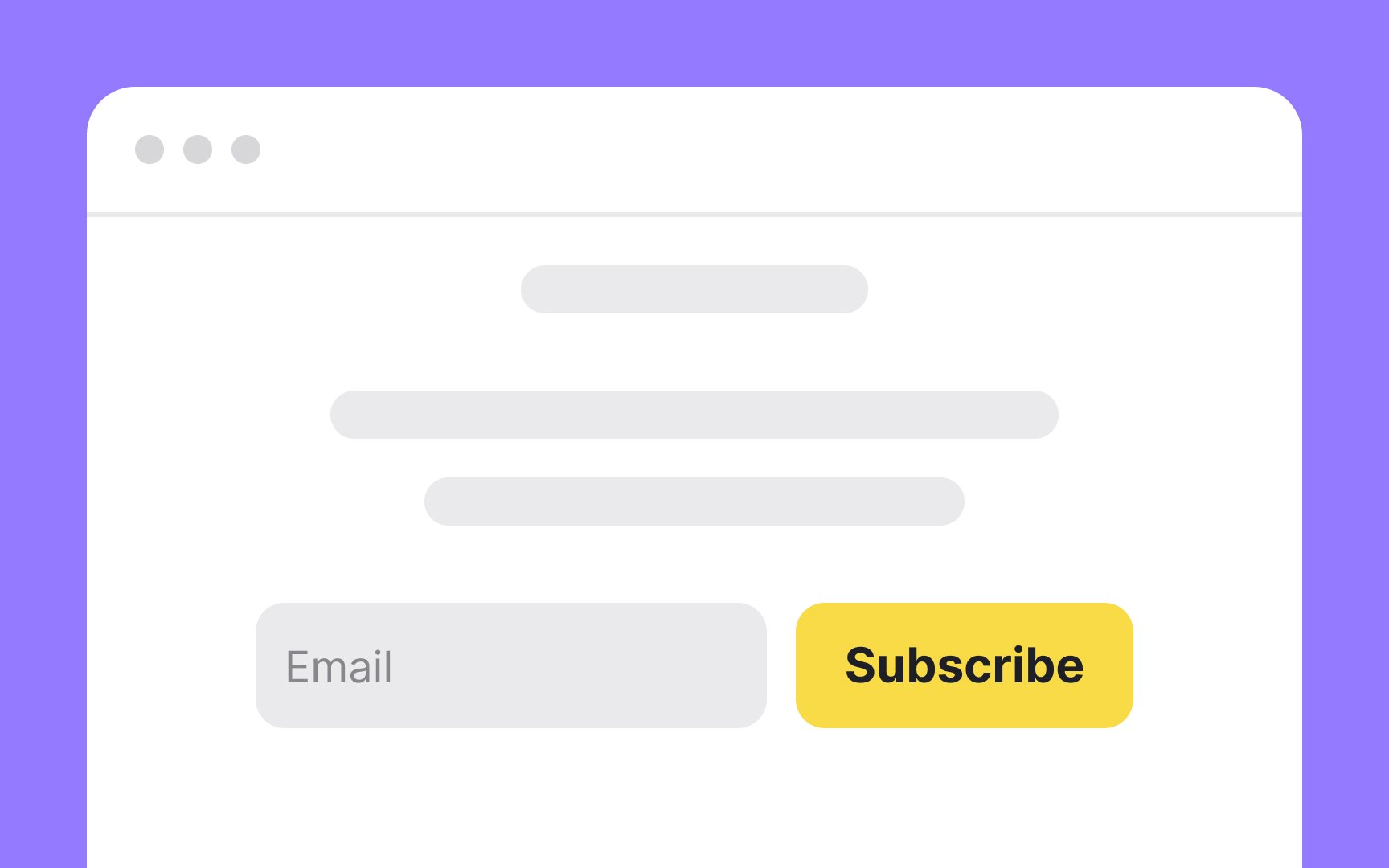
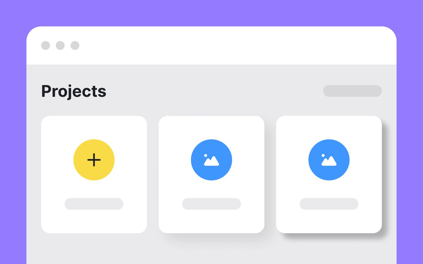
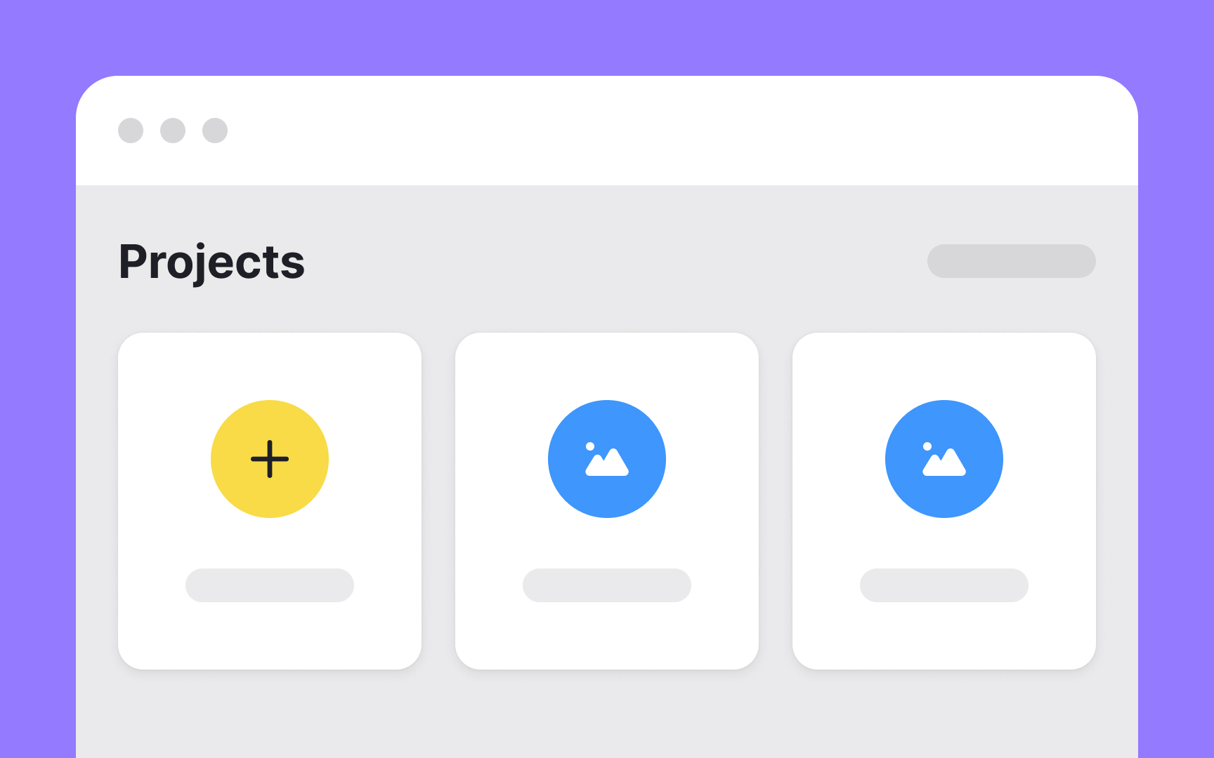
A UI component is a reusable, interactive building block that forms part of a
A component can contain other components or be part of a more complex component. For example, a component such as a header may contain components like a button and a
Design systems often contain a component library. This lets designers work faster by reusing proven building blocks rather than recreating them for each project.
A
The layout structure depends on your project's objectives. Designers use composition principles and various design format properties to place elements to guide users' eyes toward the points of interest.
Designing layouts with a grid helps organize
Layouts can also be built without a grid. Such layouts enhance contrast and create unique, artistic websites when done well. However, this rarely works for goal-oriented products.
References
- Material Design | Material Design
- Microcontent: How to Write Headlines, Page Titles, and Subject Lines | Nielsen Norman Group
- The Role of Animation and Motion in UX | Nielsen Norman Group
- Icon Usability | Nielsen Norman Group
- Material Design | Material Design
Top contributors


Topics
From Course

Share


Similar lessons

Common UI Component Definitions I

Image Terminology
