Mobile Navigation Design
Explore guidelines to design navigation that gets users where they want to go with the least amount of friction possible
Navigation is the backbone of any app. Its purpose is to get users where they want to go with the least amount of friction possible.
Mobile navigation must be discoverable, accessible, and take little screen space. The best type of navigation for your website or app will depend on your users' needs.
All mobile navigation patterns negotiate between content prioritization and accessibility. For example, a hamburger menu offers more space for content but is harder to discover. Consider your users' goals to strike the right balance between content and navigation.
Top
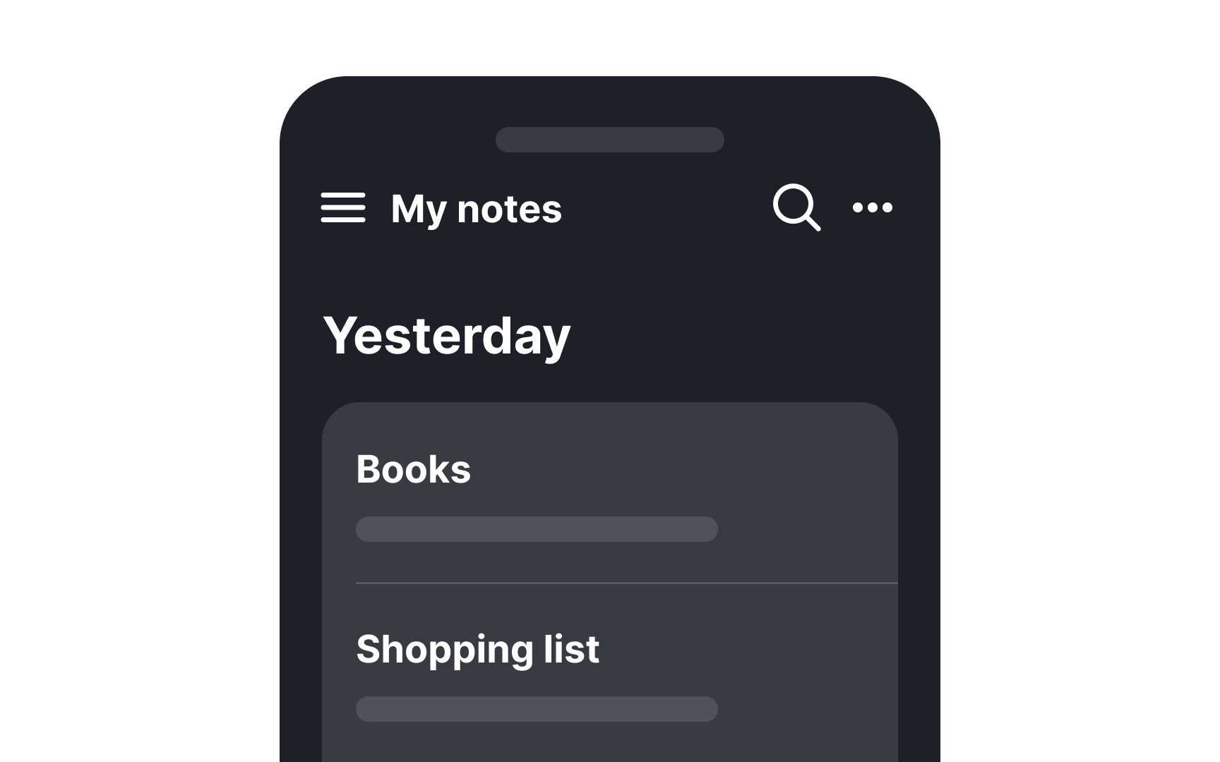
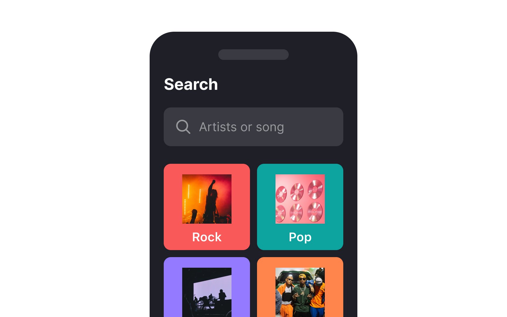
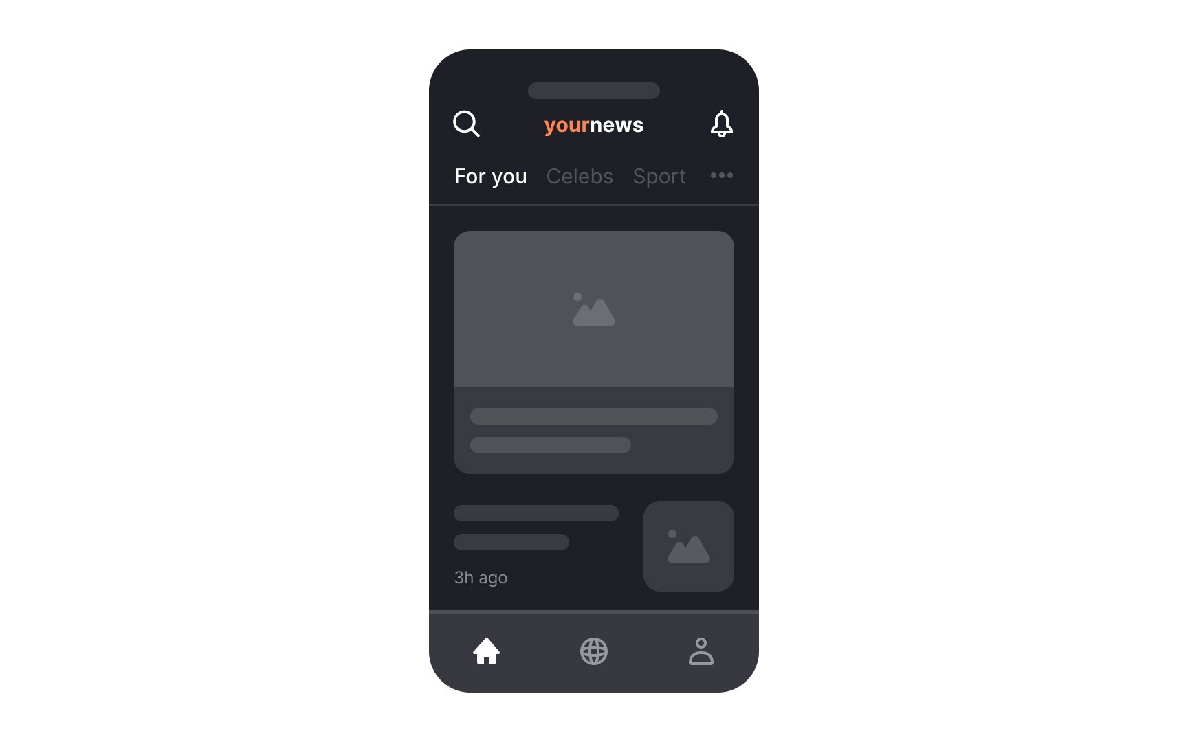
- Material Design (Android) top app bar. These components display navigation elements, key actions, and sometimes contextual information like page titles or search fields. This bar is often fixed, providing users with consistent access to important controls throughout the app.[1]
- iOS Navigation Bars: these components also appear at the top and typically include a title to help users orient themselves. They may feature additional controls, like a back button or a menu, that affect the content displayed below. These bars act as anchors, giving users a sense of structure and hierarchy within the app.[2]
Top navigation is best suited for situations where users need constant access to primary actions or navigation elements across multiple screens.
Bottom
Material Design (
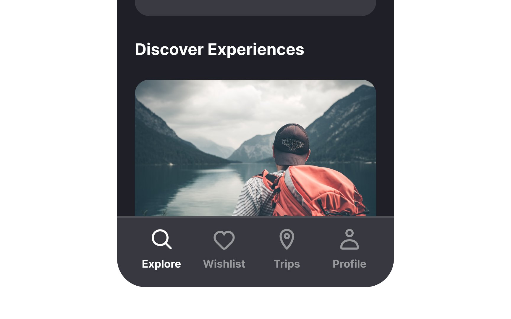
- Navigation bars: Provide access to 3-5 consistent top-level destinations across screens. They are focused solely on navigation and ensure a familiar, intuitive experience. Previously called "bottom navigation," these bars don’t include additional actions.[3]
- Bottom app bars: Combine navigation and key actions, including up to four actions and a floating action button (FAB). Designed for mobile screens with two to five actions, they should not be used alongside navigation bars as they serve different purposes.[4]
On iOS, tab bars function similarly to Android’s navigation bars. Positioned at the bottom, they allow users to navigate between top-level app sections while maintaining the current navigation state in each. This ensures seamless transitions and clarity in app structure.[5]
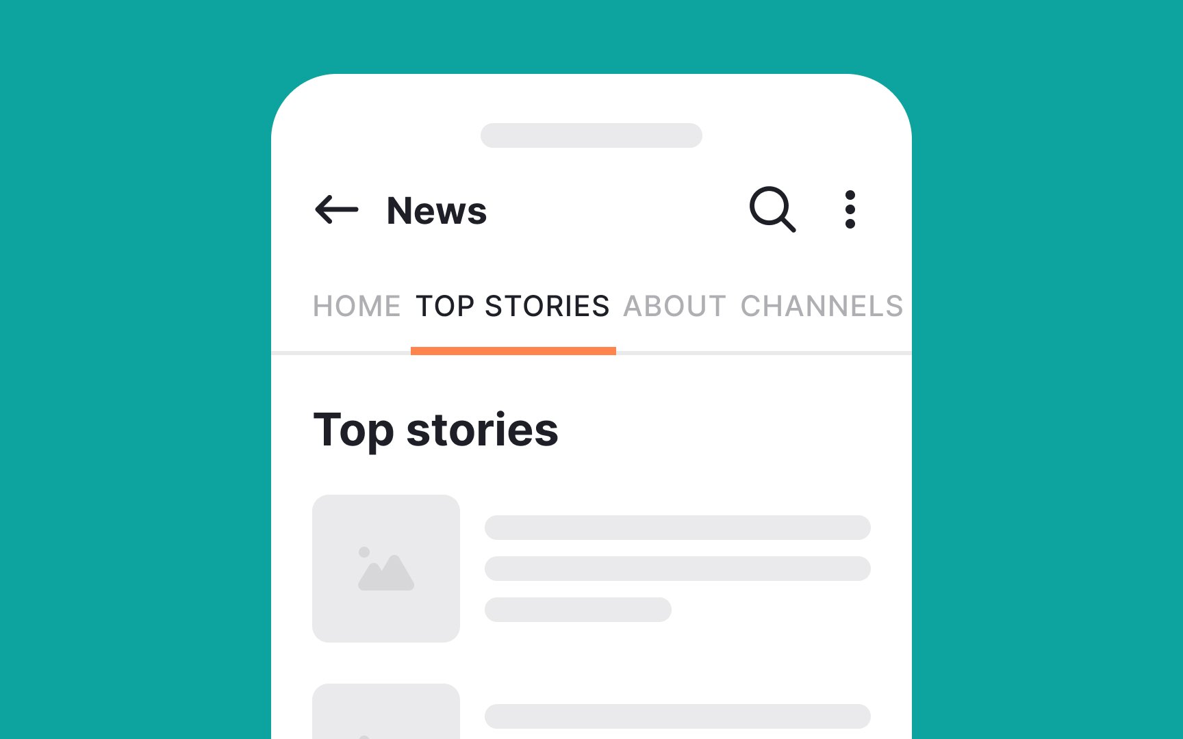
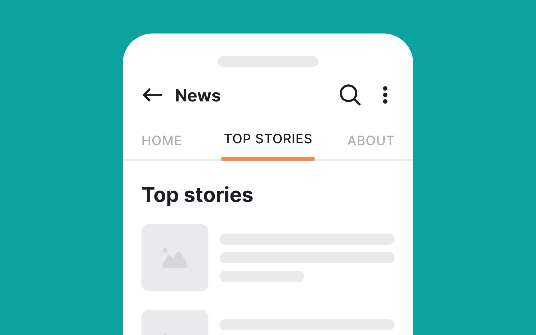
Tabs on
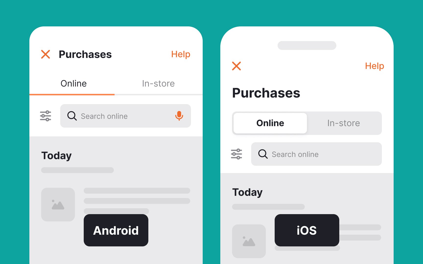
On iOS, tabs do not exist in the same way as on Android. Instead, segmented controls serve a similar purpose, though they are not identical. Segmented controls allow users to toggle between related content or views within a screen. Unlike Android tabs, segmented controls are typically placed near the top of the screen and are better suited for lightweight toggling rather than extensive navigation.[7]
A
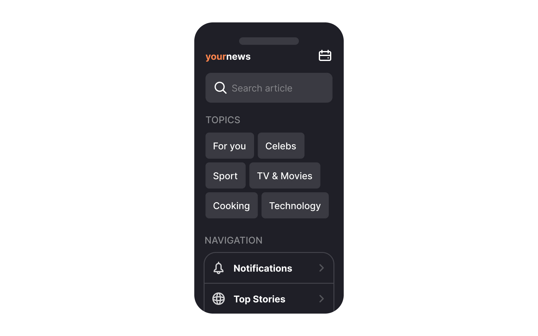
Hamburger menus have some advantages. They save space by keeping many options tucked away, and they can easily accommodate submenus.
However, a major drawback is that they are less discoverable.[8] While many mobile users recognize hamburger menus, not all intuitively open them, which can lead to lower engagement with hidden options.
Hamburger menus are best suited for content-heavy apps or browsing-focused experiences where users are less concerned with navigating to specific sections and more focused on exploring presented
If you use a hamburger menu, consider supplementing it with alternative navigation patterns, such as bottom navigation bars or
UI cards look like physical cards, usually with physical boundaries and square or rounded edges. They come in a variety of shapes and sizes.
A UI card usually consists of the background, an image, and a few containers. These containers hold items such as an image, a CTA
Card UI designs have many advantages. They are intuitive, straightforward, and make
3D Touch is an Apple feature that detects different levels of pressure on the screen. When users apply varying amounts of pressure, it triggers shortcuts or actions in apps. This technology works mainly in native iOS apps and is not commonly used in web apps.
A common use of 3D Touch is
Pro Tip: Make sure that 3D touch isn't the only way to access central features. Users should be able to find the primary features without discovering the 3D touch option.
When designing mobile
Key considerations for accessible navigation:
- Size and spacing: Provide minimum 10mm touch targets with adequate spacing to help users with motor impairments tap accurately
- Visual clarity: Ensure high contrast and clear labels alongside
icons to support users with visual impairments - Physical comfort: Position key navigation within easy reach, considering different hand sizes and grip styles
- Alternative methods: Support voice control and assistive technologies for users who can't perform standard touch
gestures - Cognitive ease: Keep navigation consistent and predictable, using simple language and clear location indicators to reduce mental load
When deciding on
Content-focused apps (like news, videos, or data dashboards) benefit from minimalist navigation:
- Use hidden navigation patterns like
hamburger menus - Prioritize
content visibility over navigation access - Keep navigation unobtrusive yet easily accessible
Task-based apps (like booking services, fitness apps, or learning platforms) need more prominent navigation:
- Display key actions directly on the main screen
- Make navigation options immediately visible
- Provide clear paths to different functions
Choose navigation patterns based on how frequently users need to switch between sections and whether they focus more on consuming content or completing tasks.
References
- Top app bar – Material Design 3 | Material Design
- Navigation bars | Apple Developer Documentation | Apple Developer Documentation
- Navigation bar – Material Design 3 | Material Design
- Bottom app bar – Material Design 3 | Material Design
- Tab bars | Apple Developer Documentation | Apple Developer Documentation
- Tabs – Material Design 3 | Material Design
- Segmented controls | Apple Developer Documentation | Apple Developer Documentation
- Hamburger Menus and Hidden Navigation Hurt UX Metrics | Nielsen Norman Group
- What is Apple 3D Touch? | Definition from TechTarget | Search Mobile Computing
- FAB – Material Design 3 | Material Design
Top contributors


Topics
From Course

Share


Similar lessons

Designing for Mobile Interfaces

Responsive vs. Adaptive Design
