Dashboards
Explore the best practices for building dashboards to visualize critical data
Dashboards are tools that visually represent complex data in a simplified manner. They offer a complete overview of crucial information, allowing users to make quick, well-informed decisions. Used across industries like finance, marketing, healthcare, and project management, dashboards are indispensable for monitoring performance, identifying trends, and guiding data-driven strategies.
For designers, mastering dashboard design principles is crucial. It empowers you to create user-friendly interfaces that prioritize user needs and enhance overall usability.
Dashboards can sometimes be confusing and overwhelming for users, which can lead to spending a lot of time trying to figure out how to use them. To avoid this, you can start by understanding what kind of information your users want to see on the
User research is the best way to get accurate information about:
- When and why users will look at and analyze the data
- What brings users to the dashboard and what difficulties they might face
- The specific information users need to see, compare, and analyze on the dashboard
- The order of importance for different parts of the dashboard and how they should be arranged
- Options for customization based on individual preferences
- How familiar users are with the technical aspects of the system
Also, consider your business goals when designing a dashboard. Ask yourself what actions you want your users to take and how it can help your business.[1]
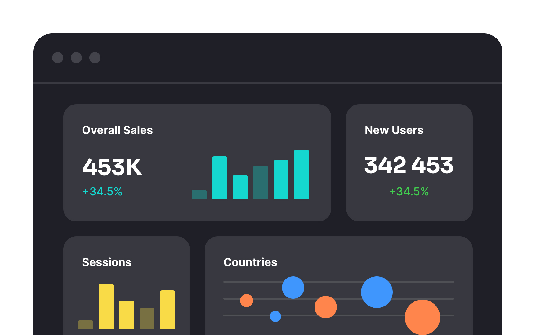
Operational
Operational dashboards provide frequent data updates and should be comprehensive enough at first glance. They must communicate information so clearly that users can quickly spot critical parameter deviations and take action.[2]
As the name implies, analytical
Sales dashboards are a common example of analytical dashboards. They provide thought information for sales managers about fluctuating sales data that may require thoughtful analysis rather than rapid intervention.
The human brain has limitations when it comes to processing large amounts of information simultaneously. While this might seem counterintuitive for data-rich
Ensure that there's ample space between different data points, graphs, and textual elements. This not only prevents visual overload but also directs the user's attention to the most critical information.
When there's too much information, the human eye needs visual anchors that help scan the
Ensure that these labels and section titles are distinctive, using
Just as kitchen containers organize spices, teabags, coffee, and sugar,
Remember that content within a boundary is perceived as a group. This is because according to the principle of the common region, users assume the information inside containers shares some common characteristics or functionality. Consequently, everything outside the container frames belongs to a different category.[3]
When crafting a
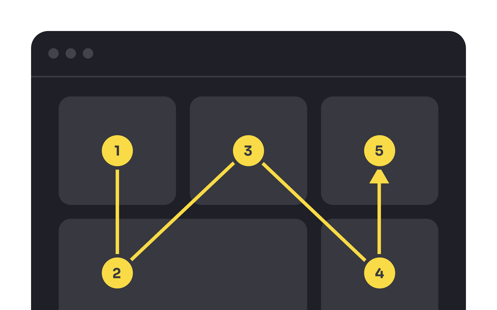
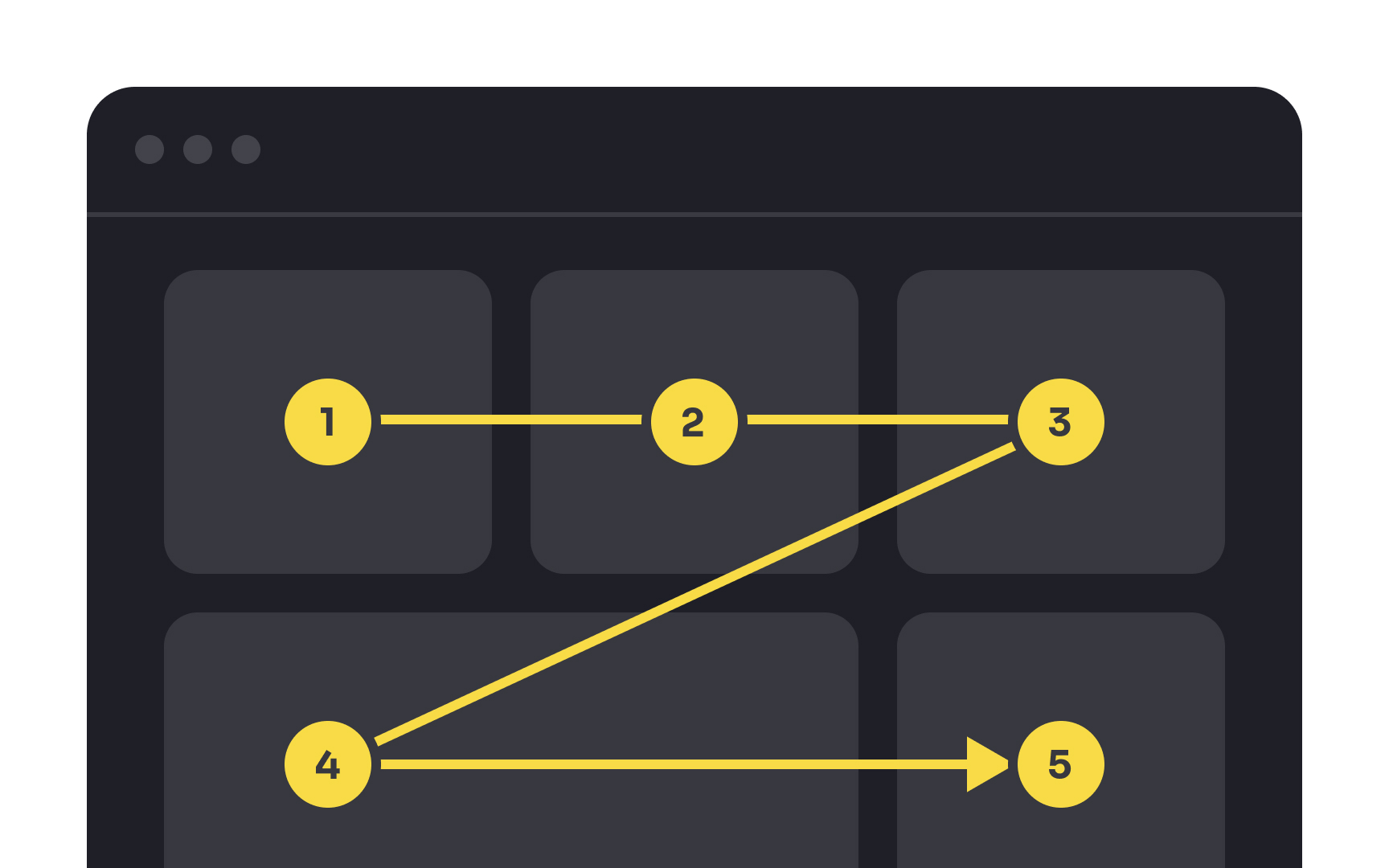
There are multiple scanning patterns, and which one users choose depends on:
- Their task
- Their prior experience of reading on the web
- The
page layout - The type of page content (text or images)[4]
For example, the F pattern is people's default scanning pattern and is more typical for content-loaded pages, like news websites. The zigzag and lawn-mower patterns are more common for pages with distinct cells of content, like dashboards, or pages with small amounts of copy, like landings.
Regardless of the layout pattern, you should know how to lead users toward the desired destination. Use clear, evident headings and subheadings and place the information of core interest in the most scannable spots to direct users' attention.
Pro Tip: Avoid scrollable dashboards as they can cause users to expend extra effort. Instead, strive for less and prioritize essential content.
Ensure structural consistency in
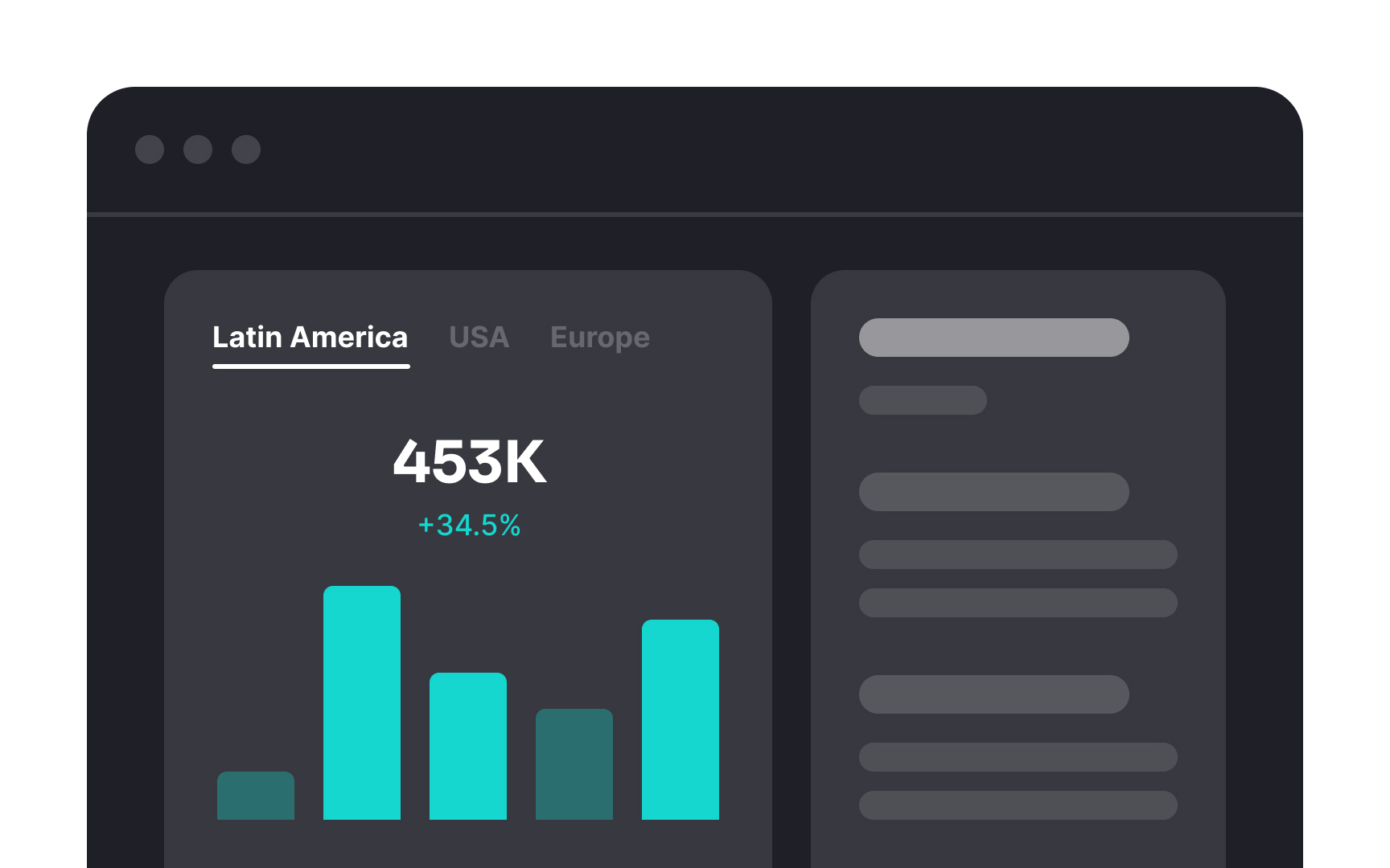
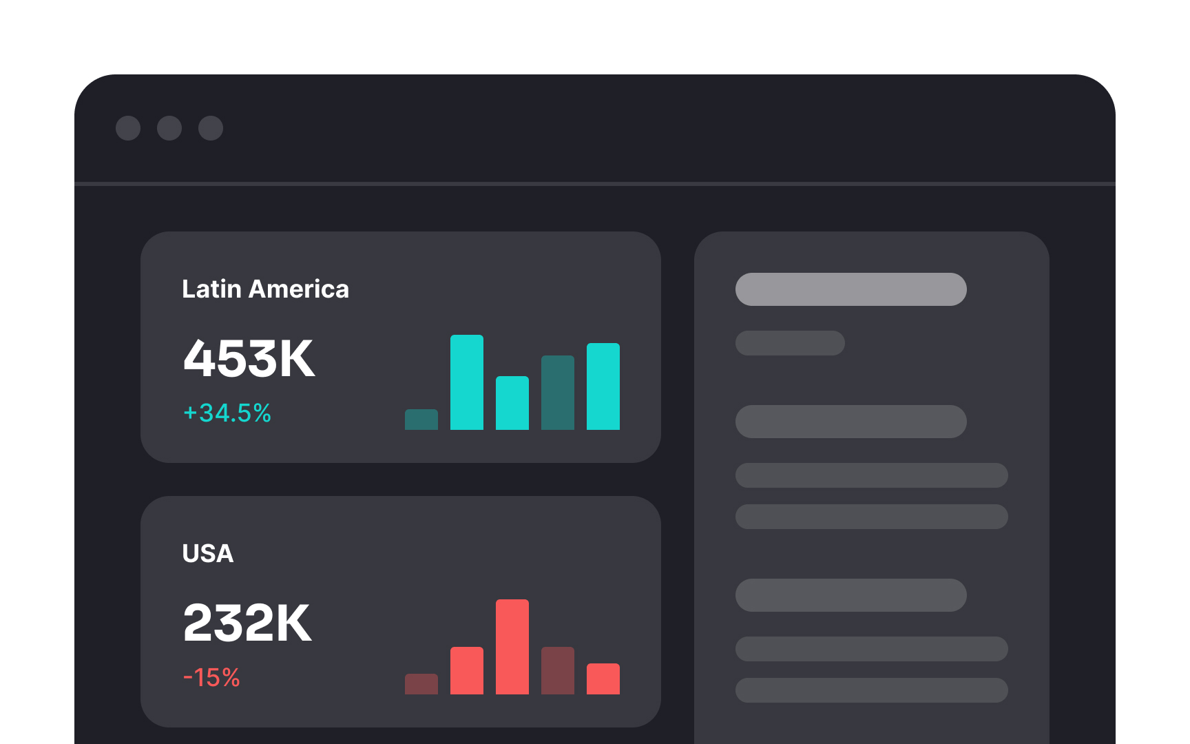
When you have lots of information to show on one
For example, if you're showing sales data for different regions, it's better to display it all at once instead of making users click on tabs to see each region separately. This way, they can easily compare the numbers. And remember, always keep important information visible without needing to click or hover.
Sometimes, designers try to squeeze massive amounts of data into one
Let the project goals, user needs, and the nature of data guide you in choosing the most relevant widgets and graphs. Ask yourself: "What specific problem will this dashboard help users solve?" The answer will reveal which metrics, properties, values, visuals, and data are essential for completing a goal and which are useless and should be removed.
A personal touch can help your
In systems with many different roles, customization is crucial. It ensures that everyone, with their unique needs and tasks, can make the dashboard work just right for them. For example, a sales manager might want to see revenue figures first thing, while a customer service agent might prioritize support ticket updates. Customization makes these adjustments possible.
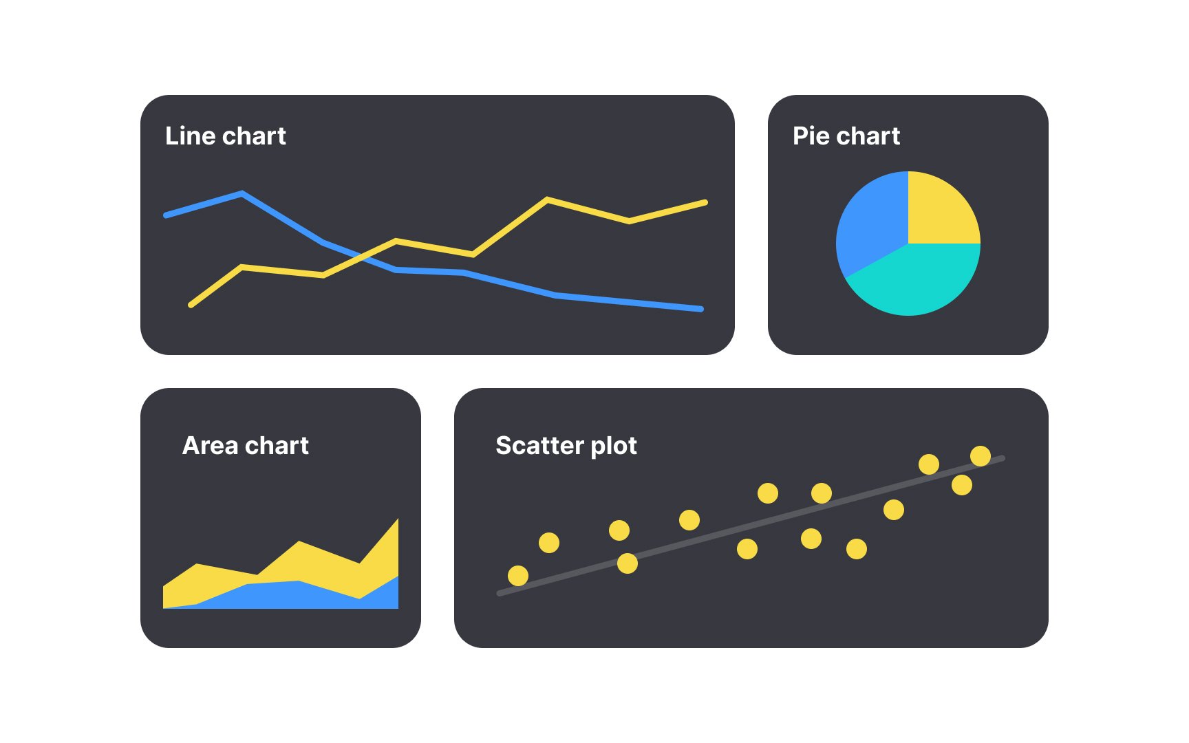
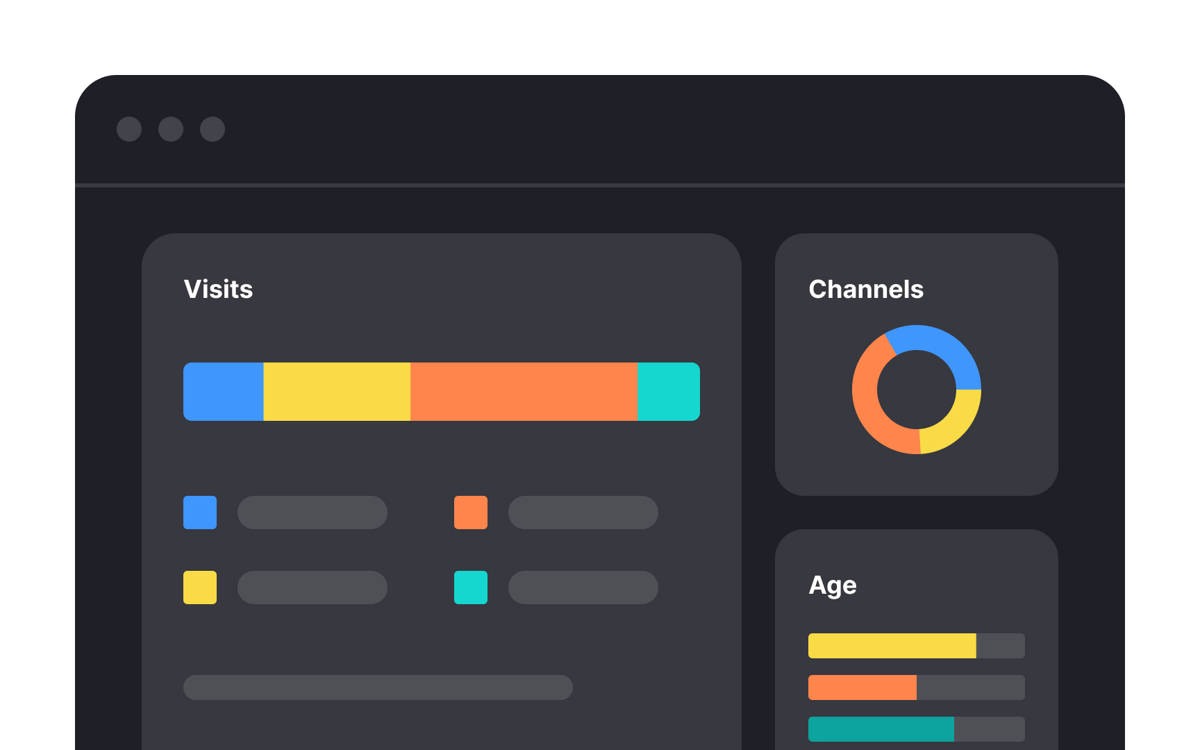
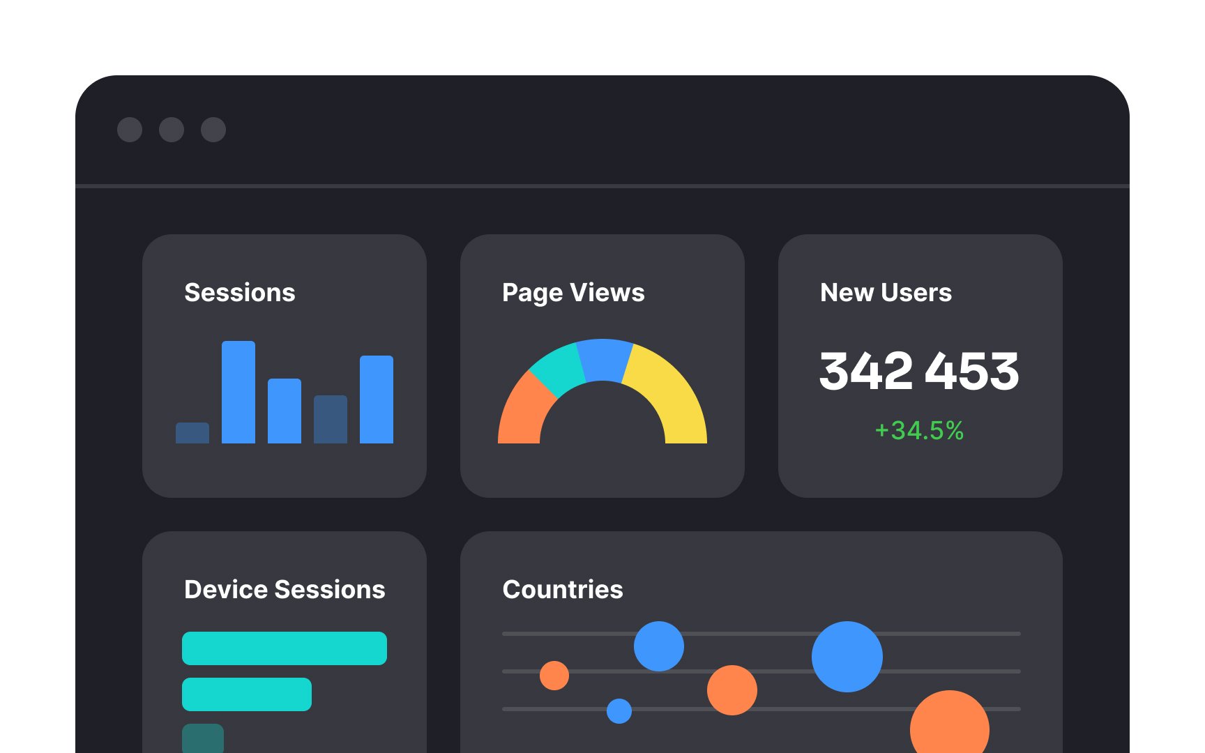
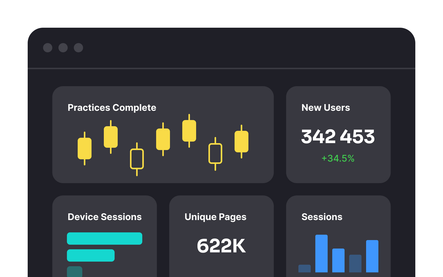
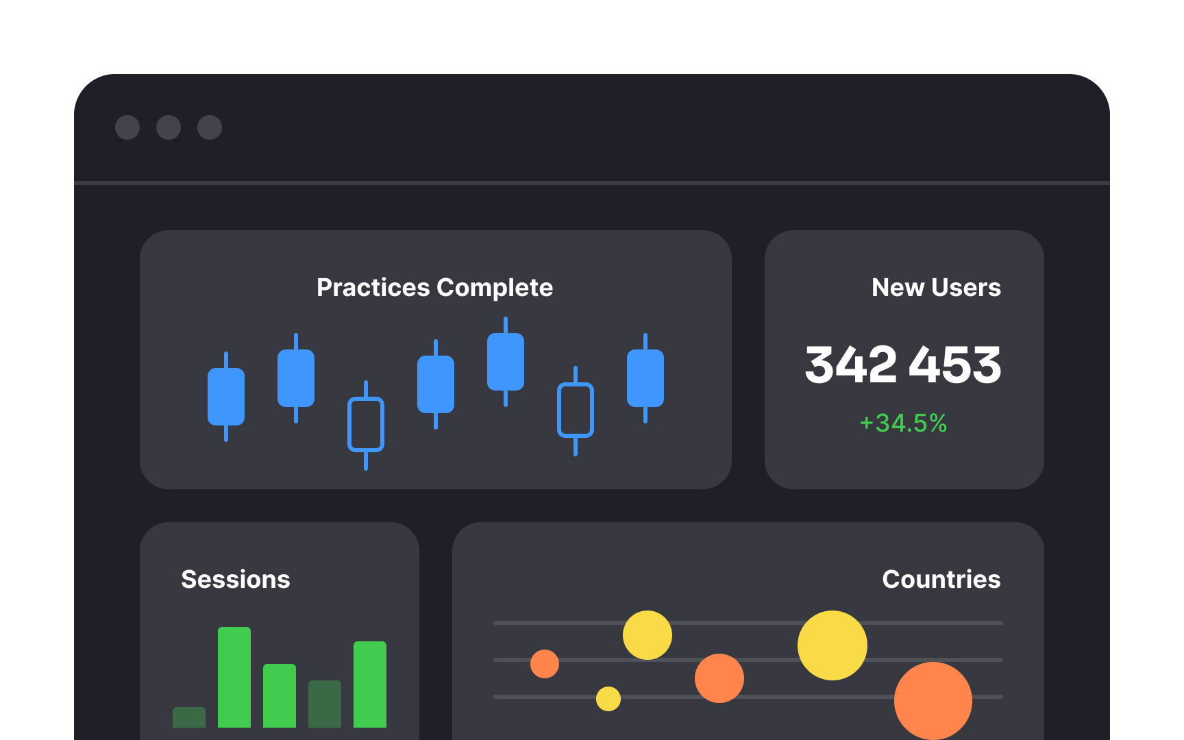
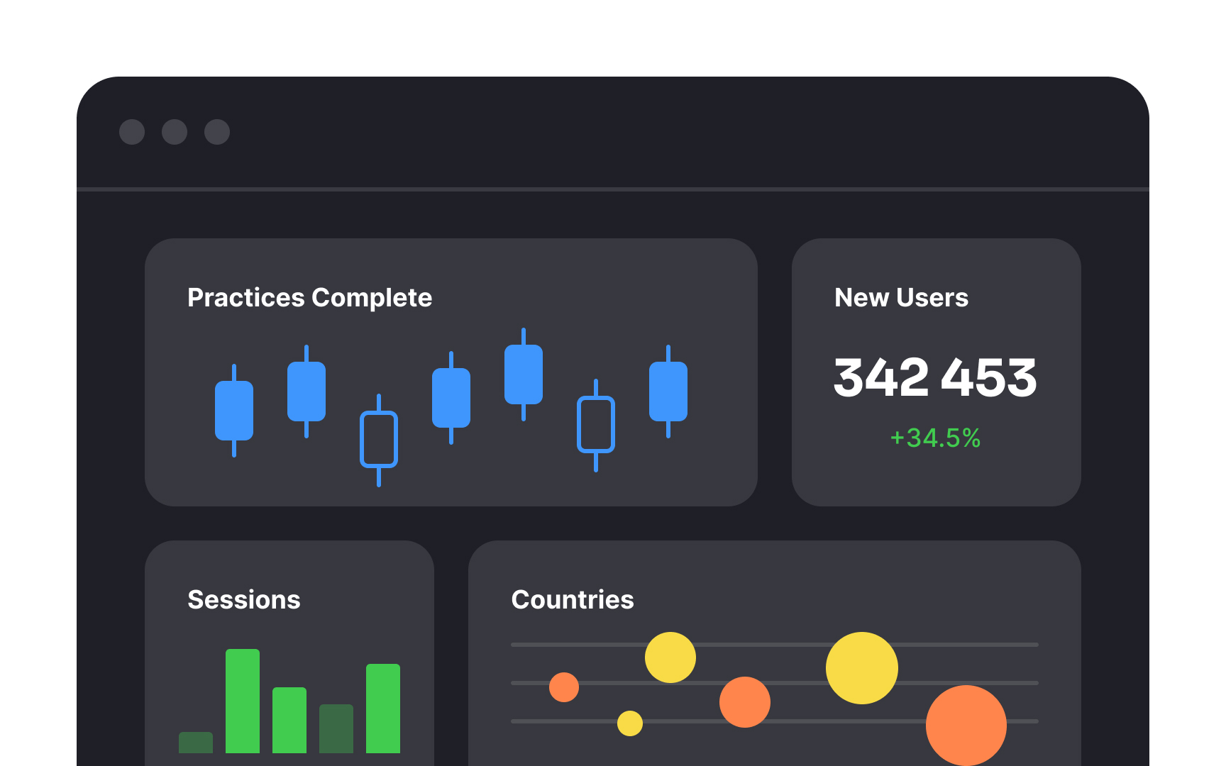
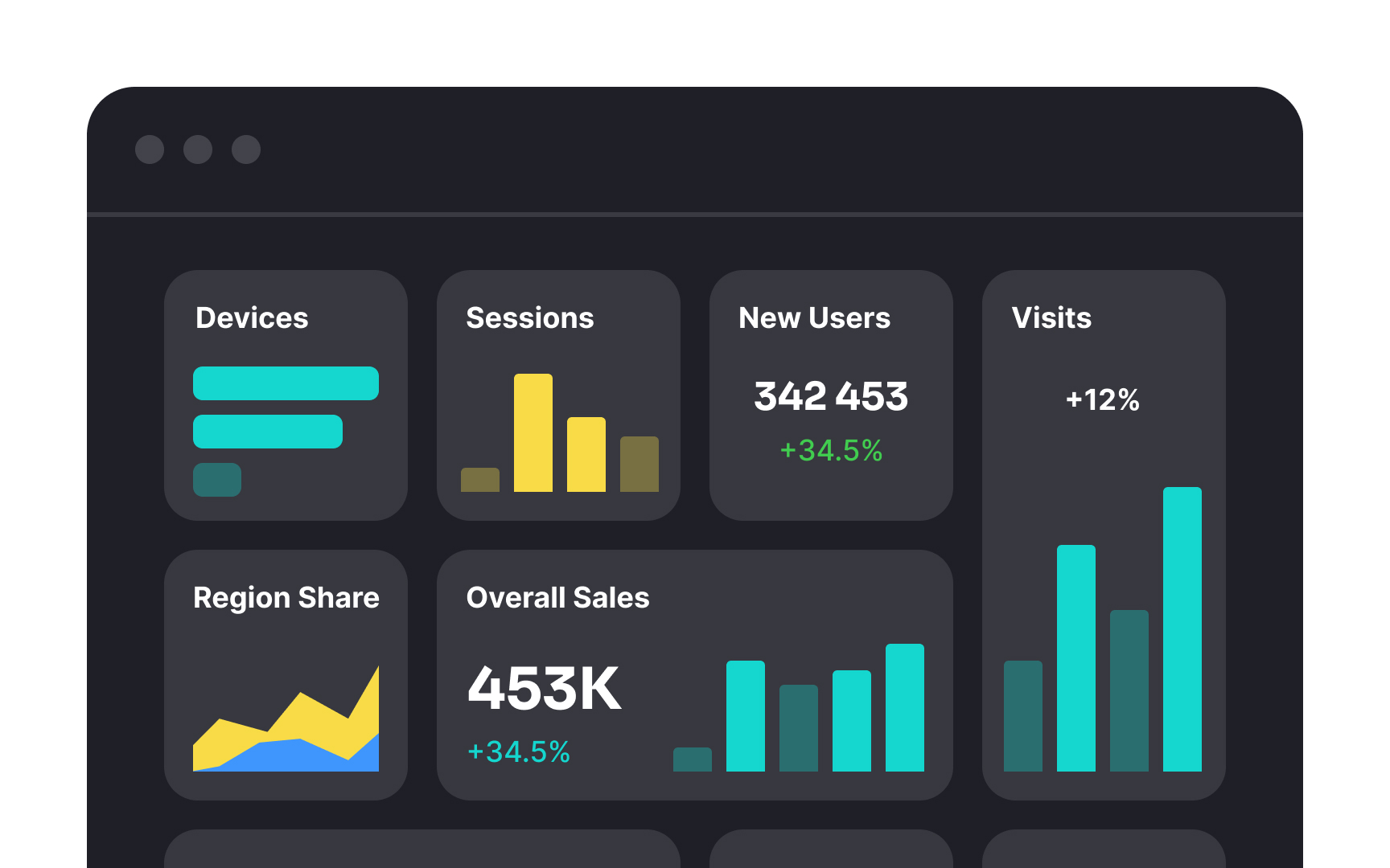
Charts are powerful tools for illustrating complex data effectively. However, choosing the right chart type is crucial, as it depends on the specific goals and needs of users.
Consider why users need graphs:
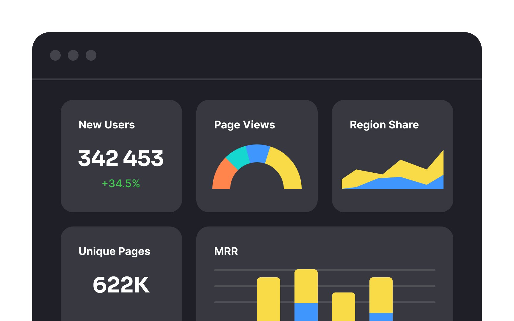
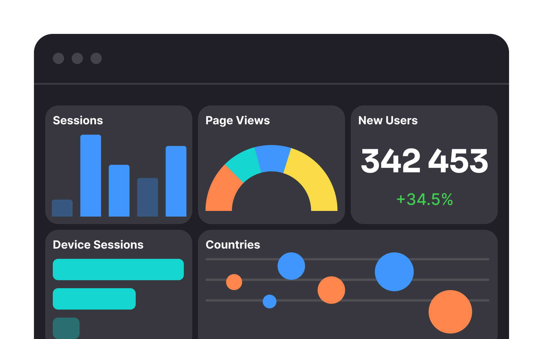
- Use line charts or bar charts to track changes and trends over a period.
- Opt for scatter plots when analyzing correlations or associations between different data sets.
- Use area charts to show overall trends over time, especially when visualizing cumulative values.
- Utilize pie charts or stacked bar/area charts to represent components in relation to the whole.
According to Nielsen Norman Group, bar charts, line charts, and scatter plots are the easiest to understand.[5] Selecting the wrong chart type can overload cognitive processing and hinder data comprehension. This may lead users to abandon the product if they struggle to interpret the charts efficiently.
Pro Tip: Using patterns and textures in charts helps people who cannot rely on color, including those with color blindness or low vision.
References
- Dashboard Design - Considerations and Best Practices | Toptal Design Blog
- Dashboards: Making Charts and Graphs Easier to Understand | Nielsen Norman Group
- The Principle of Common Region: Containers Create Groupings | Nielsen Norman Group
- How People Read Online: New and Old Findings | Nielsen Norman Group
- Choosing Chart Types: Consider Context | Nielsen Norman Group
Top contributors


Topics
From Course

Share


Similar lessons

Intro to Tables in UI

Best Practices for Designing Charts
