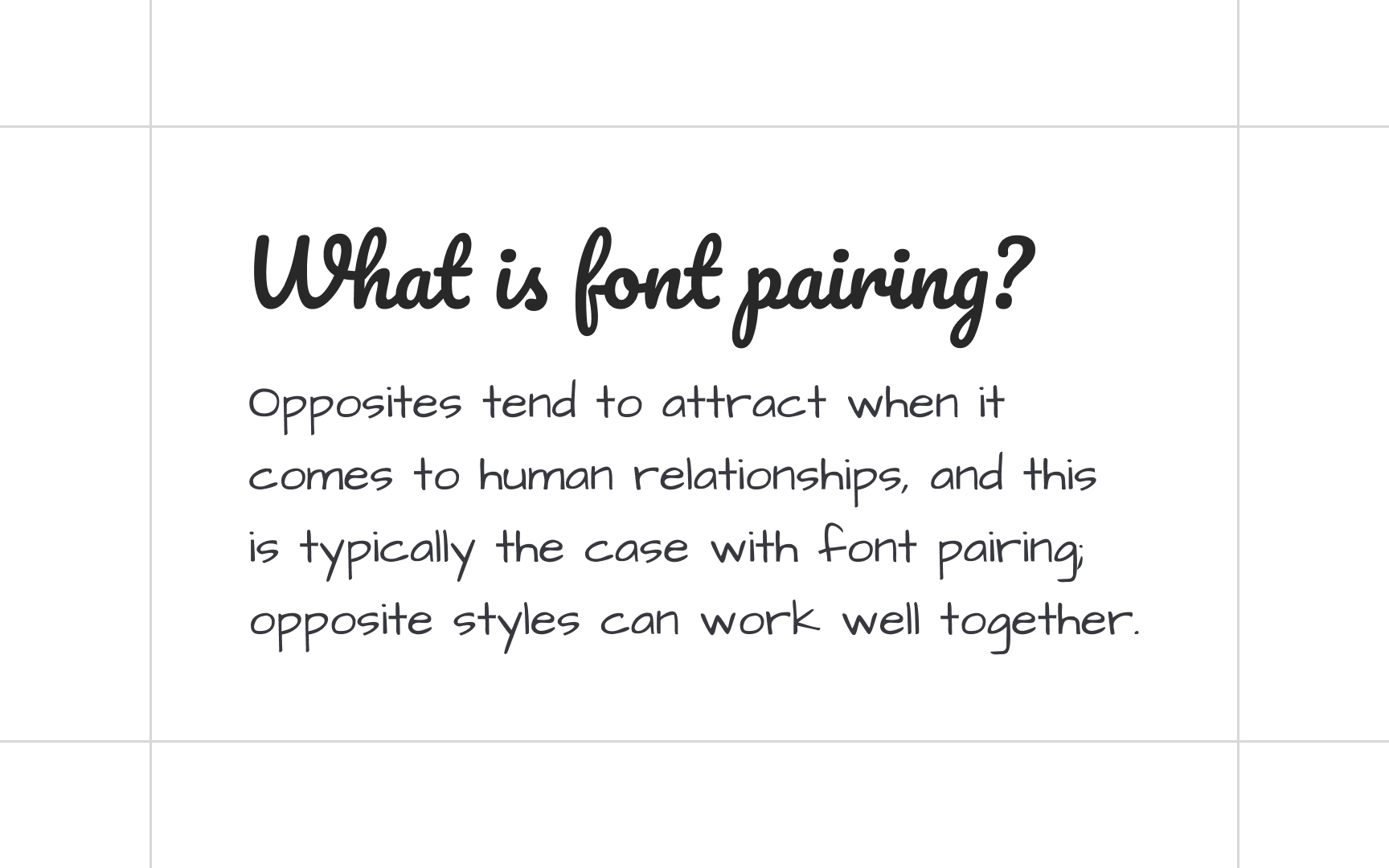
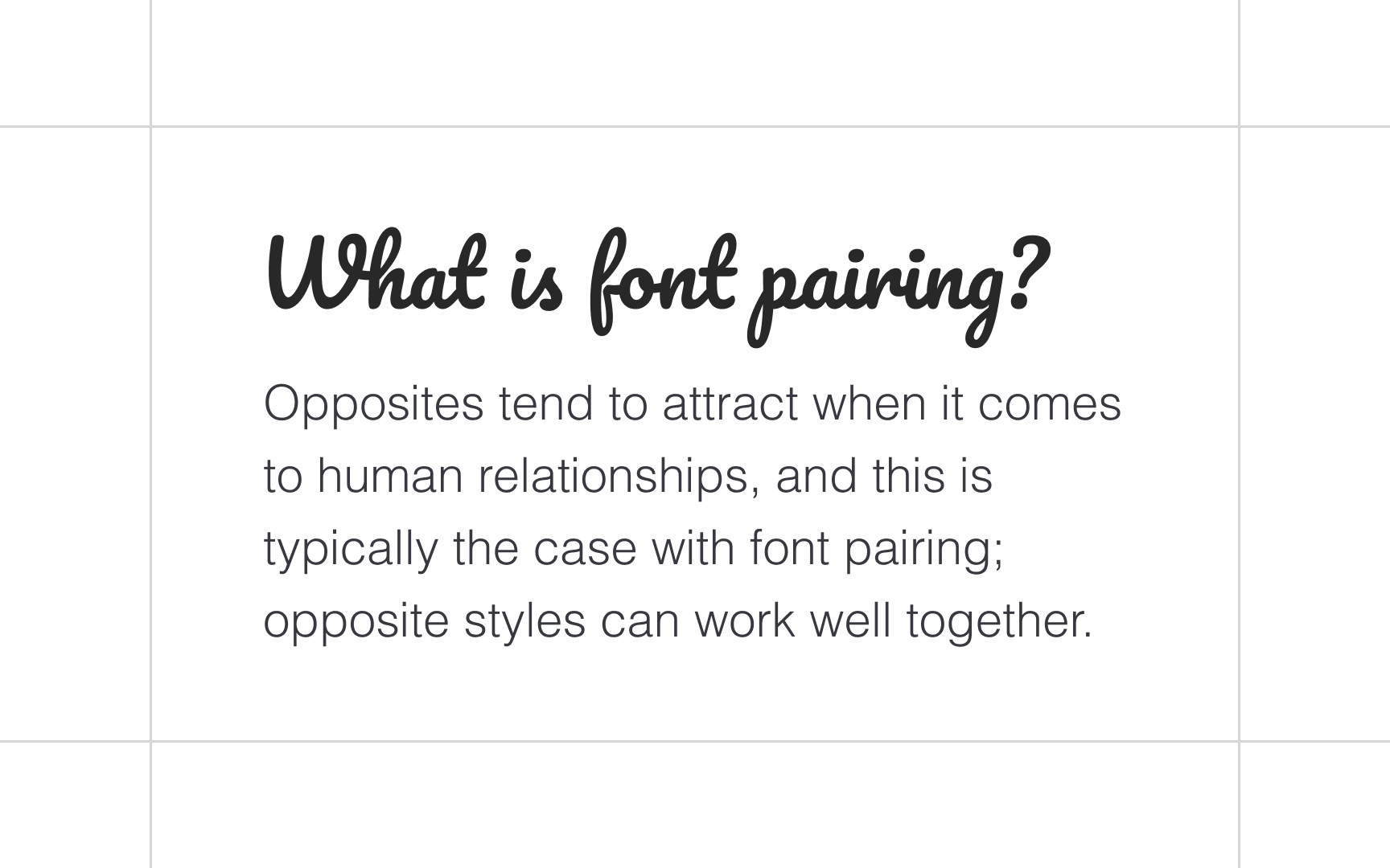
Combining Typefaces
Learn techniques for pairing complementary typefaces that create contrast, balance, and hierarchy within your typography
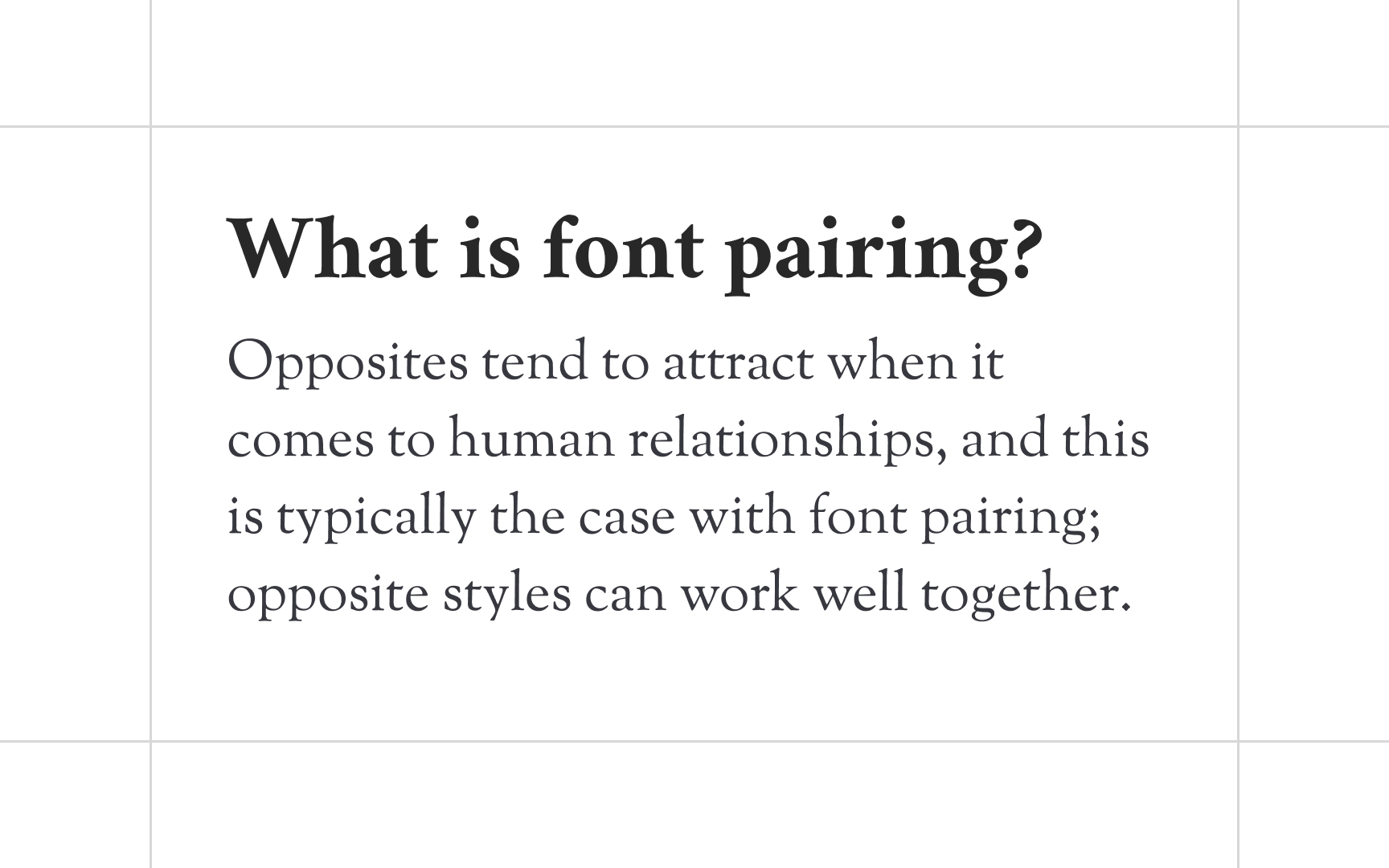
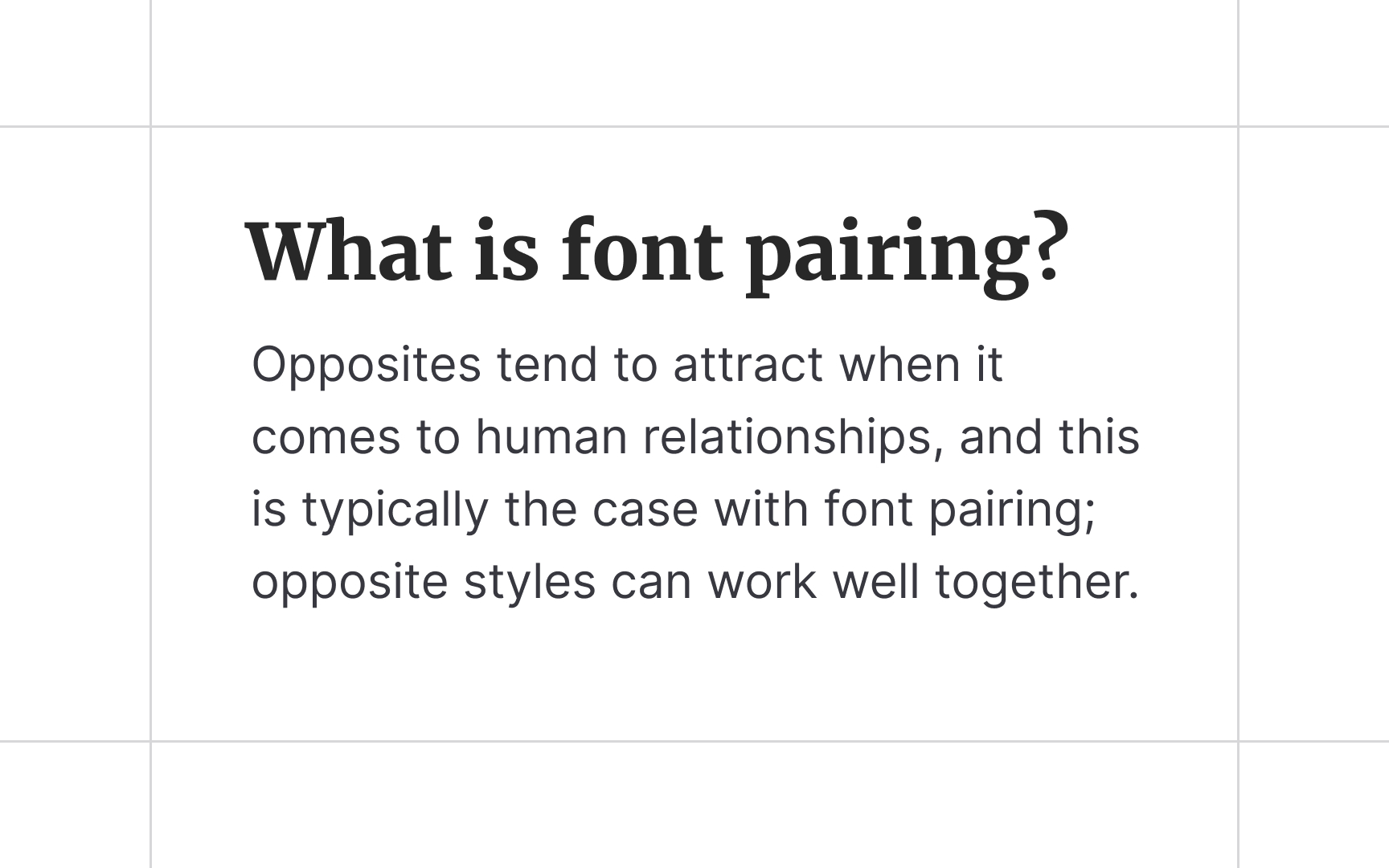
Although combining different typefaces has no creative boundaries, having a set of go-to rules can help you avoid common mistakes. You're probably well aware of the classic combination of serifs and sans serifs, but there are many other tricks to create engaging typography for a project. For example, you can combine typefaces having the same height or shape, but they need to possess different personalities. Otherwise, your website or product will look too monotonous and be hard for users to scan.
While the process of combining typefaces may be exhausting, the best practice is to keep changing type parameters, mixing, and iterating. You can start by searching for inspiration on Behance, Dribble, or other websites presenting type designers' works.
If you mix too many colors in a painting, it might turn into a muddy mess. Likewise, if you mix too many typefaces, you could risk confusing your users. So how many typefaces are enough? Keep it simple — sometimes, one
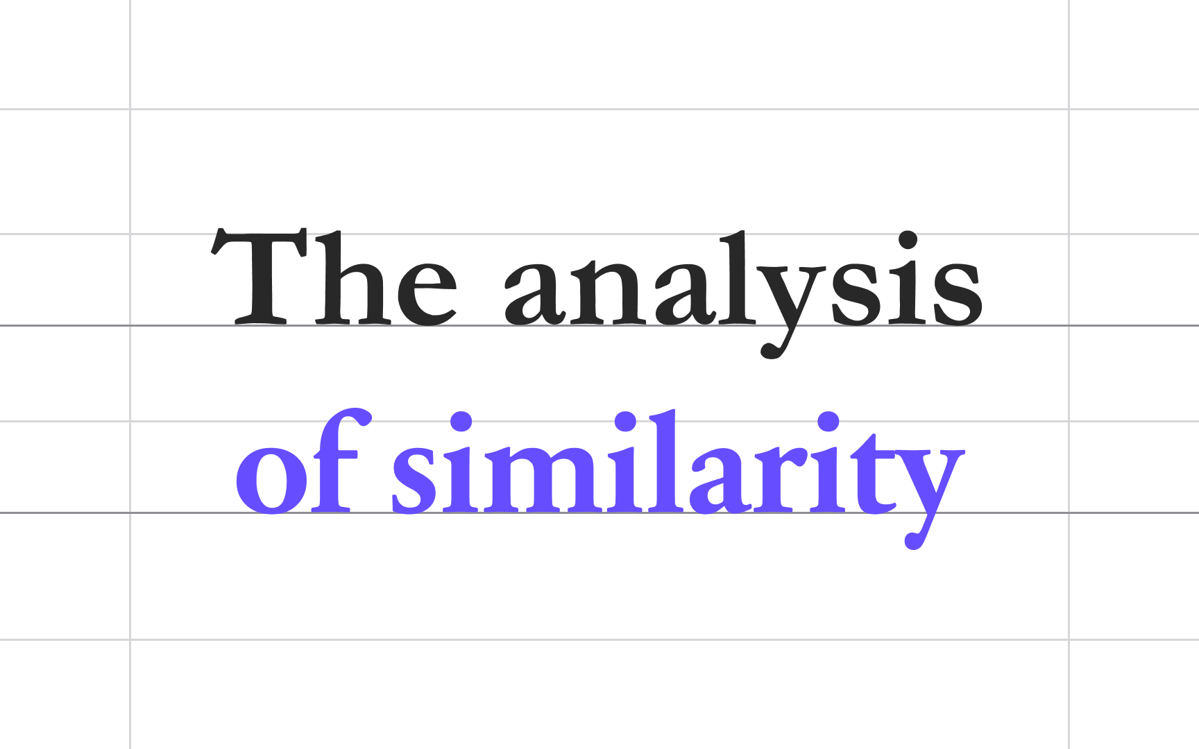
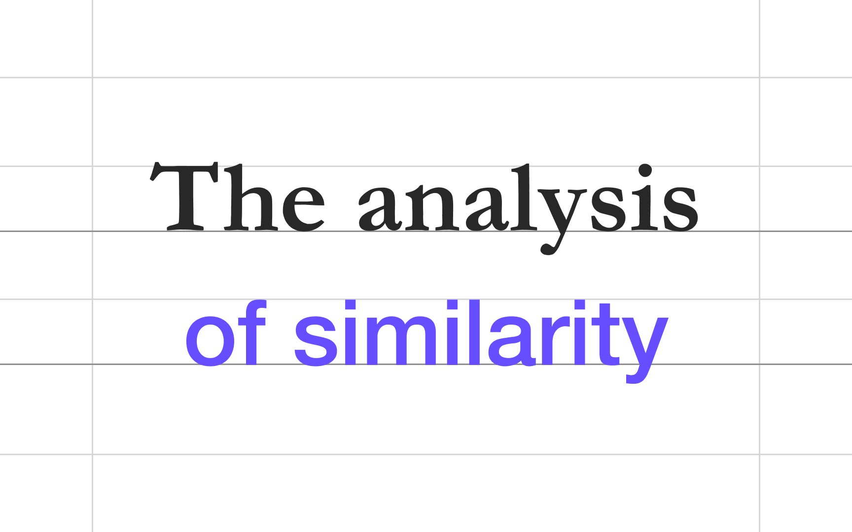
If you want to introduce a bit more contrast, it's okay to use 2-3 typefaces. Ensure they balance and complement each other. For example, neutral, reserved sans serifs go well with elegant scripts and classic serifs.
A rule of thumb in
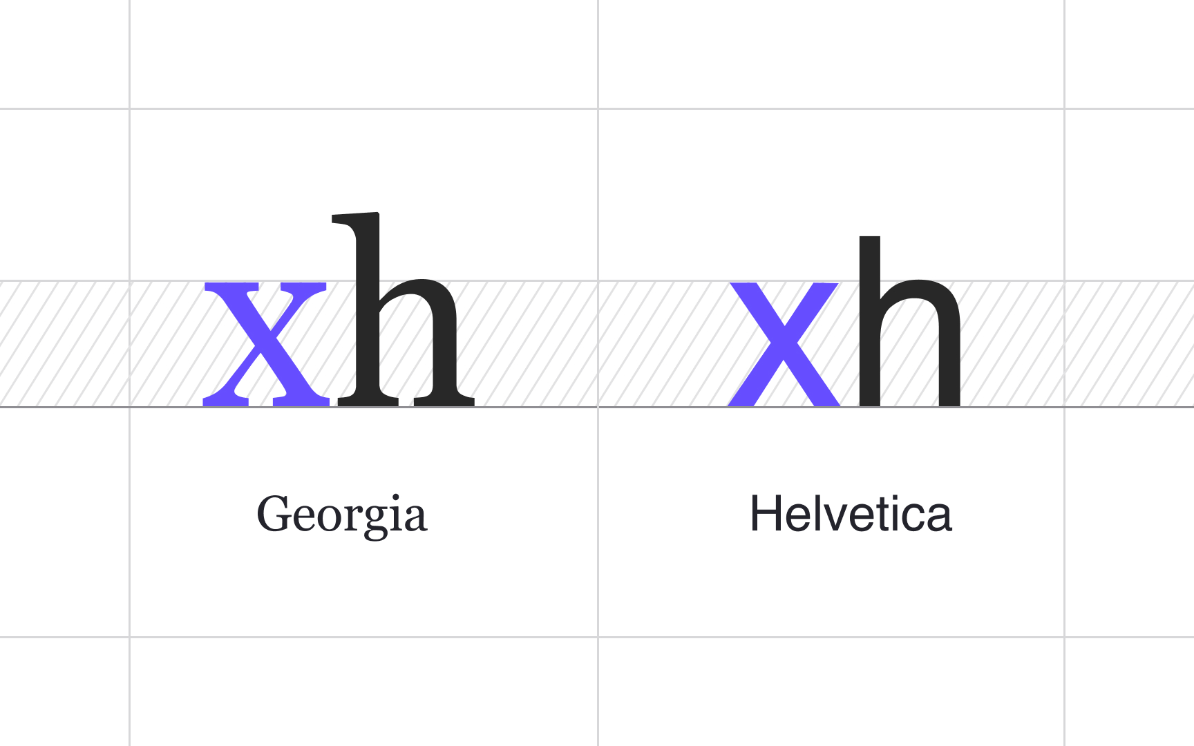
Conversely, it might be too hard for users to follow lines of text when the x-heights are too different. Matching x-heights ensure that your typefaces pleasantly
Surprisingly, even the most
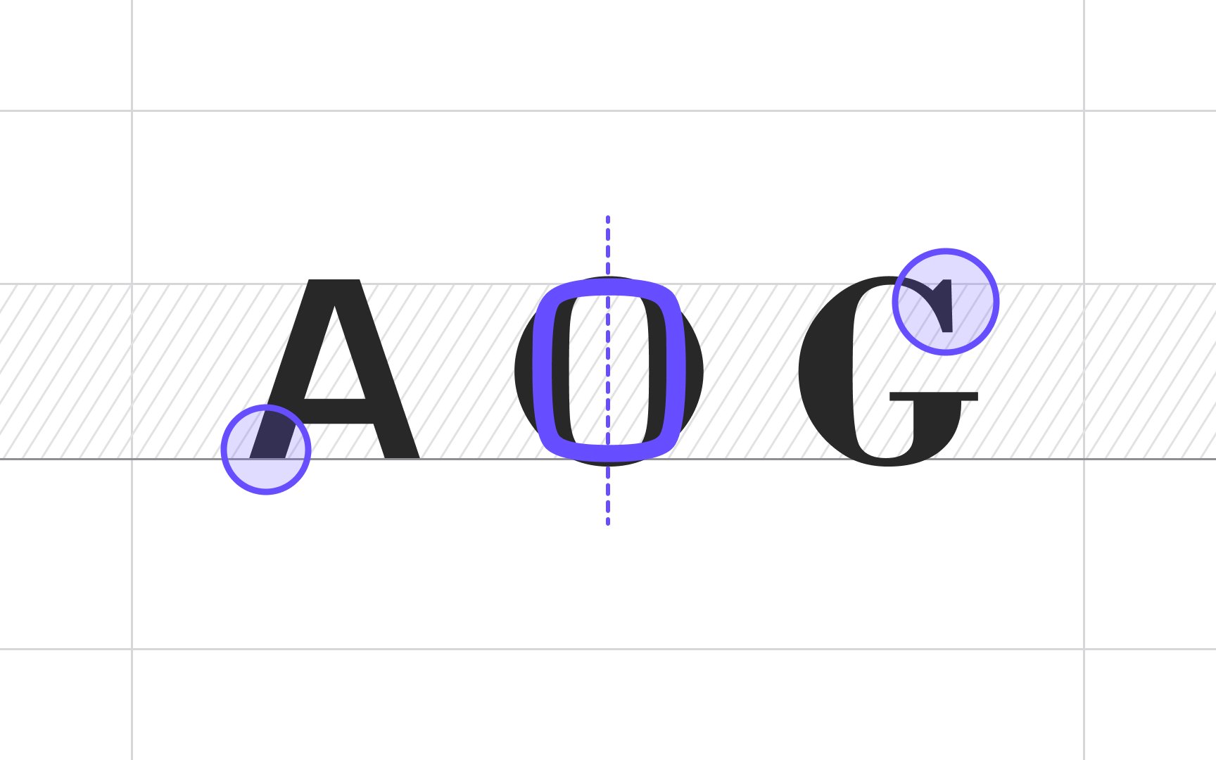
The point to note here is that if you aim to combine opposite typefaces, make sure they have something common in their geometry, i.e., in terms of proportions, stress, stroke width, or letterform shapes (border-radius or angle).
Combining 2-3
Try combining typefaces having different but complementary personalities. For example, the distinctive, friendly sans serif Helvetica and the traditional, elegant Garamond typefaces form a complex yet appealing pair.
The
How much contrast is too much? Consider parameters such as x-height, cap height, the contrast between thin and thick strokes, vertical stress, proportions, and spacing — at least some of them should be similar. If you try to combine a chunky, bold
Sometimes, you have to rely on your gut feeling and a sense of balance and aesthetics to decide what combination of typefaces works and what does not.
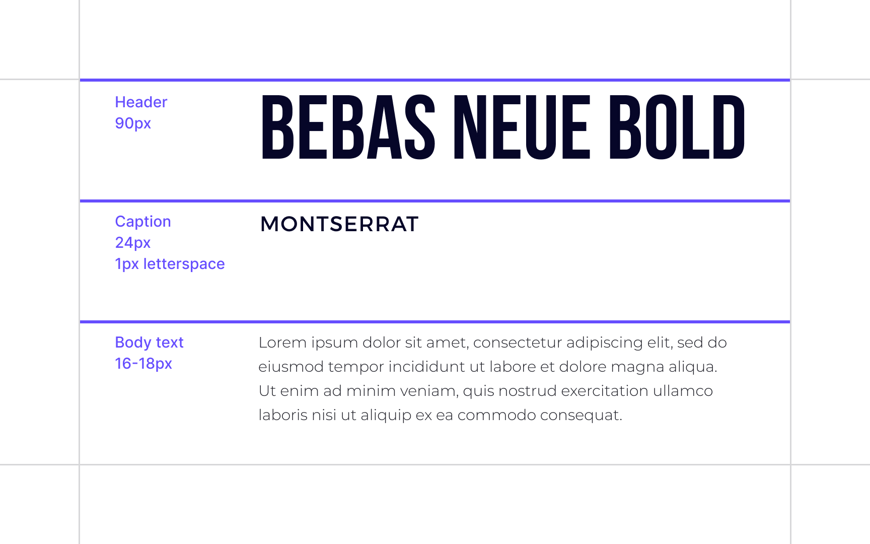
Visual hierarchy refers to the arrangement of elements, including text, to help users navigate a page. In other words, it helps you tell users where to go to find the relevant information using methods of size,
Knowing the hierarchy within a page, you can decide how many typefaces you need, for example, one
Users tend to see large-sized letters in a different typeface and weight and assume it's a new section or a vital piece of information. So variations of typefaces, weights, sizes, and spacing between text elements can help designers set zones of importance (aka anchors), to increase the scannability of a page.
Playful, serious, elegant, casual — your
Like
Pro Tip: If you're uncertain about the typeface's mood, type its name in Google and read its characteristics, or check out other design projects and products created using this type.
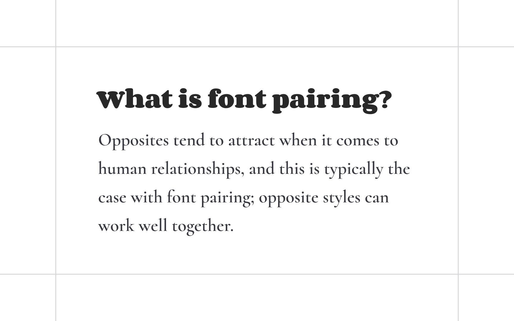
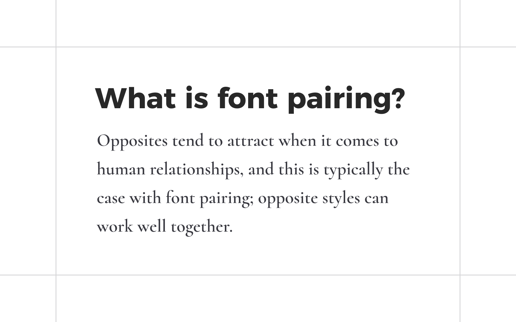
A combination of sans serifs and serifs is a safe bet if you're short on time or don't have experience in
On the other hand, serifs feel like a better fit for the headlines and subheads where a pinch of creativity is allowed. This combination contains enough
Like two extroverts hardly can get along together, two distinct, attention-grabbing
Architects Daughter and Pacifico are both handwriting typefaces and convey the same friendly, informal attitude. Their combination lacks