Best Practices for Designing UI Button Labels

Explore the best practices for crafting clear, legible, and unmistakable button labels that guide users
Best Practices for Designing UI Button Labels Lesson

Labels are so important that a button without them is almost entirely useless. Following button label best practices can enhance your product's legibility and help users work more efficiently. 

A lot goes into creating great button labels, from the typography to the wording of the actual text. Following best practices for your button labels will help you design buttons that entice users to interact, while giving them a clear indication of what their interactions will accomplish.

Place icons on the left Bad Practice
Place icons on the left Best Practice

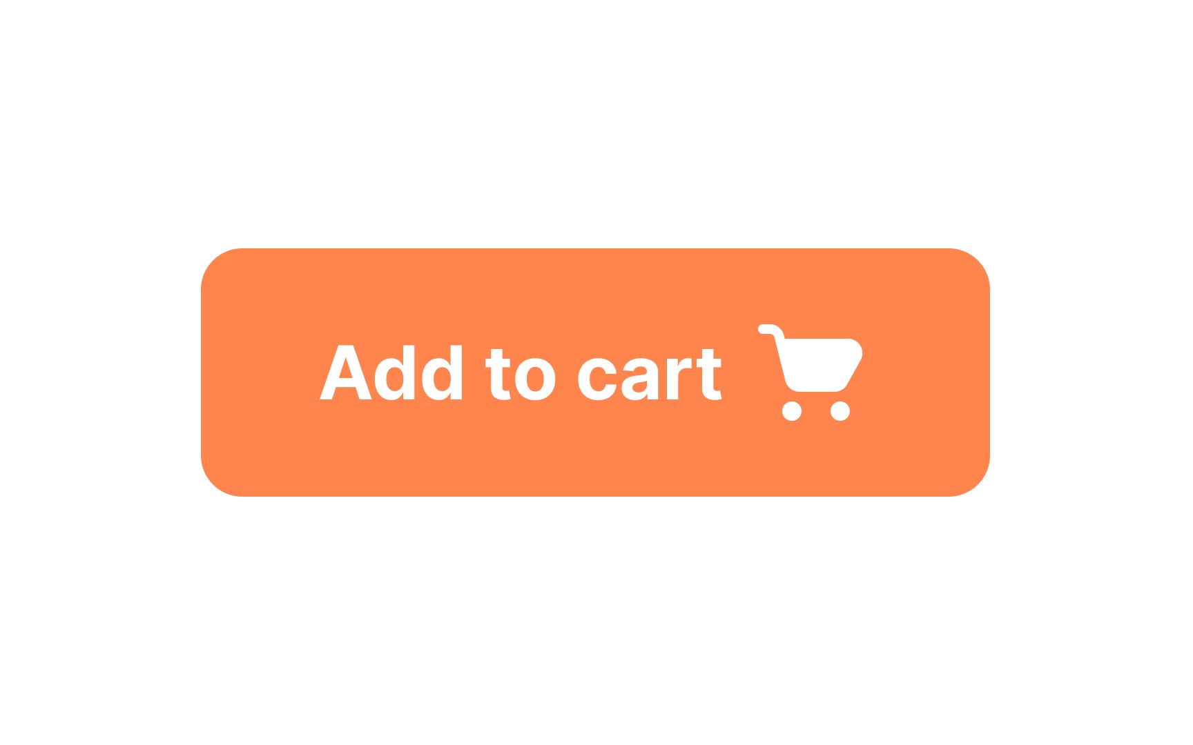
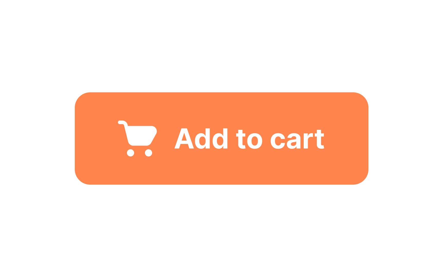
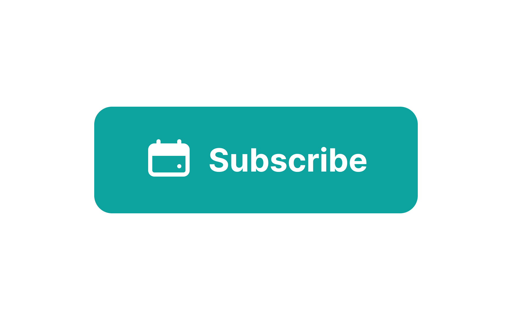
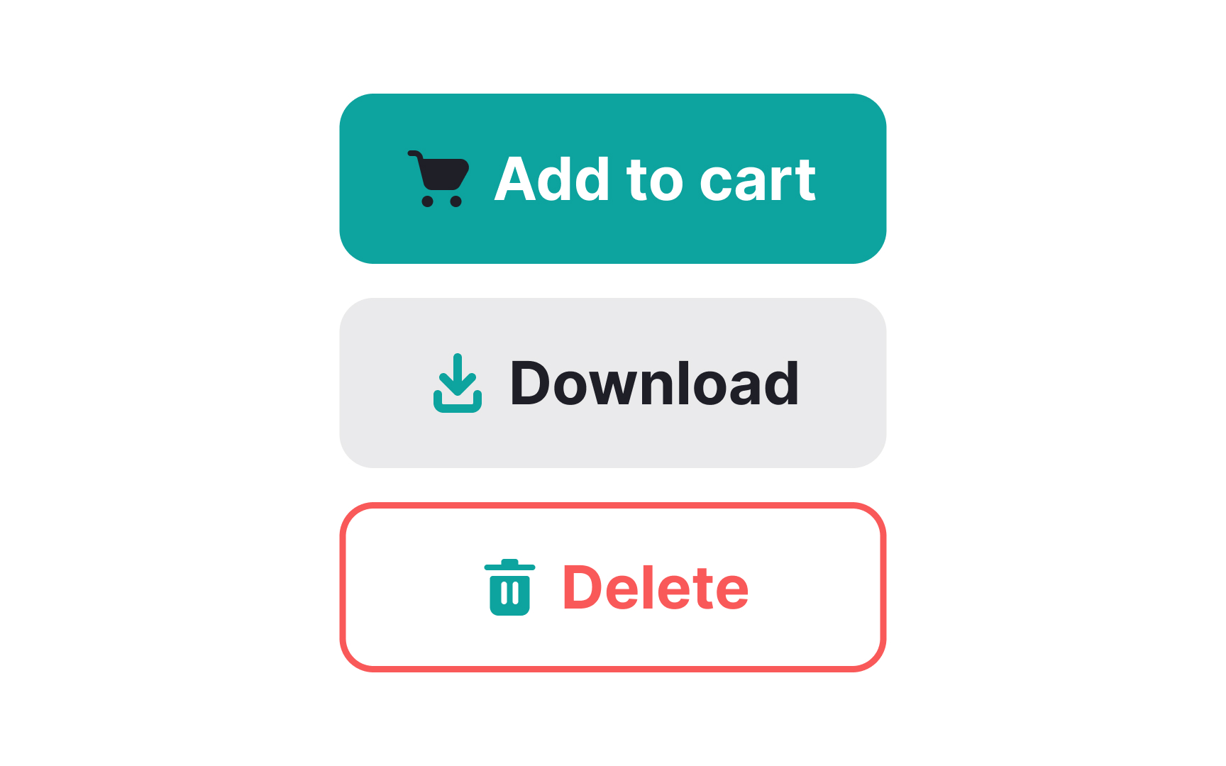
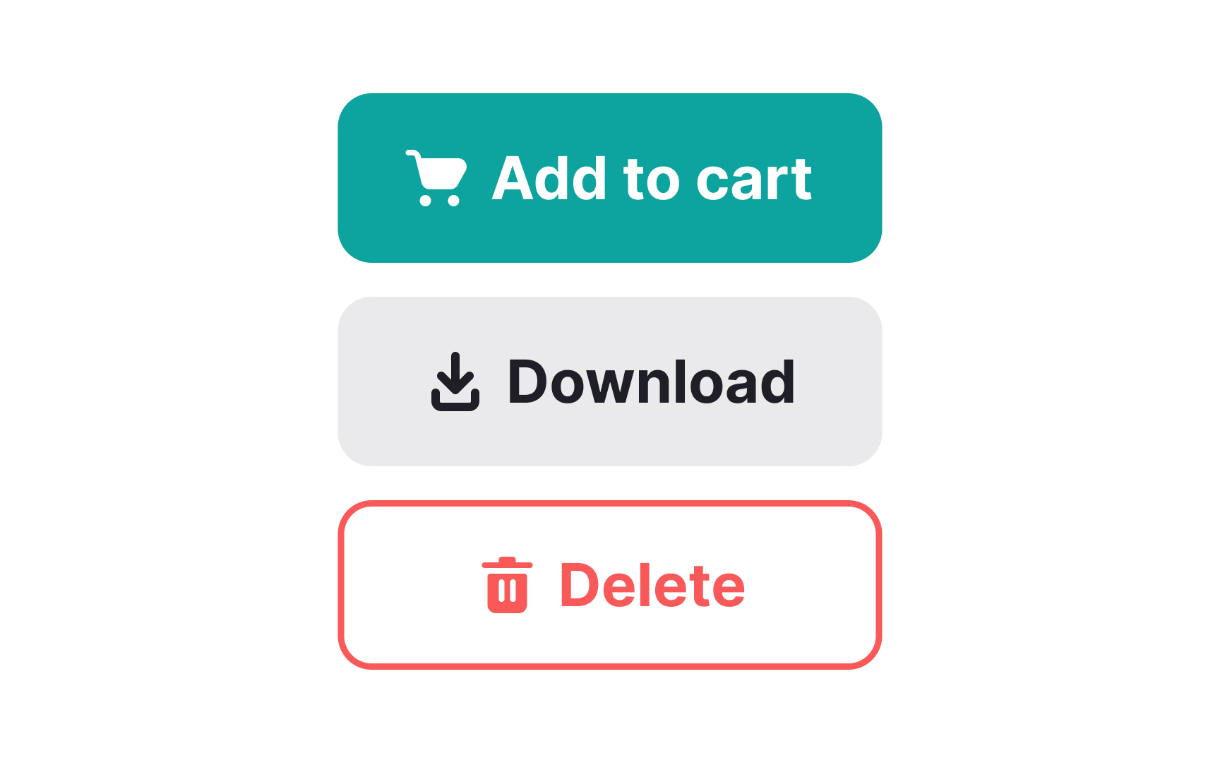
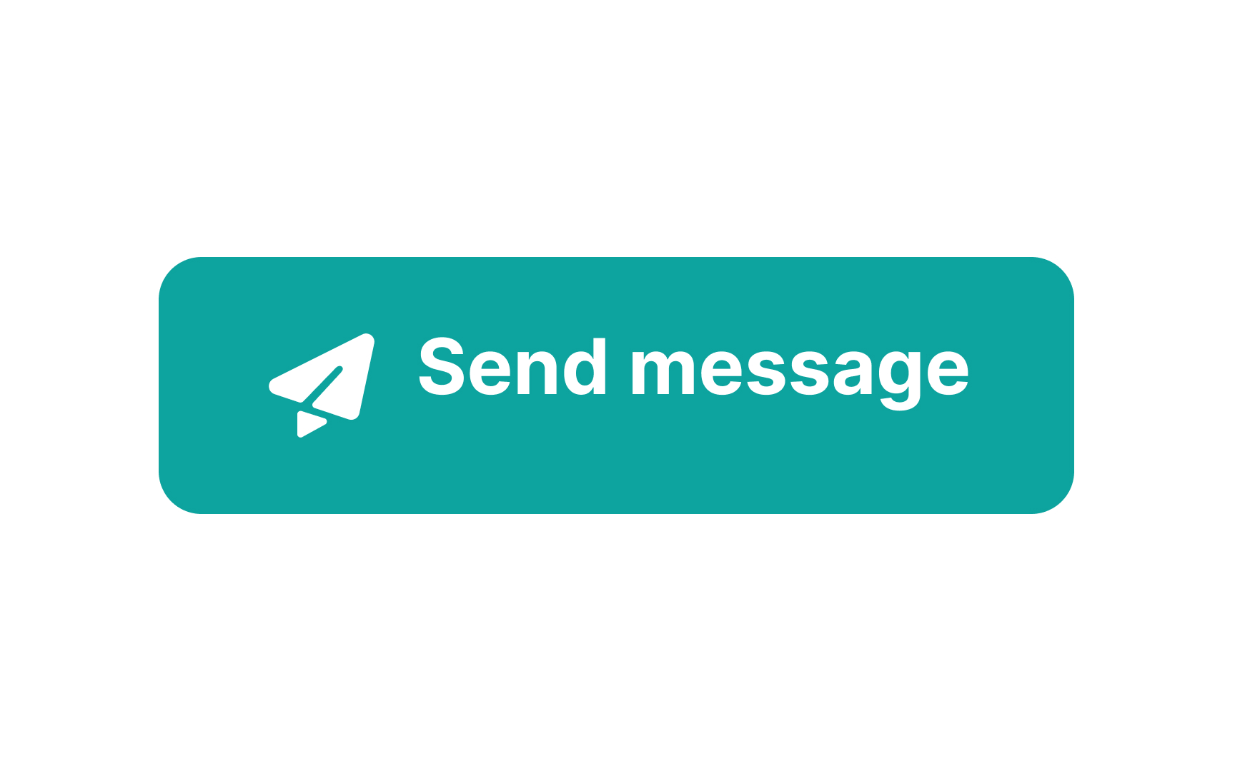
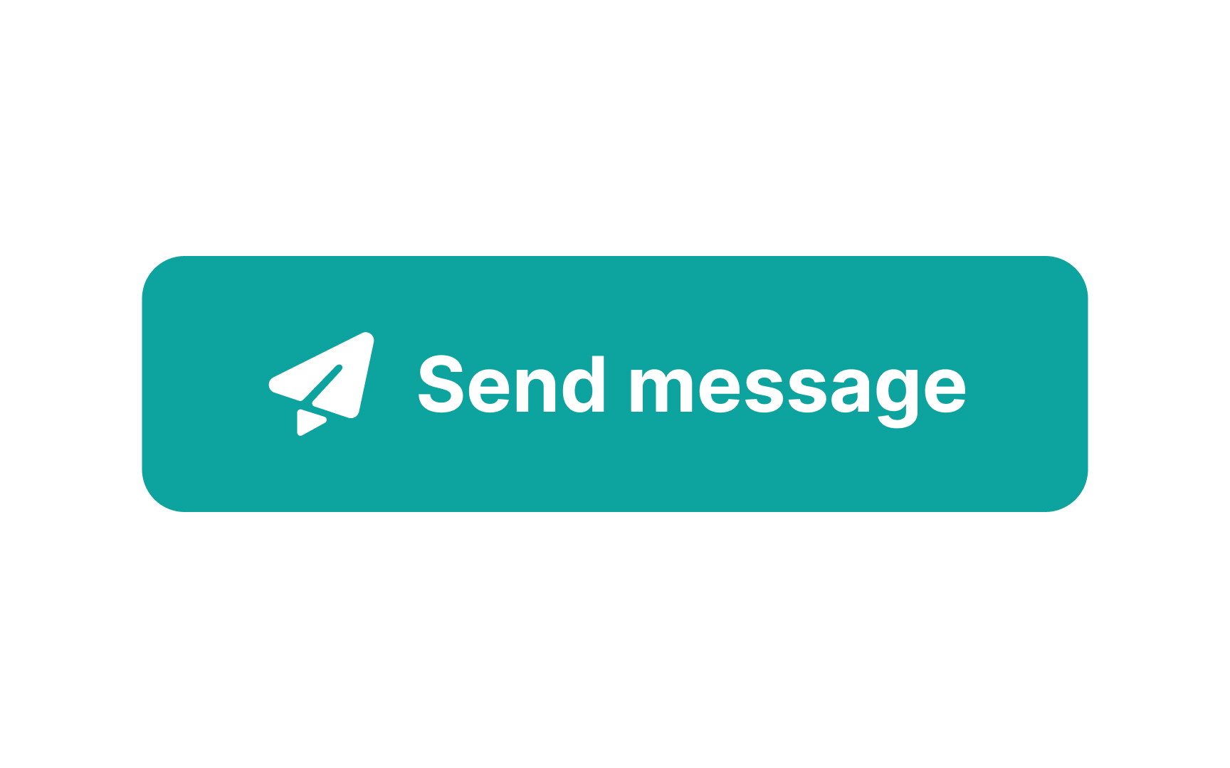
An icon can give users a hint about the button's purpose. Leading icons are commonly placed before the label in left-to-right languages. Research shows that in left-to-right languages, users scan pages, paintings, movie screens, and just about everything from the left.[1] For this reason, placing an icon on the left helps identify a button and its purpose much faster. When it appears after a button label, the icon serves only as decoration.

Additionally, placing your icons on the left will leave room on the right for a downward pointing arrow when you need a dropdown menu.

If icons are self-explanatory and recognizable, users won't need to read the label. Use a leading icon to grab their attention.
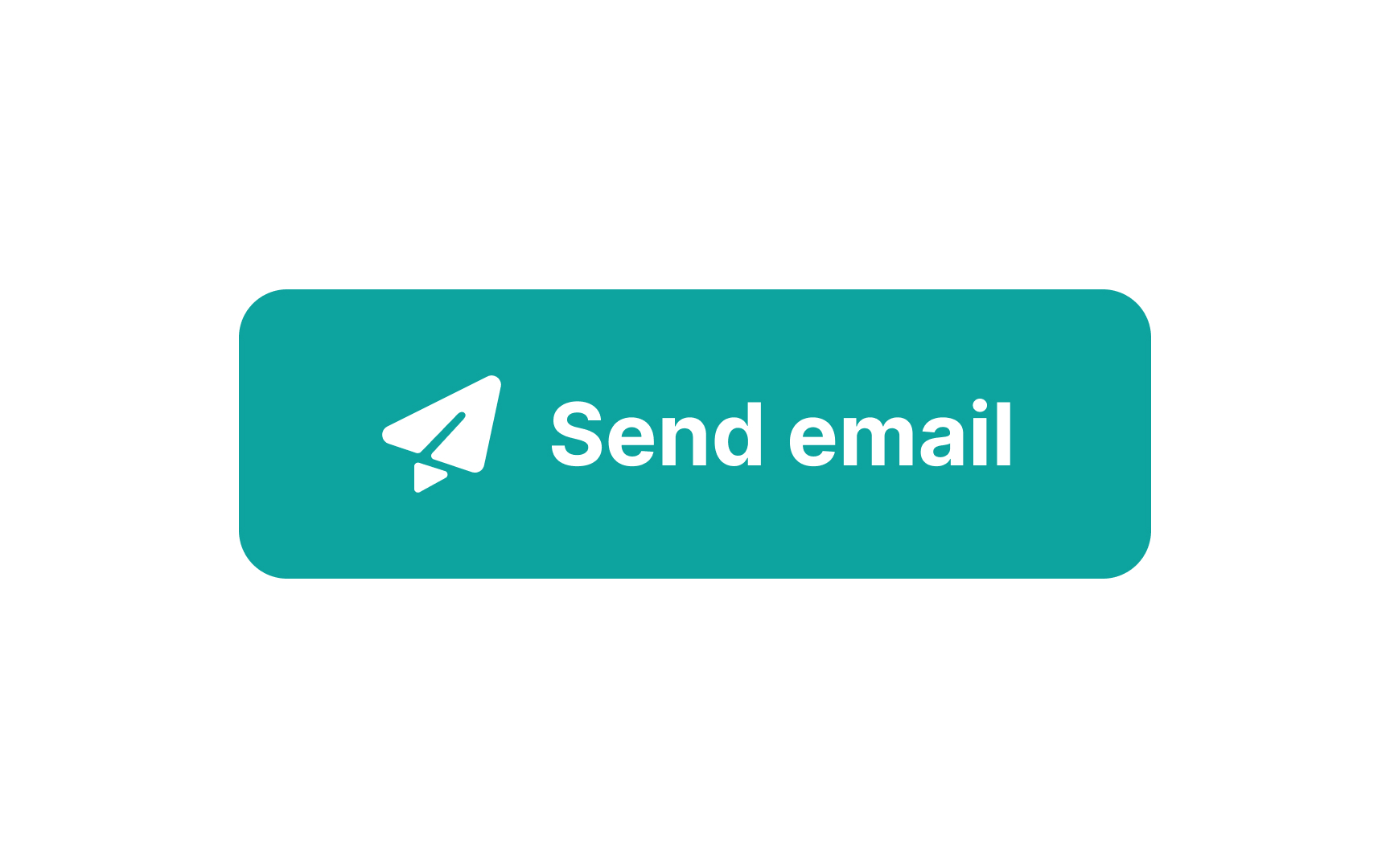
Use meaningful button commands Bad Practice
Use meaningful button commands Best Practice

Button label commands must be crystal clear, especially for actions that can’t be undone. Users should immediately understand what will happen when they click a button.

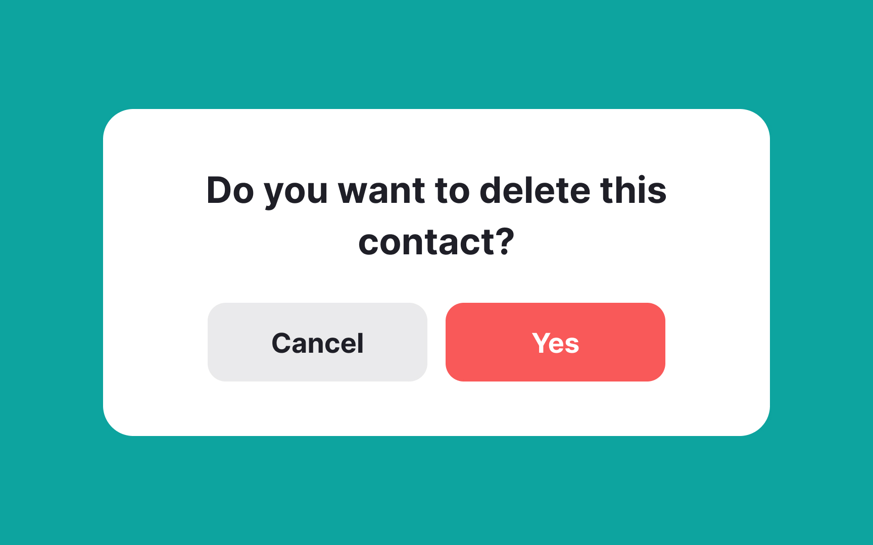
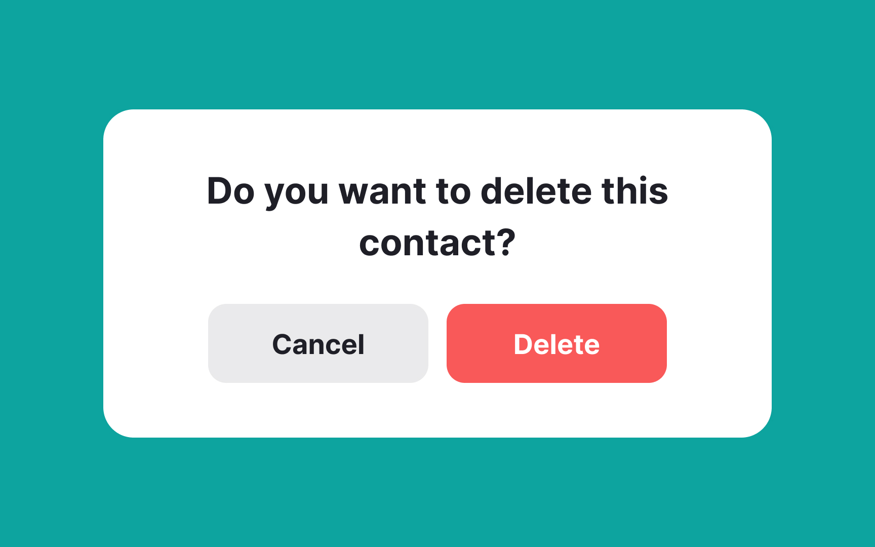
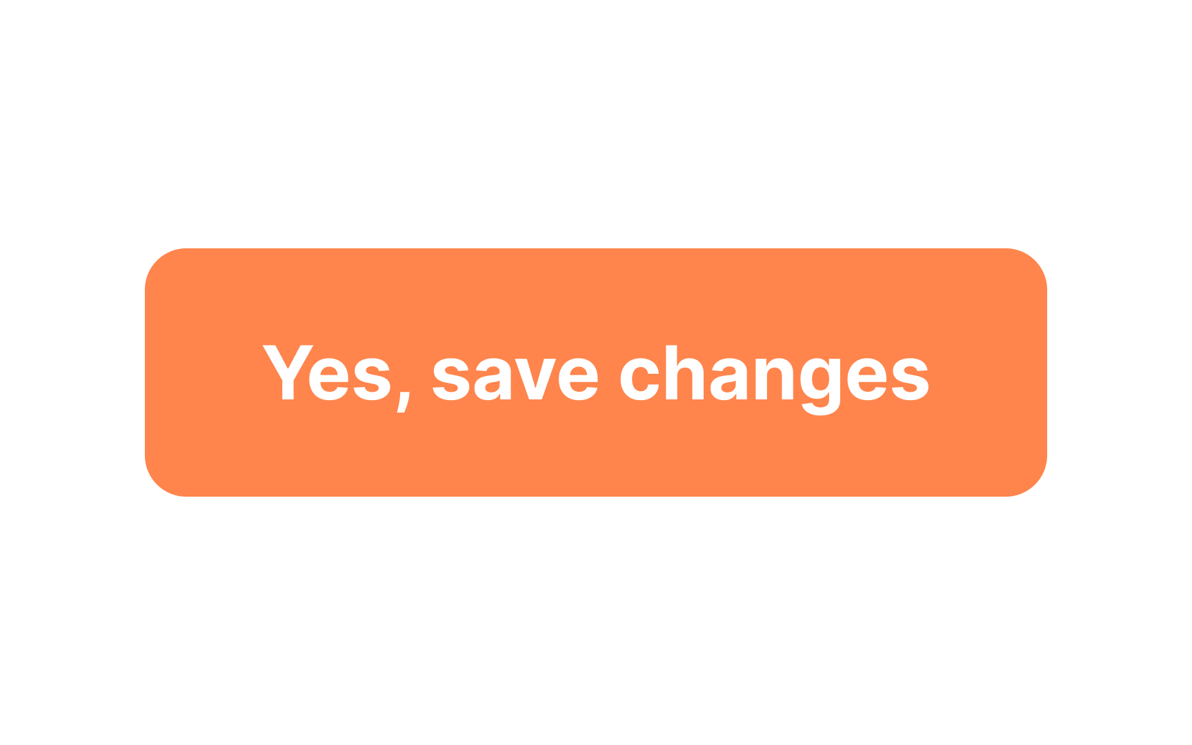
Rather than using words like “yes” or “no” in your buttons, use clear action verbs like “delete” or “cancel.” This leaves no doubt in the user’s mind what action they’re completing.

Apply recognizable icons Bad Practice
Apply recognizable icons Best Practice

Icons are simplified images showing a button's purpose. They can make the function of a button immediately recognizable to users, without needing to read the accompanying label.

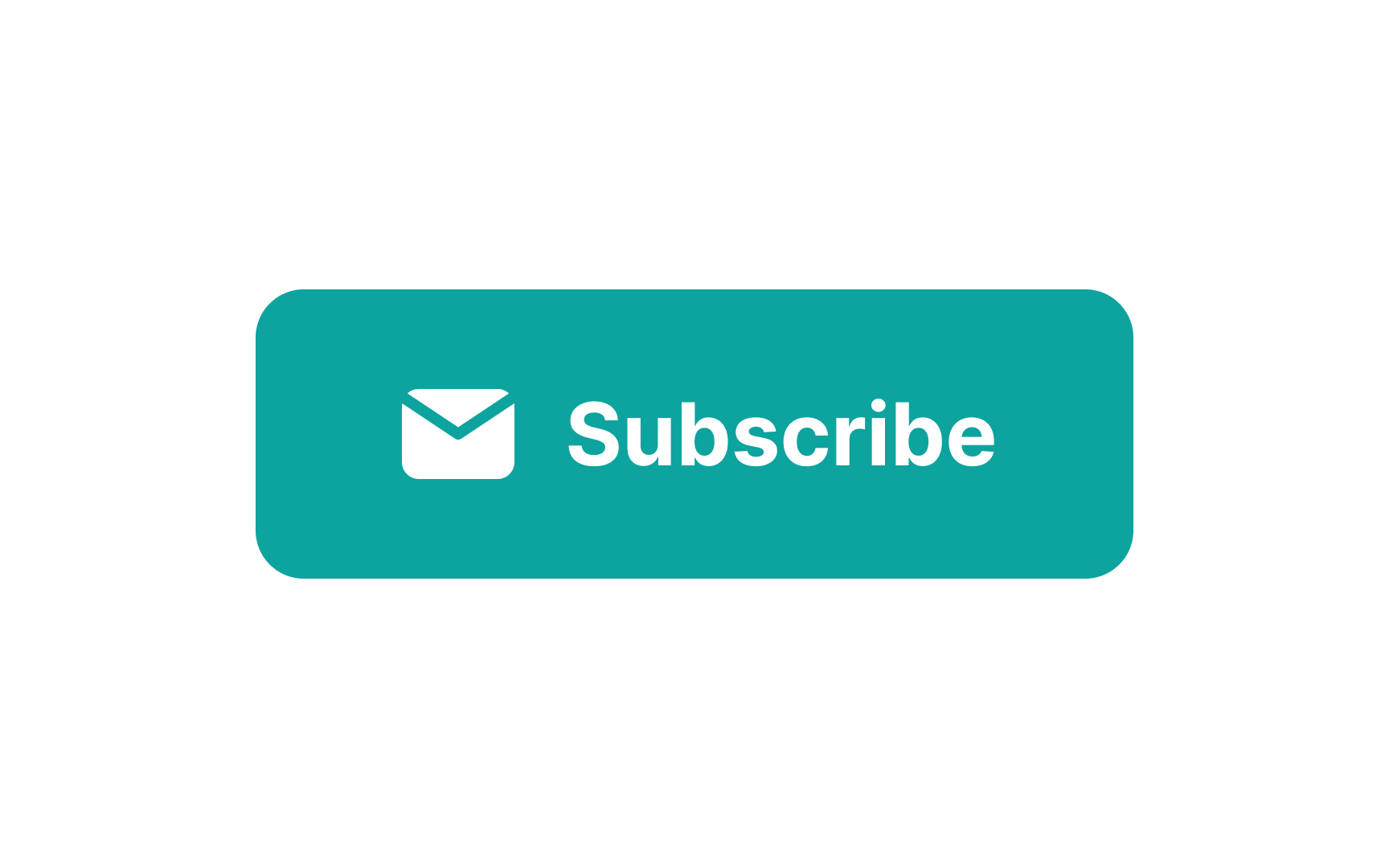
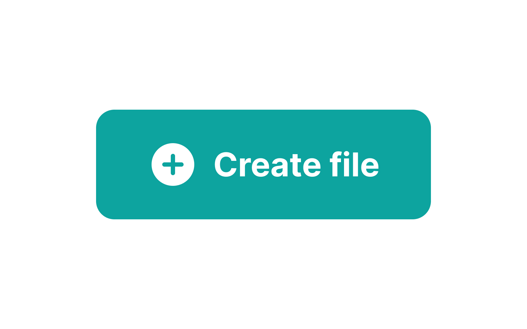
Universal icons — those that are instantly recognizable and used across digital products — are generally the best choice for common tasks such as returning to the home page or sending an email. Their immediate recognizability speeds up the user journey and requires less thought.

Accompany icons with labels for more clarity Bad Practice
Accompany icons with labels for more clarity Best Practice

Icons are great for saving space and adding a visual element to your design, but they can sometimes leave users guessing about their function. That's why pairing them with text labels is often a smart move.

Labels clarify the purpose of an icon, reducing ambiguity and enhancing user experience. Think about it: an icon of a floppy disk might not mean "save" to a younger audience. Labels make sure everyone's on the same page. Plus, adding text next to an icon boosts accessibility. Screen readers can articulate the label, offering a more inclusive experience for users with visual impairments.[2]

Maintain color consistency Bad Practice
Maintain color consistency Best Practice

While establishing the visual hierarchy of your buttons, you may come up with multiple color ideas. Remember, however, that the same color should be applied to button labels and icons for better scannability and legibility. Take time to find the right colors, and don't hesitate to seek feedback from users or colleagues.

Use contrasting label color Bad Practice
Use contrasting label color Best Practice

Selecting the right color for your button labels is more than just an aesthetic choice; it's also about accessibility and user experience. High contrast between the text and its background is crucial. It helps ensure that the text is readable, not just for users with perfect vision but also for those with visual impairments. The Web Content Accessibility Guidelines (WCAG) recommend a contrast ratio of at least 4.5:1 for normal text and 3:1 for large text.[3]

Fit a label into a single line Bad Practice
Fit a label into a single line Best Practice

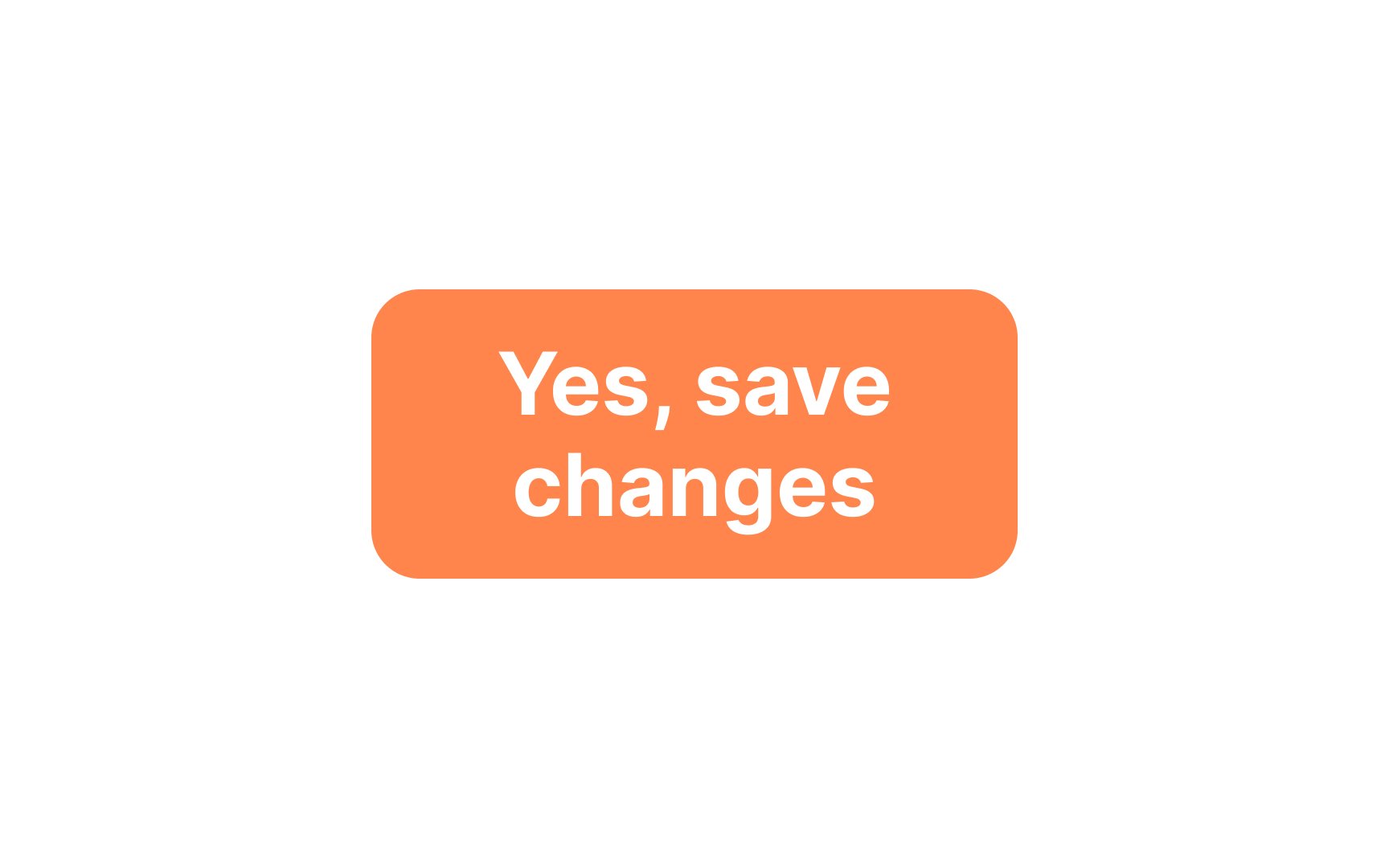
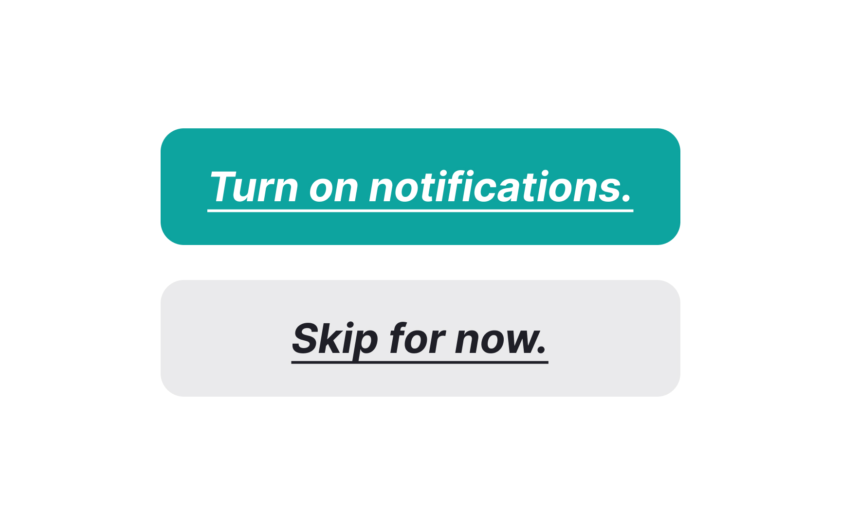
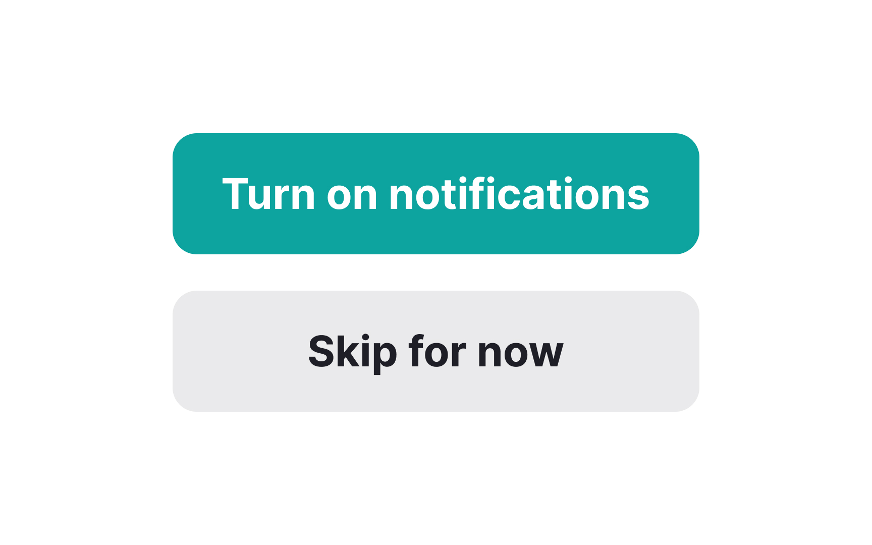
Breaking a button label into two lines usually creates confusion for users, making them more likely to choose the wrong action. To maintain user-friendly design, it's advisable to fit your button labels into a single line whenever possible.

However, exceptions do exist. For instance, some specialized call-to-action buttons may have secondary text situated above or below the main label. If you decide to take this approach, always remember to conduct A/B tests to gauge the button's effectiveness. Importantly, the primary action the button serves should remain clear and confined to a single line for the sake of readability.[4]

Center a label within a button Bad Practice
Center a label within a button Best Practice

Label alignment within buttons is a crucial detail that can significantly influence user interaction. By centering the label both horizontally and vertically within the button, you create a balanced visual focal point. This symmetry not only enhances the button's aesthetic appeal but also makes it easier for users to identify and interact with the button quickly.

Pro Tip! If your button contains a label and an icon, align them as though they are one element.

Simplify label style Bad Practice
Simplify label style Best Practice

When it comes to button labels, less is often more. Italics, underlining, and other additional formatting should be avoided. Even punctuation marks like exclamation points or periods at the end of a label should be skipped, as they can create visual clutter.

Instead, consider using a heavier text weight than your body copy to make the label stand out. The goal is to make the label's message as clear and straightforward as possible, minimizing the chance of confusing users. Keep the styling simple and the message clear, and you'll create buttons that users find easy to interact with.

Cut off unnecessary words Bad Practice
Cut off unnecessary words Best Practice

When crafting microcopy for buttons, clarity and brevity go a long way. Users typically scan rather than read, and UI elements often come with space limitations. This means every word on your button should be essential.

Here are some go-to tips for choosing the right words:

  • Use verbs: Words like "Buy," "Submit," or "Download" make it clear what action will occur.
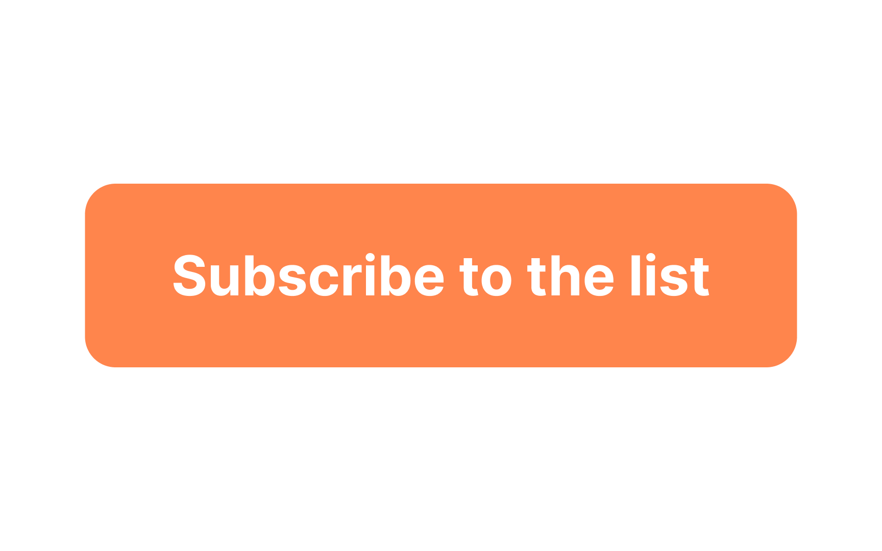
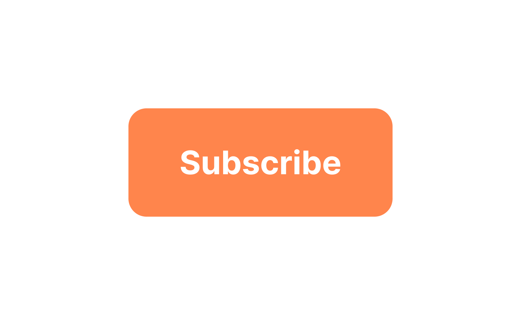
  • Be specific: Instead of vague labels like "Go" or "Send," use "Search" or "Subscribe" to provide more context.
  • Keep it short: Limit the label to two to three words to ensure it's scannable and fits well within the button.

Pro Tip! It’s okay to ignore some grammar rules — like leaving out articles or prepositions — in favor of better UX as long as the meaning is still clear.

Complete the lesson quiz and track your learning progress.
Start
<?xml version="1.0" encoding="utf-8"?>