Writing Action-Based Messages
Learns the dos and don'ts of writing messages encouraging users to take action
The main goal of UX microcopy is to guide users to take action. Users don't visit your app or website to admire the wording — they come to complete tasks like ordering food, buying clothes, or booking a flight.
Action-based microcopy plays a crucial role in conversions and product success. Sadly, many companies overlook the power of well-crafted microcopy. As a result, users face unclear or confusing text, which leads to frustration, increased mental effort, and, ultimately, abandonment.
Writing action-based copy that meets user needs and highlights benefits helps build lasting relationships with your audience, rather than assuming you know their thoughts, behaviors, or language preferences.
The main focus of action-based copy is clarity. Your copy can sound witty, easy-going, and casual, but never at the expense of clarity. After all, concise and straightforward labels will benefit all users, including those with cognitive impairments, older adults, and international users.
You can call your copy clear when:
- The copy uses plain language and is profoundly contextual, so users don't need to think twice before pressing a button or clicking a link.
- The sentences are short and snappy with not more than 5-8 words per sentence.
- The text is stripped of word clusters (for example, "with regards to," "in terms of," "by means of," etc.), idioms, slang, technical jargon, abbreviations, double negatives, and culturally-specific references.
Pro Tip: Reading the copy aloud or asking others to read it helps check if the copy makes sense.

There's an ongoing debate about active versus passive voice and their effects on readers. Critics of passive voice say it sounds unnatural and hides who’s performing the action, leading to confusion. However, native English speakers often use passive voice, and it’s useful for emphasizing the action or when describing system processes.
That said, active voice is ideal for
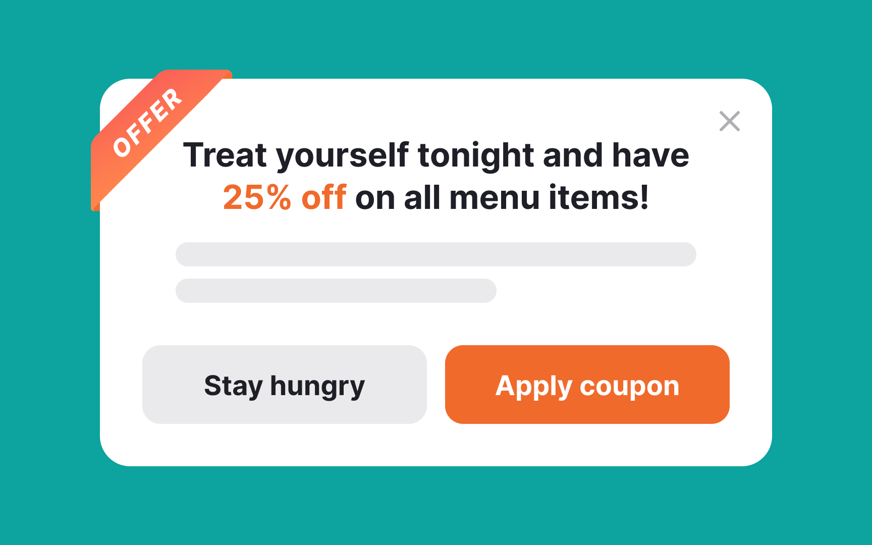
To improve UX copy around CTAs:
- Use humor, share facts, or show empathy to boost engagement.
- Reassure users by highlighting data protection or money-back guarantees.
- Clarify why you need certain information, like asking for a phone number for a taxi service to contact the user when necessary.


CTA
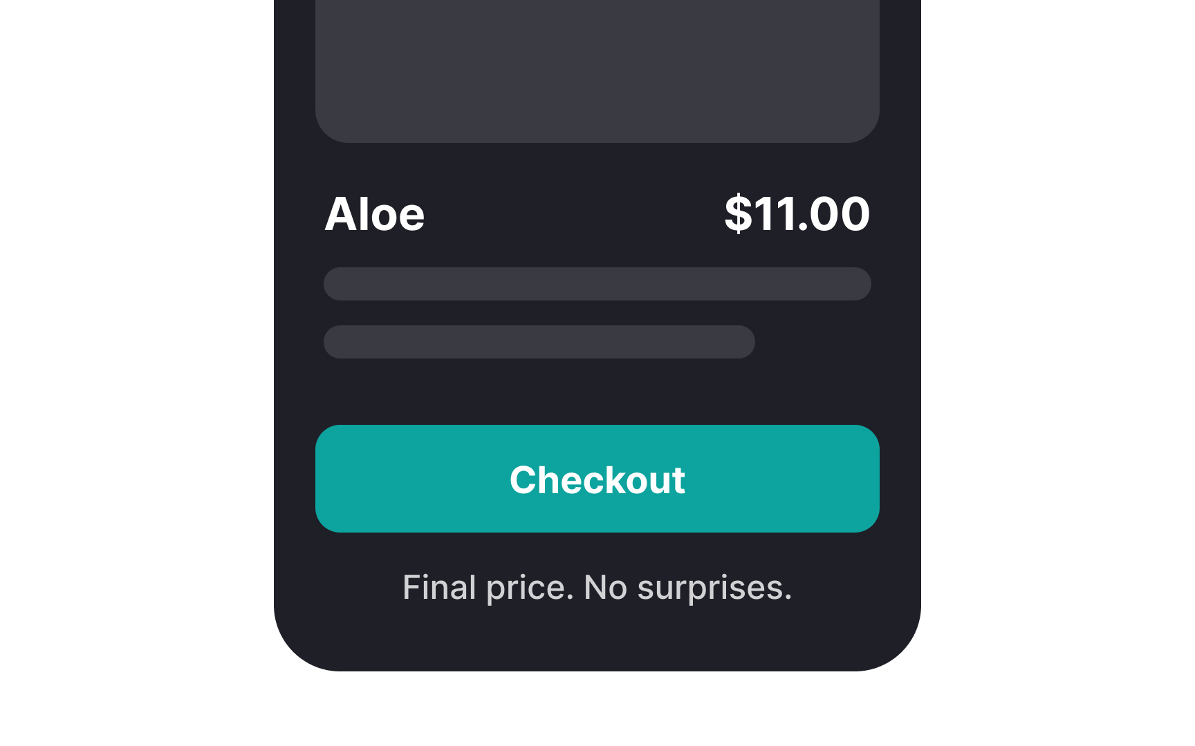
However, on pages like checkout or payment, simplicity is key. Clear labels like "Confirm payment," "Place order," or "Submit purchase" ease concerns about spending money or making errors.
The best practice for CTA copy is to focus on user needs and expectations. Avoid overly creative labels that might confuse users. For instance, "Let's start the adventure" for cloud storage plans feels vague, while "Find a plan for you" is much clearer.

Shopping can be both fun and stressful, and surprisingly, only 1-3% of e-commerce visitors make a purchase. One major reason for low conversion rates is a lack of trust. It's crucial for content marketers and
Since shopping involves sharing sensitive information like credit card details, people hesitate unless they feel safe. Words like "Secure" or "Your privacy is important to us," along with clear privacy policies, help reassure customers. Additionally, allowing users to make purchases without
Using social proof and security features also helps. Notifying users of how many others are viewing a product or how many items are left in stock can create a sense of urgency, leveraging the scarcity principle.[2] Customer reviews are another source of social approval. Motivate users to leave reviews after they buy products and display this feedback on the product
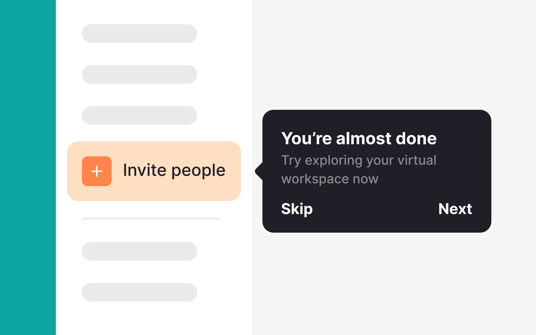
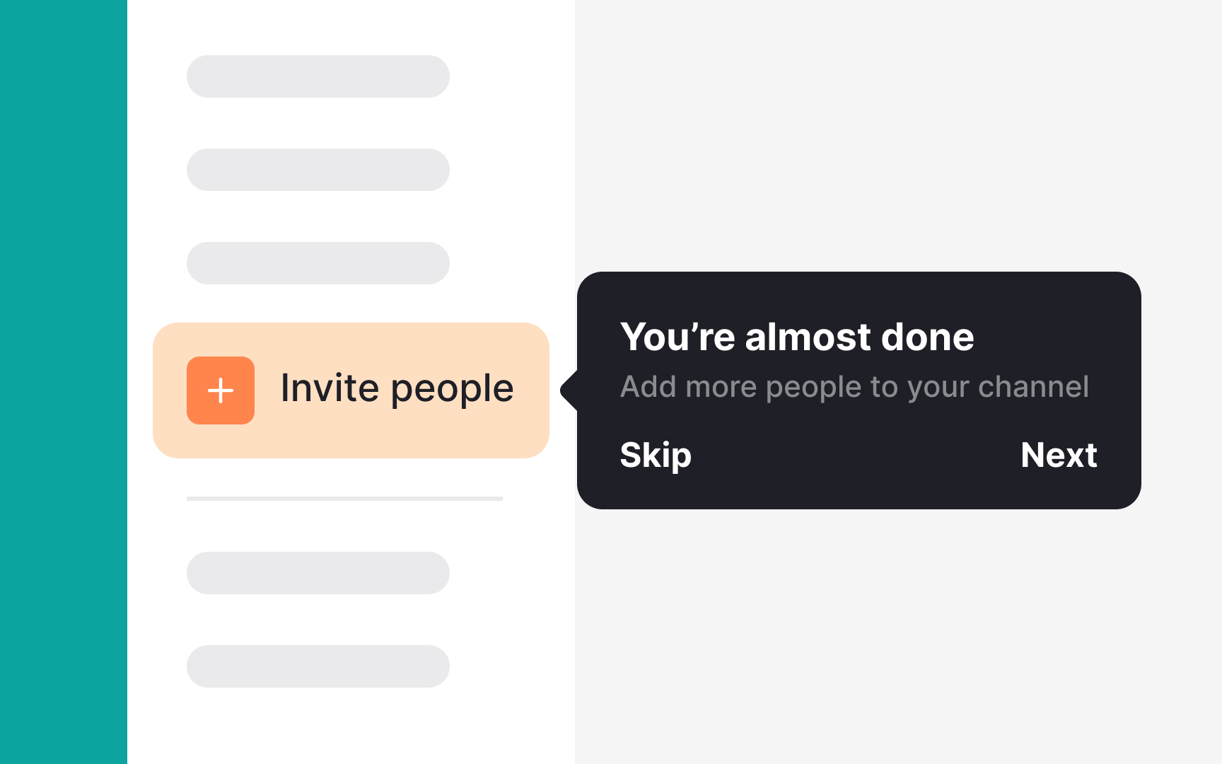
A common misconception is that onboarding happens only during the first interaction. In reality, it can occur at different stages, such as during sign-up, post-registration with a welcome tour, or when new features are introduced. The main goal of onboarding is to guide users through the interface or feature, encouraging ongoing engagement. While intuitive design is important, onboarding helps boost retention, especially since 20% of mobile apps are ignored or uninstalled after the first use.[3]
Identify users' primary goals and avoid distractions with unnecessary features. Consider these questions:
- What value do users gain from the product or feature?
- What steps should they take to achieve that value?
- What potential challenges might they face?
- How familiar are new and existing users with similar features?
Pro Tip: Teach users by doing. For example, a taxi app can guide users to select a destination, order a taxi, and even cancel it to learn the process firsthand.

Start by listing the key features that impact user
If your product targets a global audience, choose a tone that appeals to all groups. Here are a few simple rules for a great brand voice:
- Use a conversational tone. Avoid boring or jargon-filled text. Listen to how users talk about your product and match that language.
- Be concise. Keep onboarding text short, aiming for 5-8 words per sentence and 1-3 sentences per tip.
- Be respectful. Always use language that respects people of all races, religions, genders, and backgrounds, regardless of your brand's voice.

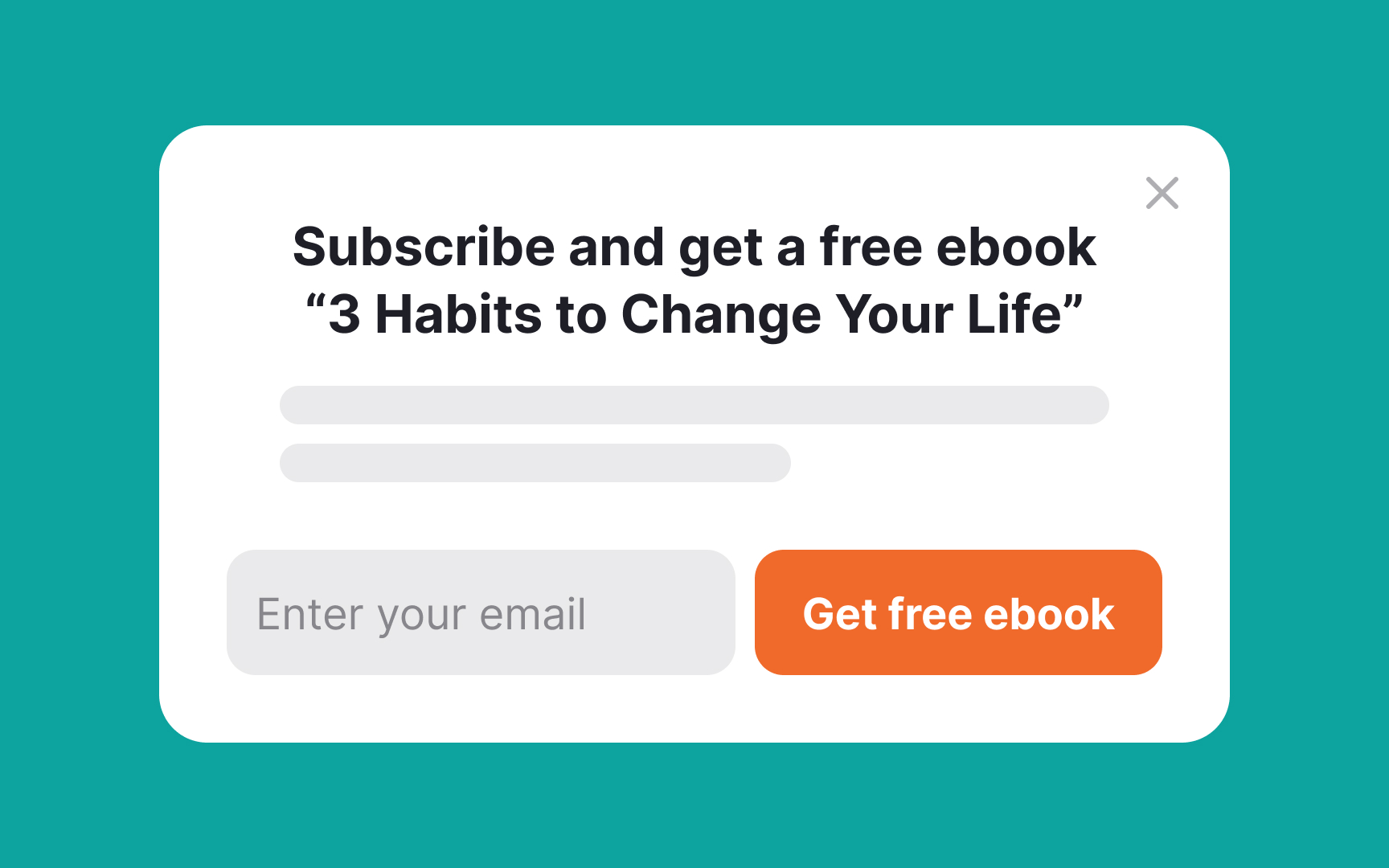
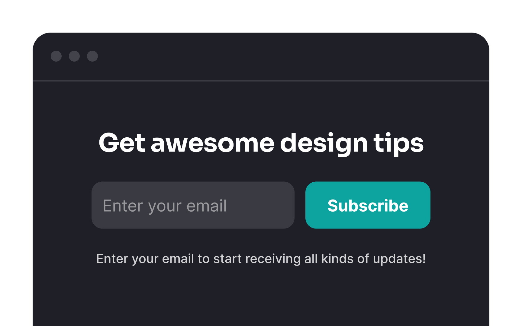
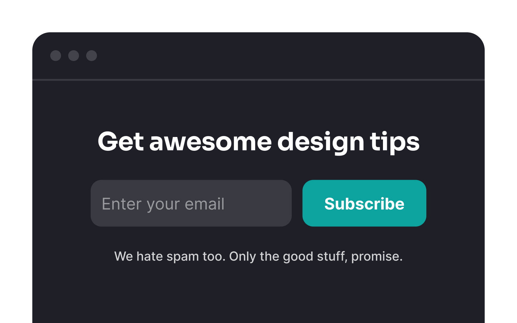
Pop-ups can be modal, blocking
If pop-ups are necessary, follow these
- Ensure relevance. Avoid interrupting users in the middle of a task. Wait until the pop-up
content is contextually relevant. For example,onboarding tooltips work better after users have had time to explore the interface. - Be polite and highlight benefits. Since users dislike pop-ups, make them respectful and clearly explain the benefits. For example, when asking for an email, specify what users will gain by subscribing.
- Add a playful tone. Pop-ups are less irritating when they include a friendly, personal touch or a lighthearted joke. This is especially useful for cookie notifications or feedback requests.
- Offer an easy exit. Always provide clear and easy ways to close the pop-up, reducing frustration.
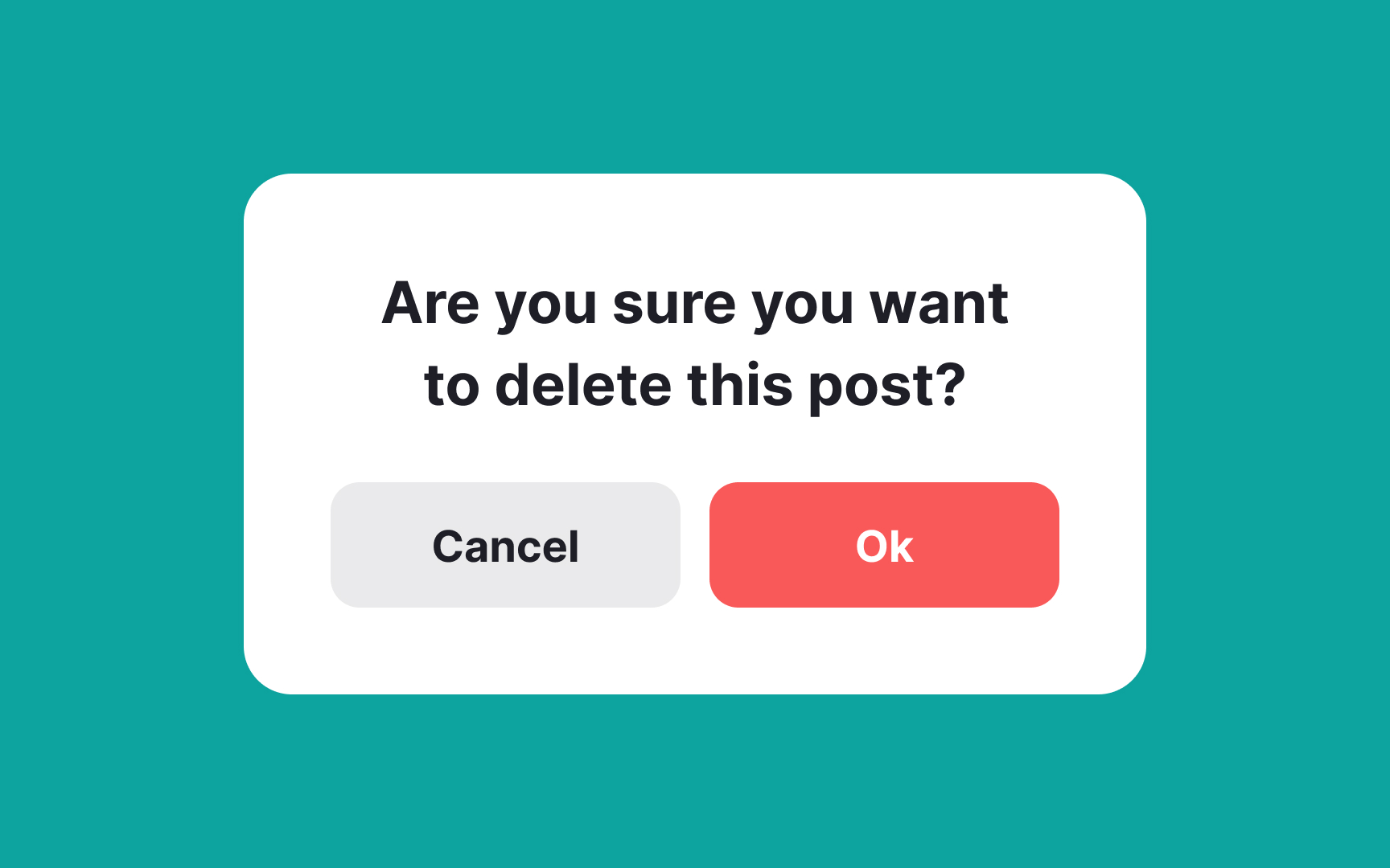
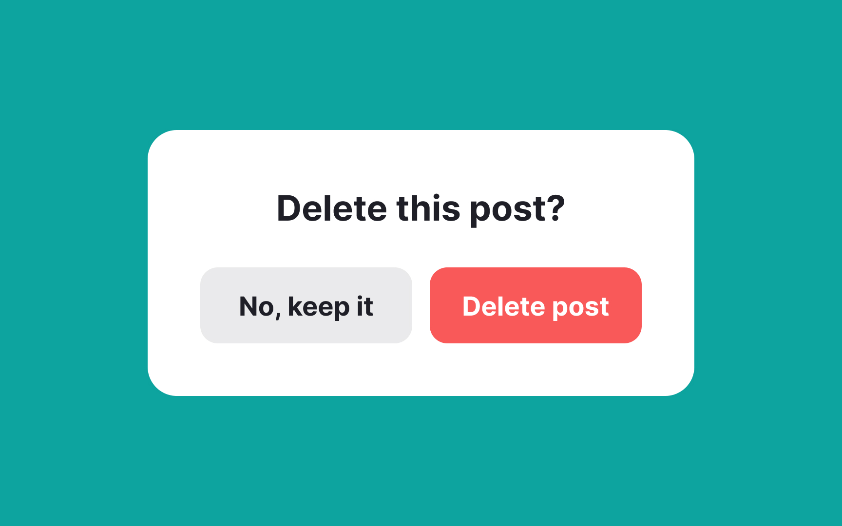
When writing for destructive actions like account deletion or subscription cancellation, word choice is crucial to avoid turning a simple task into a frustrating experience. Typically, a confirmation popup has two
Here are some tips to avoid confusion:
- Use a clear and contextual title. Match the popup title with the primary button label. If the title says "Cancel subscription?" the primary button should say "Cancel subscription" as well. Avoid using "Cancel" for the secondary button, as it can confuse users about what exactly is being canceled.
- Experiment with wording. Eliminate doubts by making the choices explicit. You can use "Yes, cancel" and "No, don't cancel" or avoid negations altogether by using "Keep subscription" vs. "Cancel subscription." This reduces ambiguity and makes the options clear.
- Avoid generic labels. Buttons like "Cancel" and "OK" paired with vague titles like "Are you sure..." add unnecessary confusion. Be specific to reduce cognitive load and help users make decisions confidently.

Copy is a powerful tool that can persuade people to do things they never planned to. Here are some ways dark patterns misuse words:
- Triggering emotions: Words like "sad," "unfortunate," "despair," or "helpless" can subconsciously evoke these emotions. When users feel down, they may act impulsively to seek relief, making them vulnerable to manipulation.
- Confirmshaming: This tactic uses guilt, anxiety, or fear of missing out to keep users from unsubscribing or deleting accounts. It makes them feel uncomfortable or ashamed for wanting to opt out.
- Confusing language: Techniques like double negatives ("Cancel Unsubscribe"), passive voice, and generic phrases ("Click here," "OK," "Yes," "No") increase
cognitive load and lead users to make mistakes, likesigning up for services they didn’t want.
As a
References
Top contributors


Topics
From Course

Share


Similar lessons

Intro to UX Copy

What is UX Writing?
