Writing Problem Messages
Discover ways to write error messages that are helpful and not frustrating to users
User interfaces can run into issues from time to time. Links might break, credentials may be rejected, or pages could become unresponsive — the possibilities are endless. The good news is that most errors can be prevented, or at least their impact minimized, saving your product and brand image from serious damage. Think of error messages as superheroes — they can come to the rescue when things go wrong. If written well, they can ease frustration and keep users calm.
According to the Nielsen Norman Group, effective error messages should be clear, concise, polite, precise, constructive, and human.[1]
From the moment a user lands on your product to the last step where they subscribe, enroll, or check out, there are a whole lot of things that can go unexpectedly. For instance,
Sure, error messages can be of great help in guiding users to the next step after an error occurs, but what if these
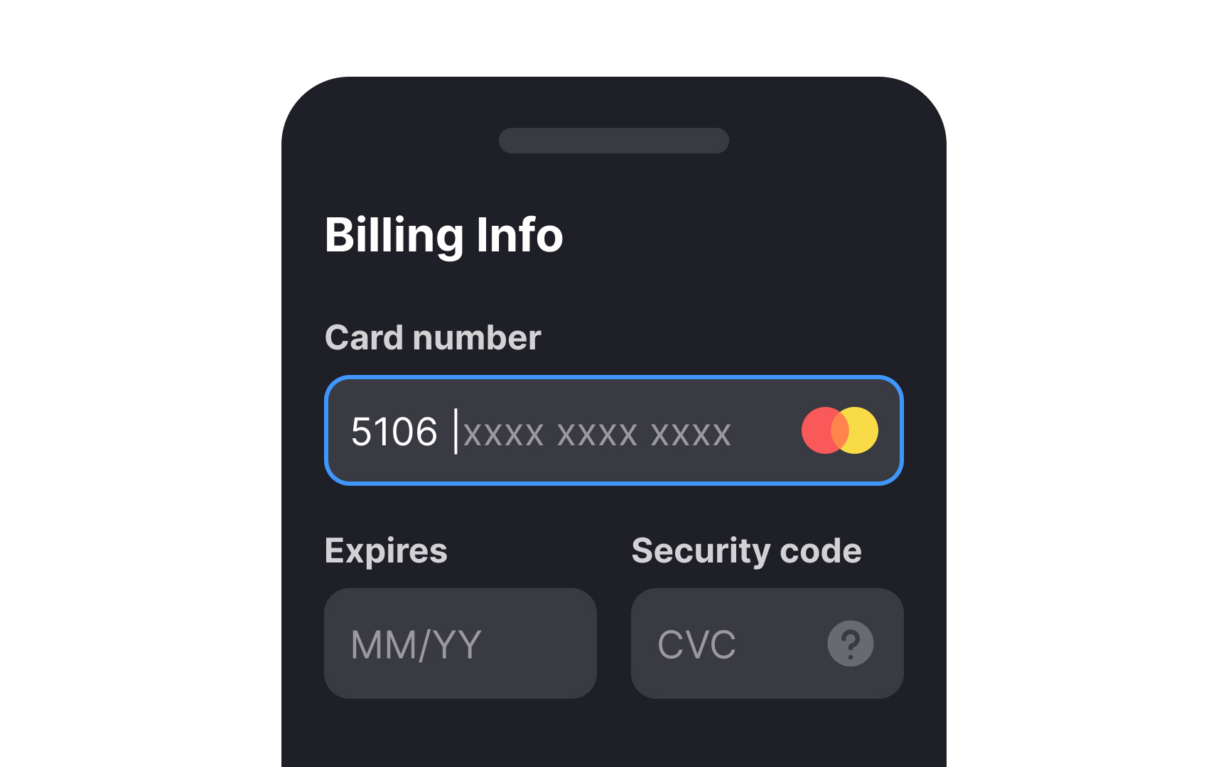
Before moving on to writing good error message copy, the focus should be on writing helpful microcopy in the form of hints, labels, and tooltips that prevent these errors from occurring. For instance, if you know that users are prone to mistyping the expiry dates on their cards, offering a clear MM/YY placeholder text can help clear up any confusion.
Pro Tip: What error messages are most triggered on your site or app? Finding out can help you amend the microcopy in this area to make it clear and less likely to elicit user errors.
Pro Tip: While writing an error message, ask yourself, "What information would I most urgently need as a user to rectify this situation?"
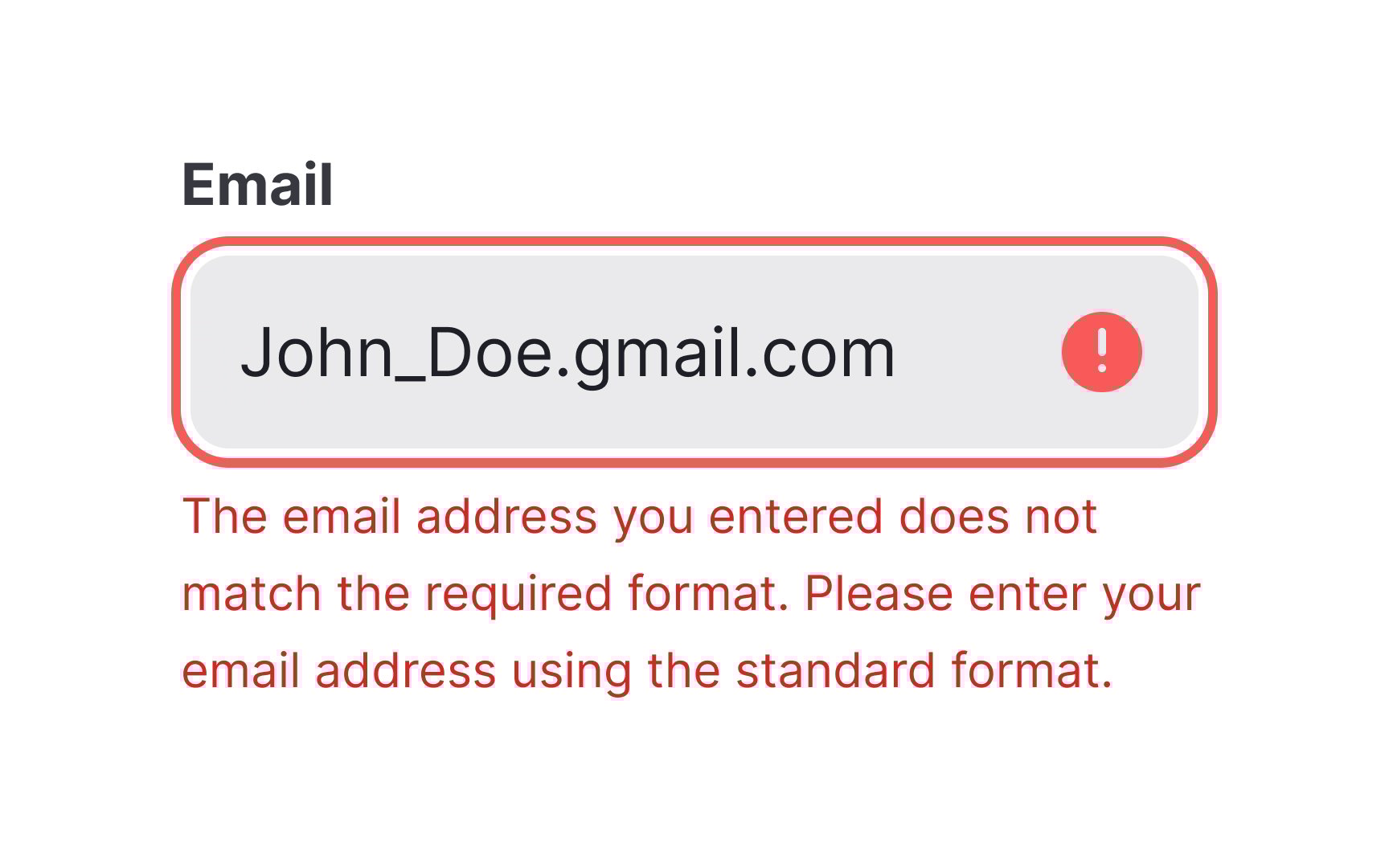
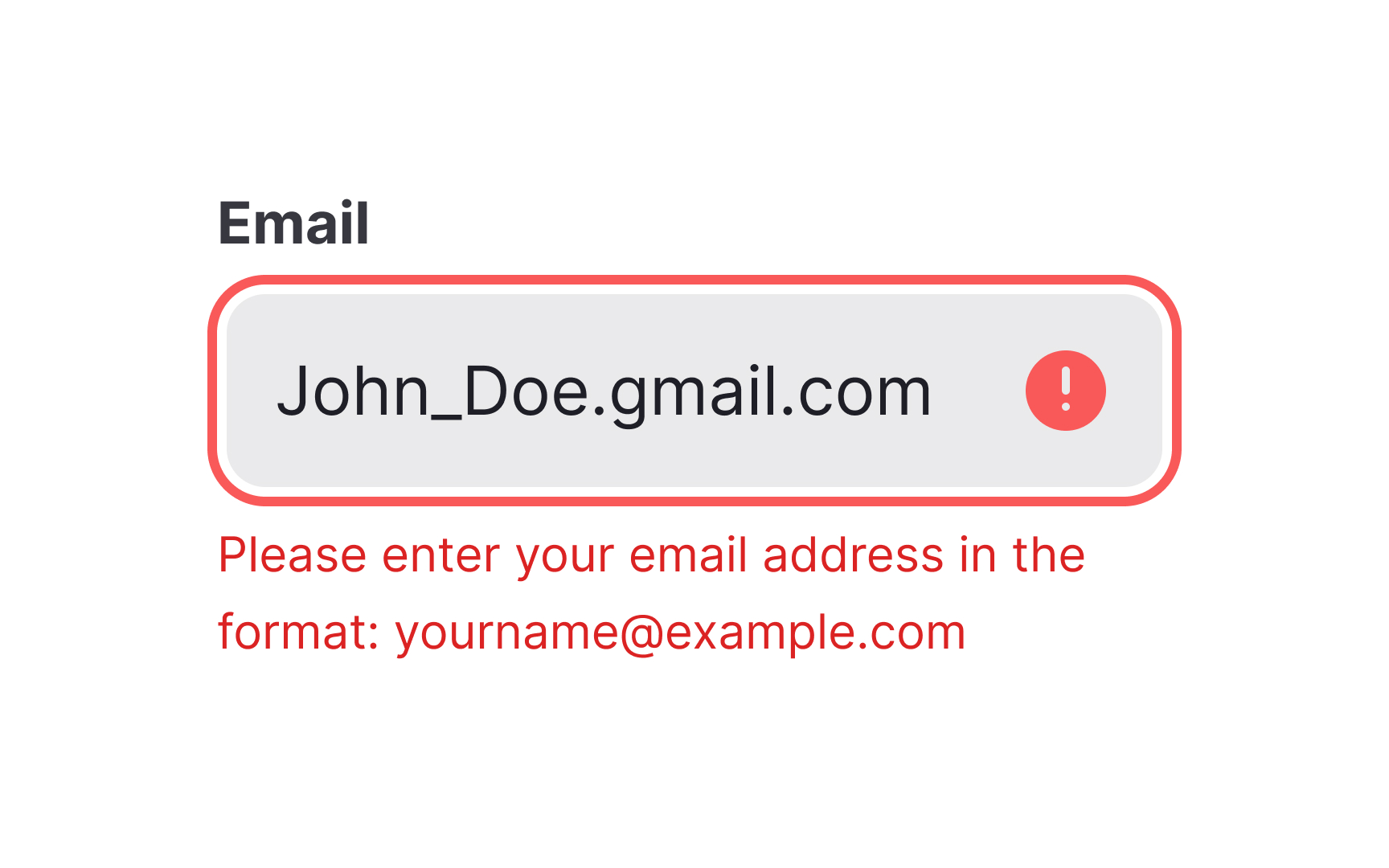
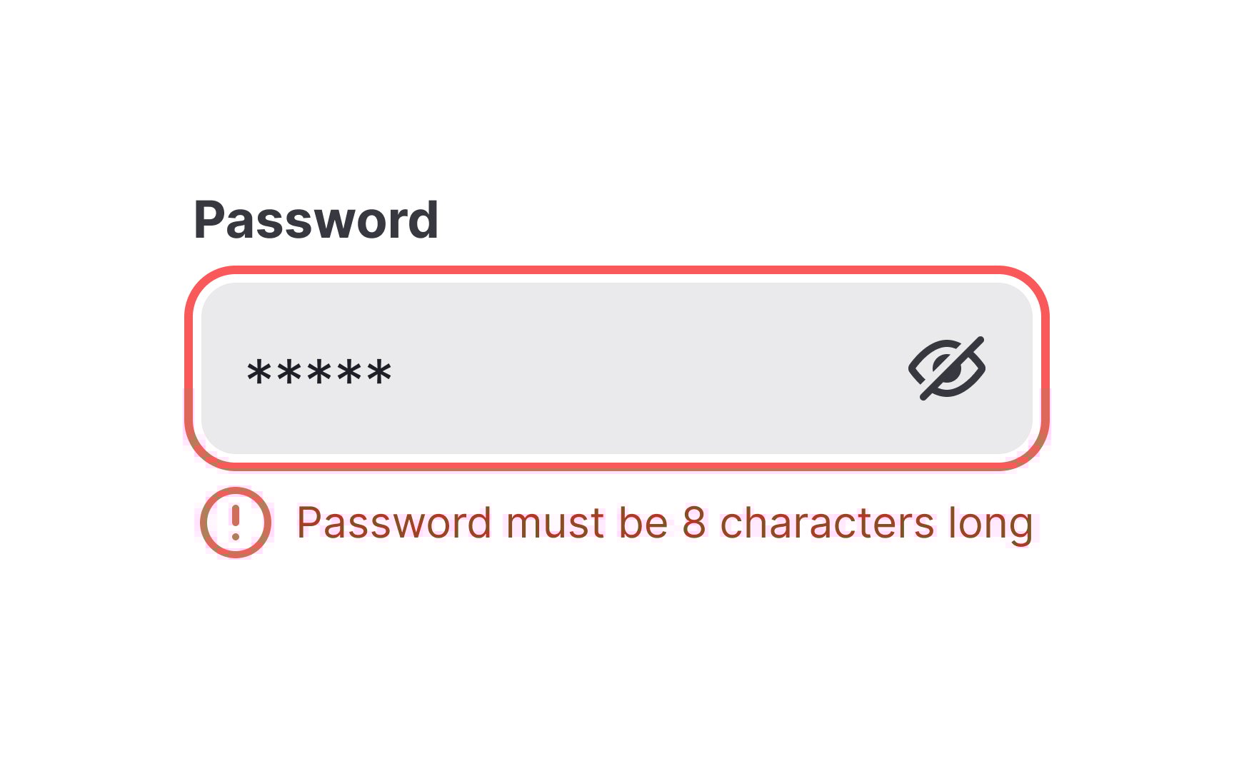
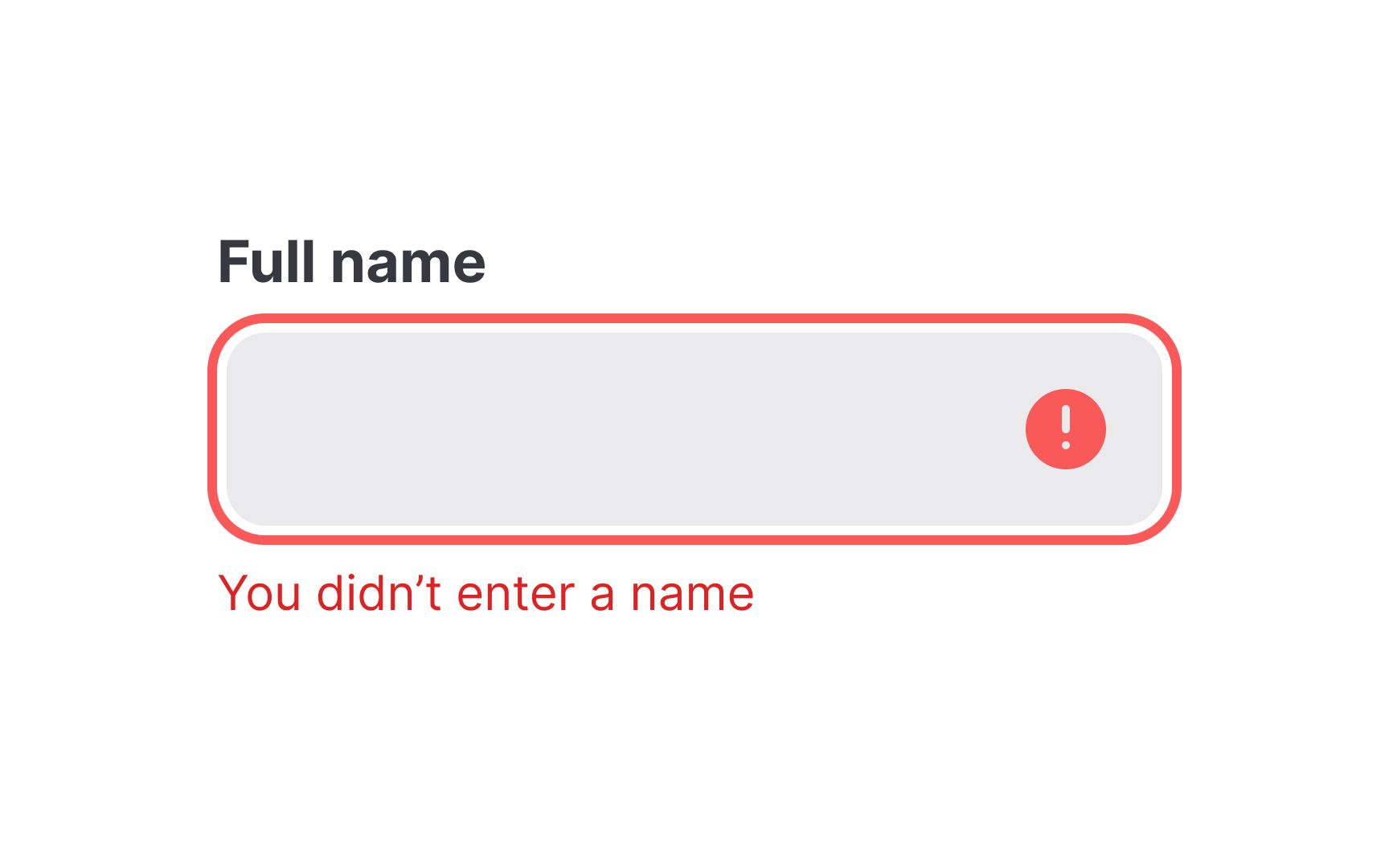
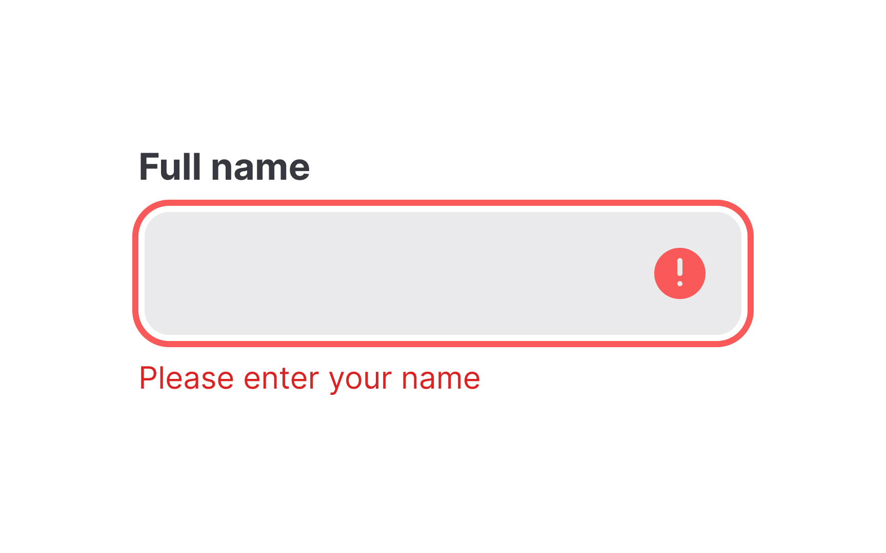
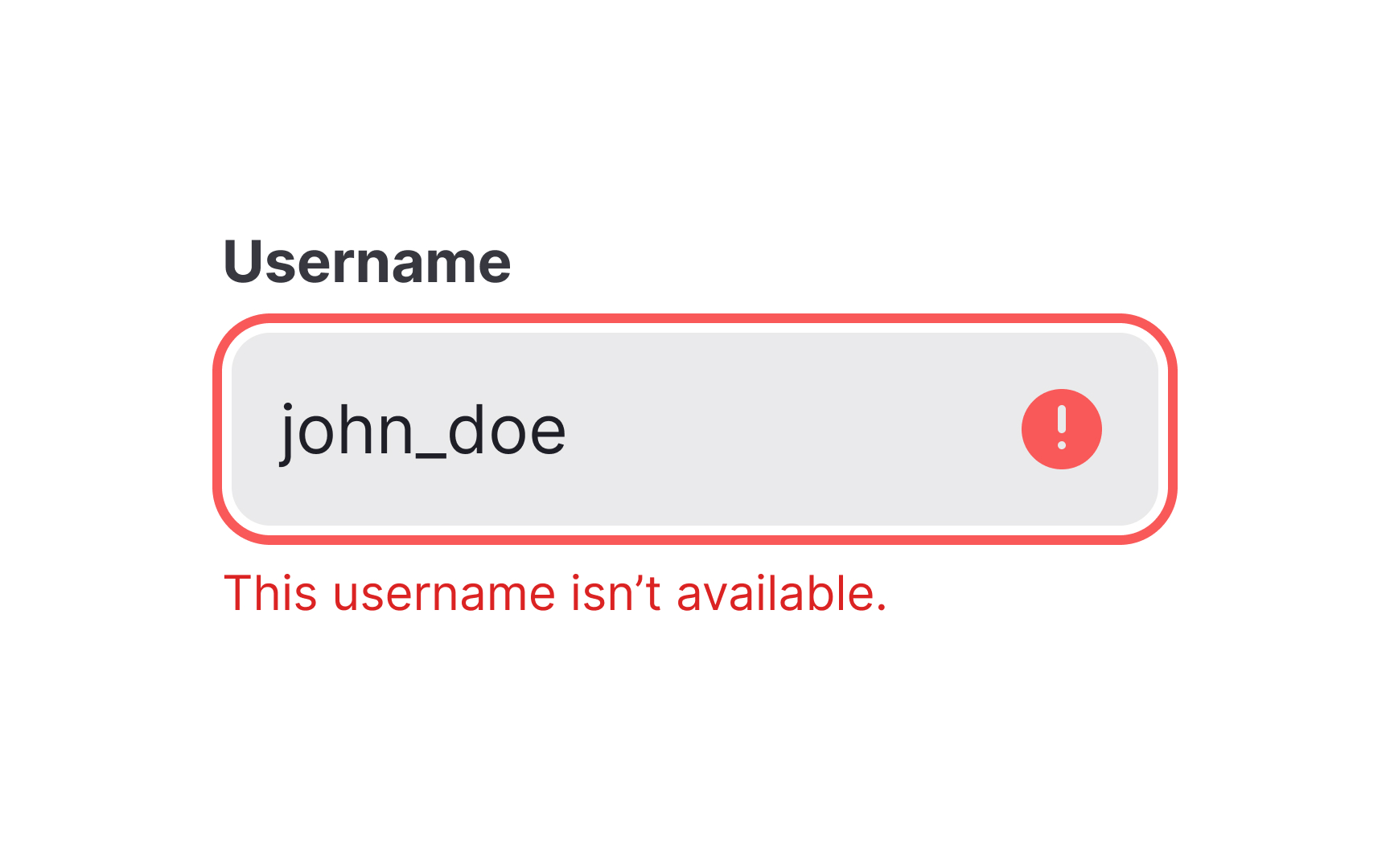
A clear and concise error message is one that:
- Uses as few words as possible while making sure that the meaning of the message is intact
- Is easy to understand at a glance
- Does not use technical jargon or high-level language
- Tells the user what to do next
Keeping it short and explicit achieves the dual objective of grabbing your users’ attention while adopting a tone that is not domineering or high-handed.
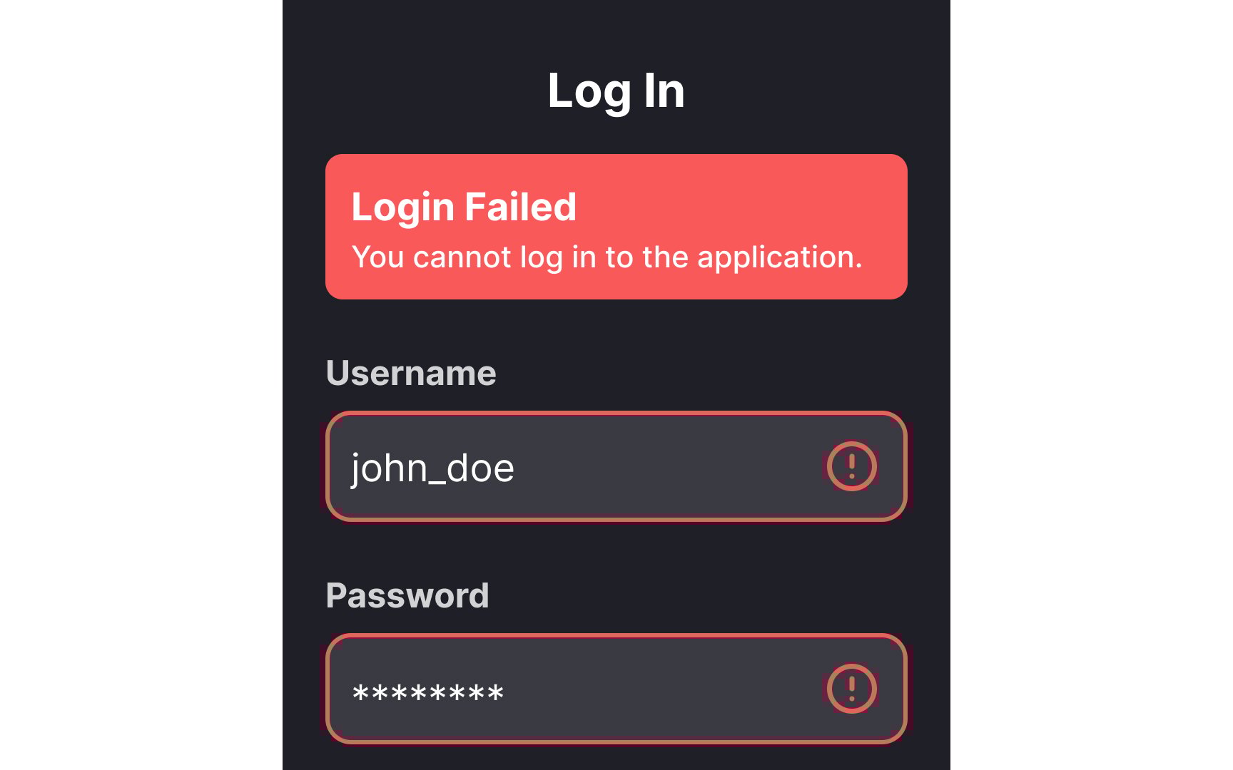
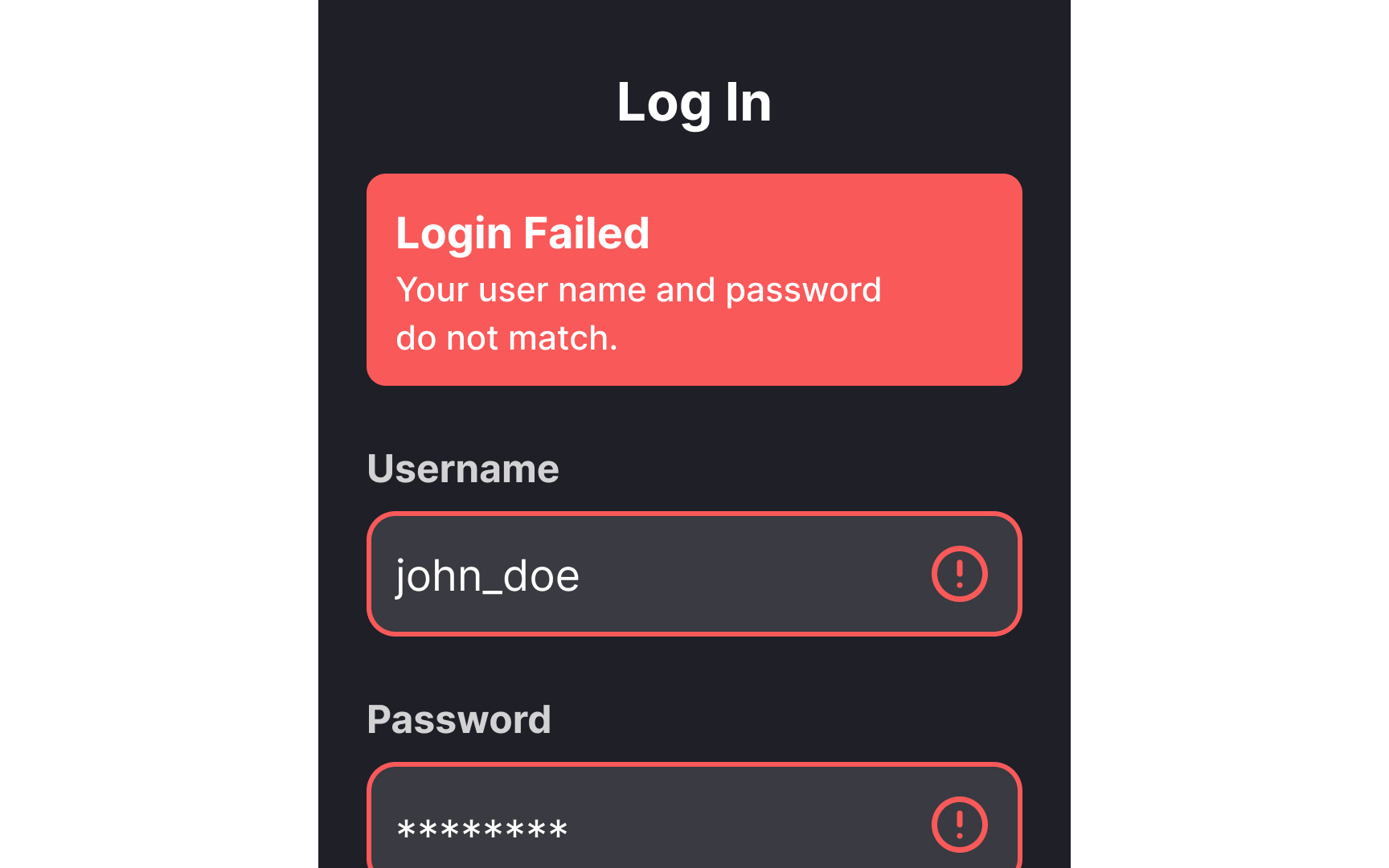
Any form that waits until after a user clicks on the Submit button to point out any
Keep these general guidelines in mind when opting for inline validation:
Pro Tip: You do not have to use inline validation for every question and input field — just select the ones that users most commonly mistype, get wrong, or struggle with, such as e-mail addresses, passwords, or usernames.
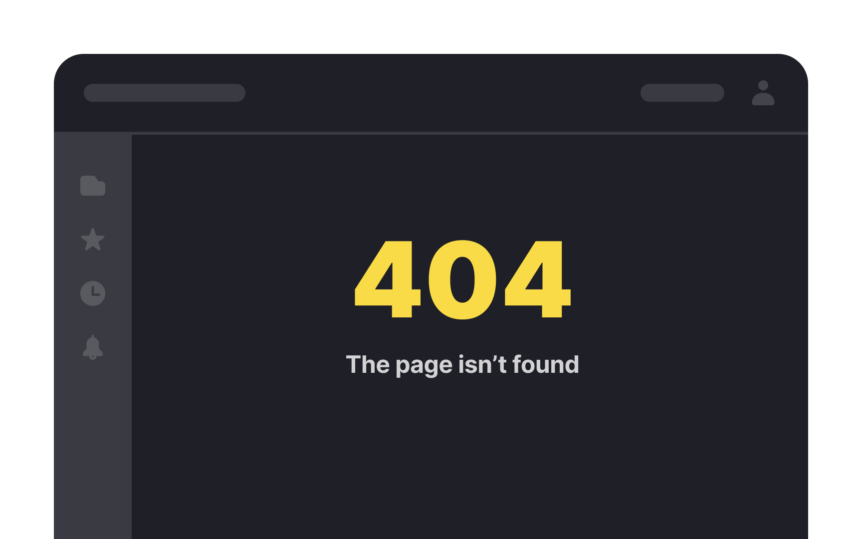
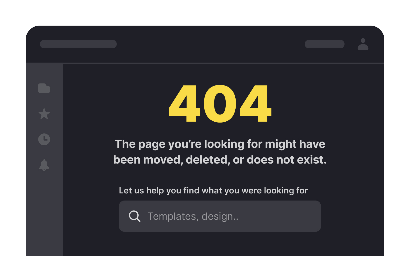
According to the principles of gamification, users always want to feel like they’re making progress.[4] A 404
You can make 404 error pages useful by:
- Designing a customized error page for your product that is in line with the rest of your pages and elements in terms of design,
color ,brand voice, and tone. - Using a simple, apologetic tone to explain that the page could not be found and why. You can do this by going through your log files to find the most commonly mistyped URLs and offering them as a hyperlinked list below the apologetic error message. Or, you could perform a spell check and show any relevant pages that do exist.
- Providing a search box so that users can find what they were looking for in the first place without having to get the exact URL right.[5]
The internet is expansive and there are likely a thousand products out there that your user could choose instead of yours. So what sets you apart? Ideally, the
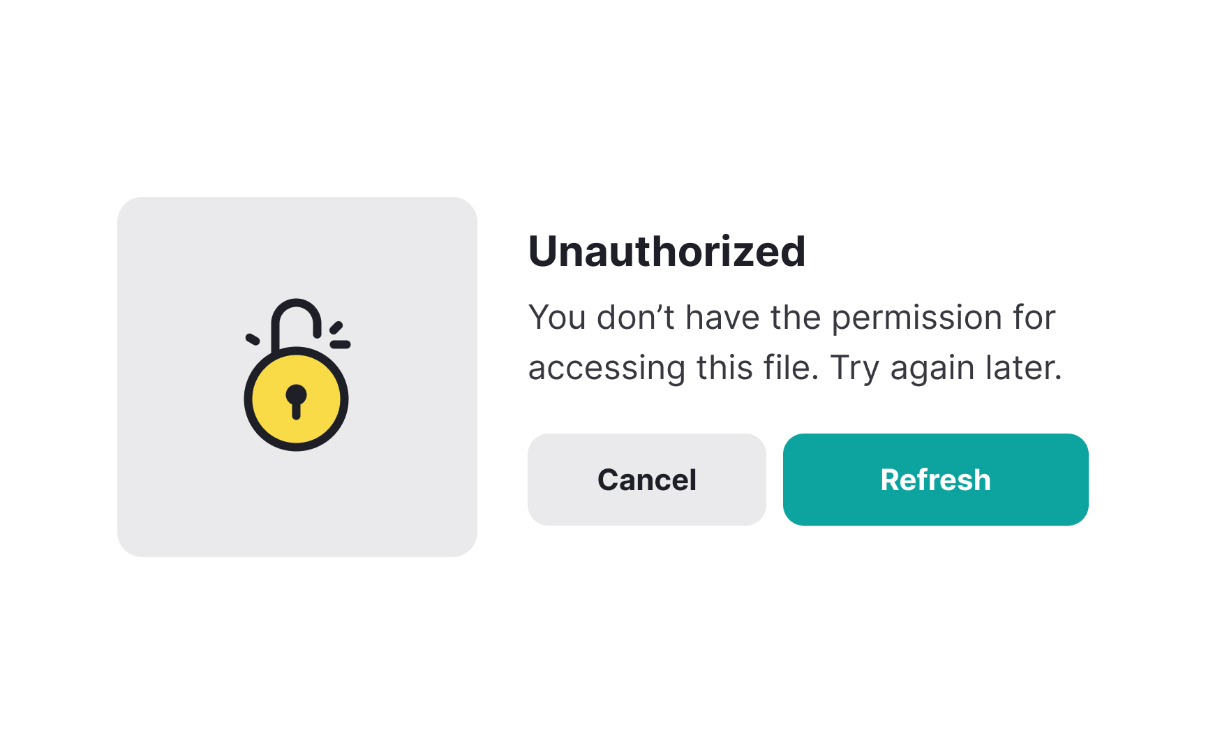
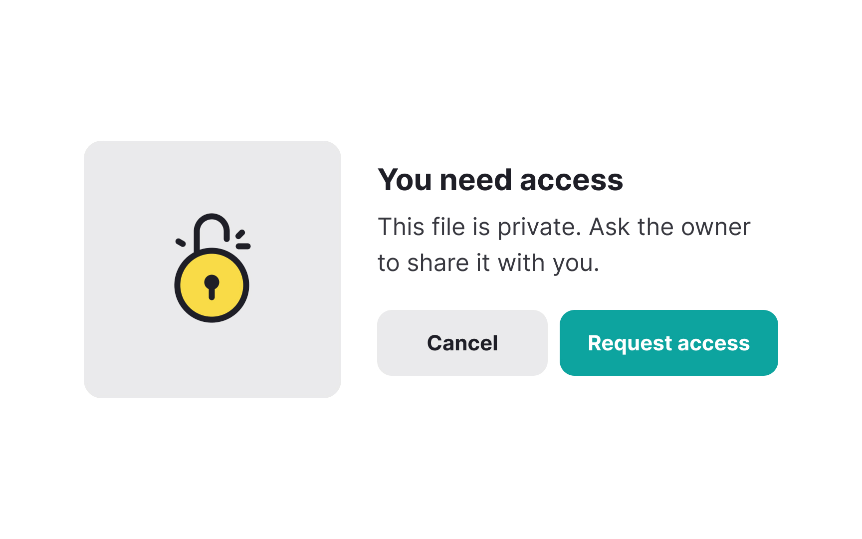
Taking a condescending or dogmatic tone in your error messages is a surefire way to lose users left and right. Instead, try to politely explain what went wrong and what they can do to fix it without making them feel stupid. This way, even if they’ve made a mistake, they’re less likely to feel bad about it. They’ll stick around because you’ve given them a solution in a warm and friendly way.
An
Using human language, on the other hand, allows you to connect with your users and makes them feel secure and supported throughout their journey.
Pro Tip: A good way to check if your error message sounds human is by reading it out loud and checking if it sounds natural and conversational.
USING ALL CAPS IS THE VIRTUAL EQUIVALENT OF SCREAMING AT PEOPLE! It isn’t just rude and aggressive, but it also makes reading difficult for your users. By using all caps, you’re reducing the shape contrast of your text, making it less likely that users take note of and read the information that you’re trying to highlight. For this reason, using all caps can negatively impact accessibility for users with visual impairments or reading difficulties, like dyslexia. Research also shows that reading speed is reduced by 13-20 percent when the text is in all caps.[6]
Using all caps is only acceptable when reading is minimal and not too lengthy, such as in the case of logos and headlines.
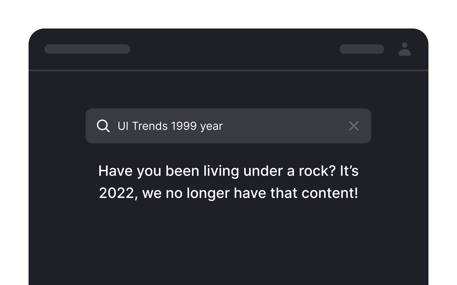
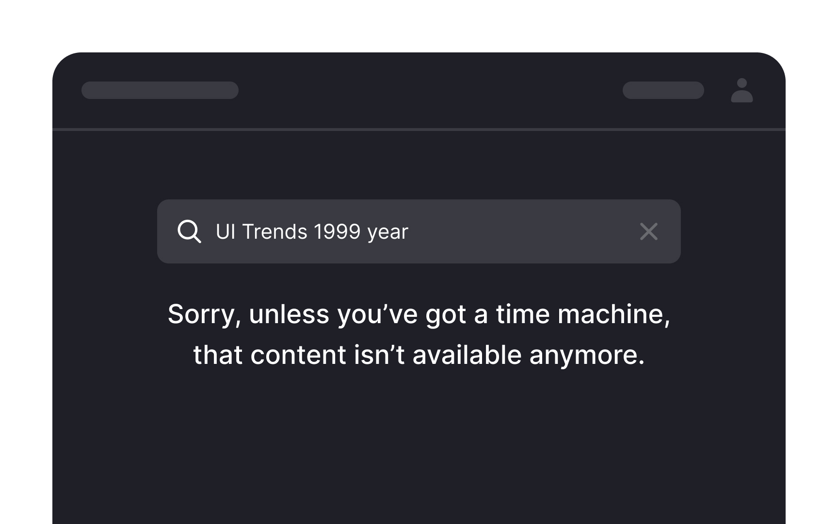
Humor is a tricky tool to use in
The line between being funny and offensive is thin, but it can be identified by simply treating your users with respect. Do not mock them or call them out on their mistakes unnecessarily. Also be sure not to offend any racial, religious, or cultural sentiments. And if you’re not sure if a joke will land with your audience, it’s best to not use it at all.
References
- Error Message Guidelines | Nielsen Norman Group
- Error Message Guidelines | Nielsen Norman Group
- Form validation best practices | Medium
- Improving the Dreaded 404 Error Message | Nielsen Norman Group
- All Caps on UI: Good or Bad? | Medium
Top contributors


Topics
From Course

Share


Similar lessons

Intro to UX Copy

What is UX Writing?
