User Engagement Through UX Writing
Discover simple methods and tools to make UX writing engaging
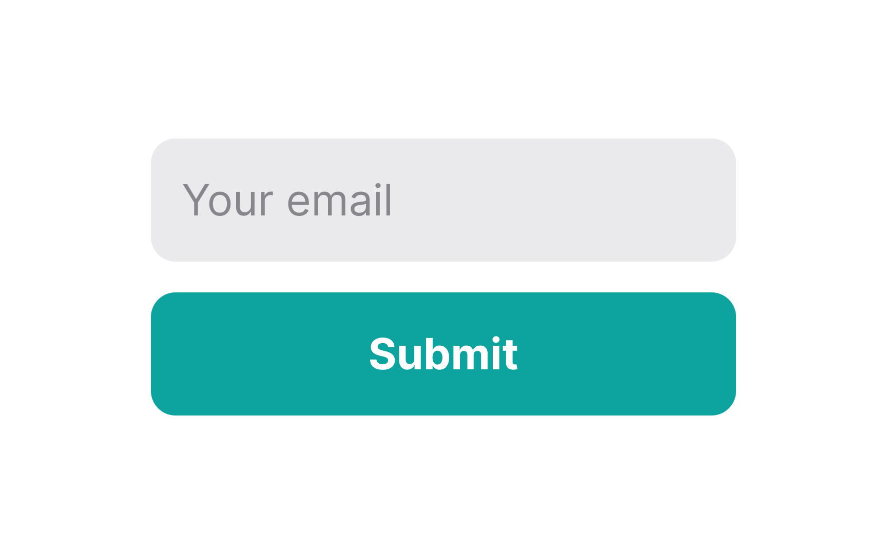
User engagement is a key indicator of product success, showing how well users interact with your interface. Metrics like page views, time on page, bounce rate, exit pages, pages per session, scroll depth, and unique visitors help assess whether the content delivers value. Strong UX writing, paired with calls-to-action, visuals, gamification, and other techniques, guides users and encourages task completion.
However, good UX writing alone isn’t enough. Usability and functionality improvements are essential for keeping users happy and preventing drop-offs. Together, these elements drive user retention, loyalty, and recommendations.
With intense competition among digital products,
- Research your target audience. Explore forums where users discuss similar products or conduct interviews to understand their preferences. Adjust your product’s tone and voice to match their expectations — whether they prefer a friendly, conversational style or a more professional one.
- Use human language. When writing
UX copy , keep it simple and clear. Avoid slang, technical jargon, or academic terms that could confuse users. Instead, use straightforward language that guides them naturally. Clear, easy-to-readcontent is far more effective than flashy words. Studies show even experts prefer simple, understandable text.[1]
Pro Tip: Your voice and tone may be official and restrained but avoid being robotic or using negation phrases like "don't" too often. It's okay to slip in a joke here and there if you're confident it won't distract or repel your users.

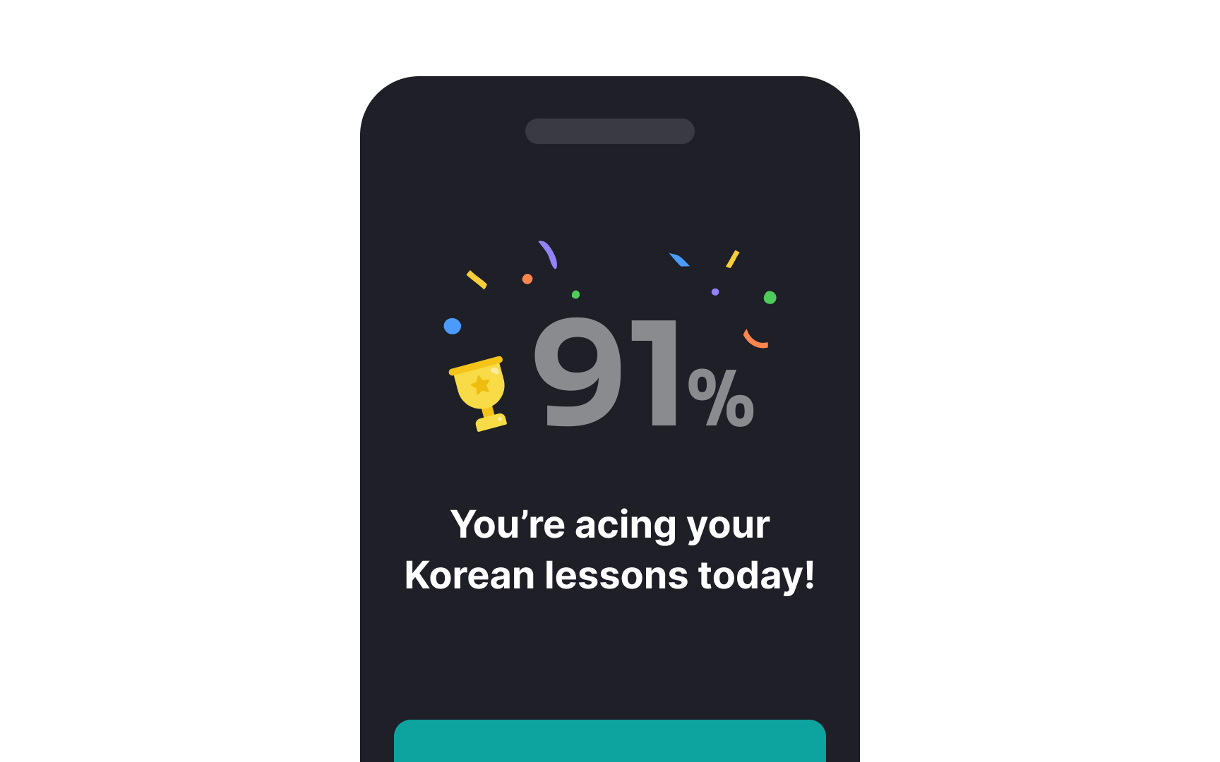
Here are some tips for using gamification effectively:
- Always remember the final goal. Rewards should motivate users to return, not just complete one task. For example, if users earn coins for signing up, offer more rewards for different future actions.
- Tailor gamification methods to various user needs. What's good for advanced users may be absolutely irrelevant for newcomers. Leverage different motivators to inspire both loyal users and those who use your product occasionally.
- Provide simple rules and clear instructions. Even the simplest game has rules. Make sure your users understand what to do without extra thought work. Also, don't overcomplicate the process — games should be fun and easy to understand.
Pro Tip: Think twice before introducing gamification techniques. Sometimes, they can be distracting and annoying, and if most users prefer skipping the gamification part, consider removing it.

A friendly, conversational tone evokes positive emotions and builds trust. But conversational doesn’t mean silly texts filled with slang and emojis — it just means sounding human and natural.
What can make your writing sound conversational?
- First and second-person pronouns: Third-person pronouns like "they," "he," and "she" sound formal and distant. First and second-person pronouns like "we" and "you" engage readers and direct your message to them.
- Informal linking words: Linking words like "besides," "firstly," "secondly," "on the other hand," "in conclusion," etc., are more common for formal writing. In conversations, people tend to use words like "anyway," "well," "plus," "since," "of course," "because," and "also."
- Contractions: People use contractions (won't, don't, aren't, etc.) in conversations to speak faster. In turn, they make writing sound more informal, as if you're talking to someone in person.
- Short sentences: People commonly speak in short sentences. When used in writing, they increase readability and help users quickly understand your message.[2]
- Use common words: Aim for a readability level of 5th to 8th grade to help users comprehend the
content faster and more efficiently.[3]
What does clarity imply? What kind of text can be classified as clear? Clear text is always:
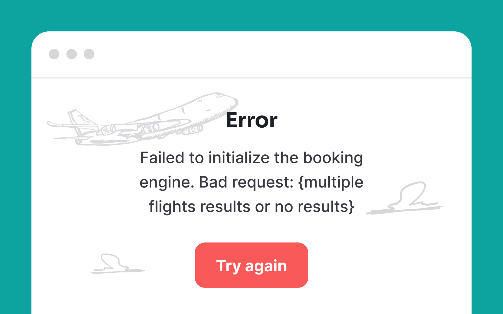
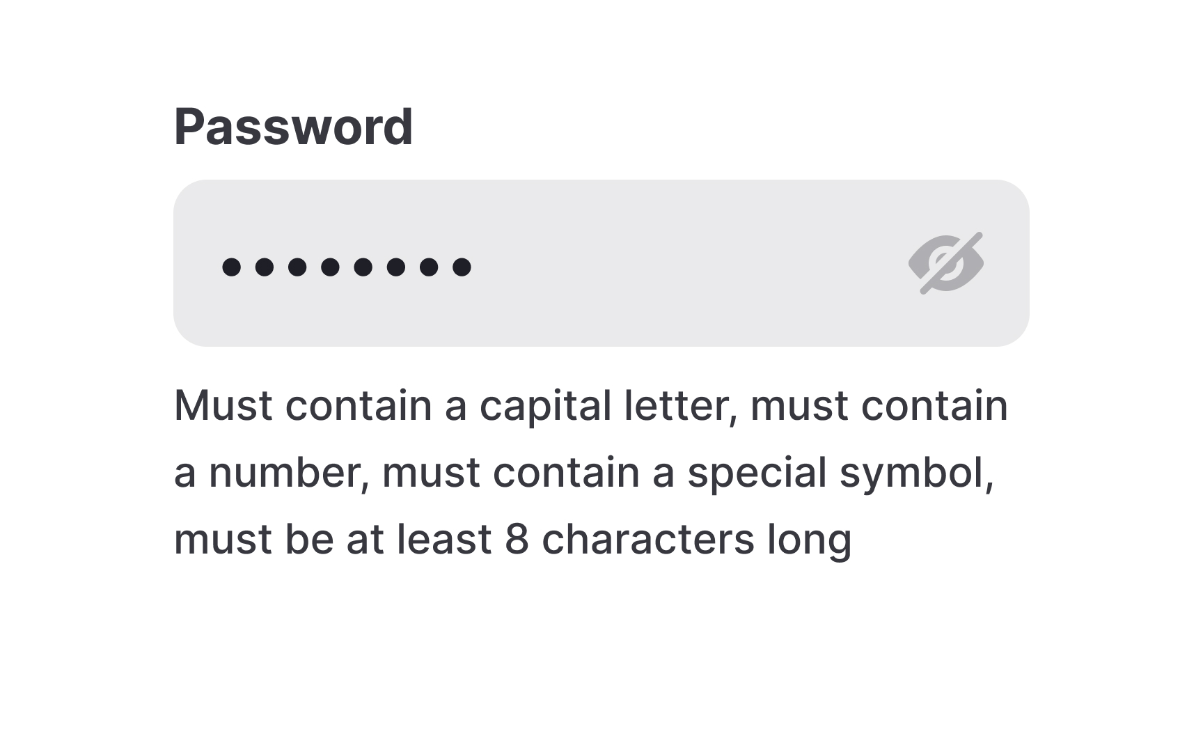
- Constructive: Clear copy doesn't tolerate confusion. If your copy is effortless and users know exactly what to do, you've reached the goal. If your users see the button label "Cancel" and aren't sure what happens after they click it (e.g., do they cancel all changes or just close the window?), your copy has some room for improvement.
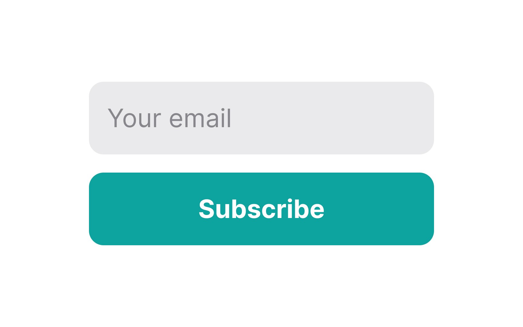
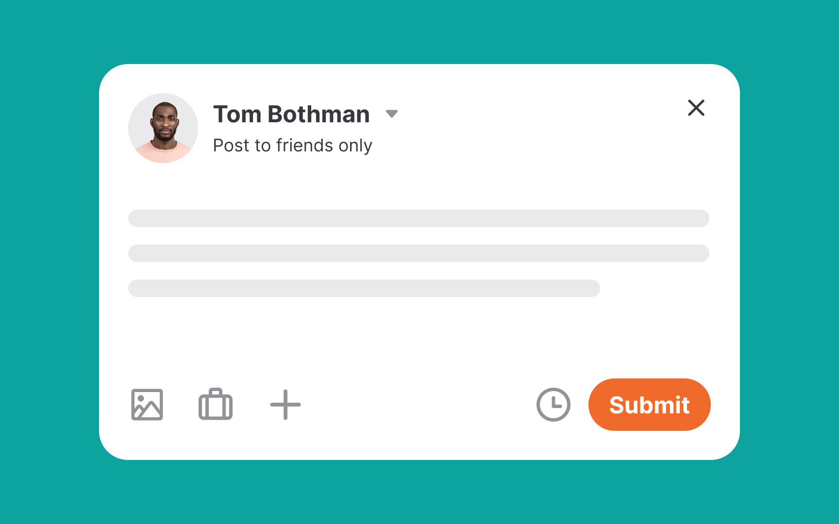
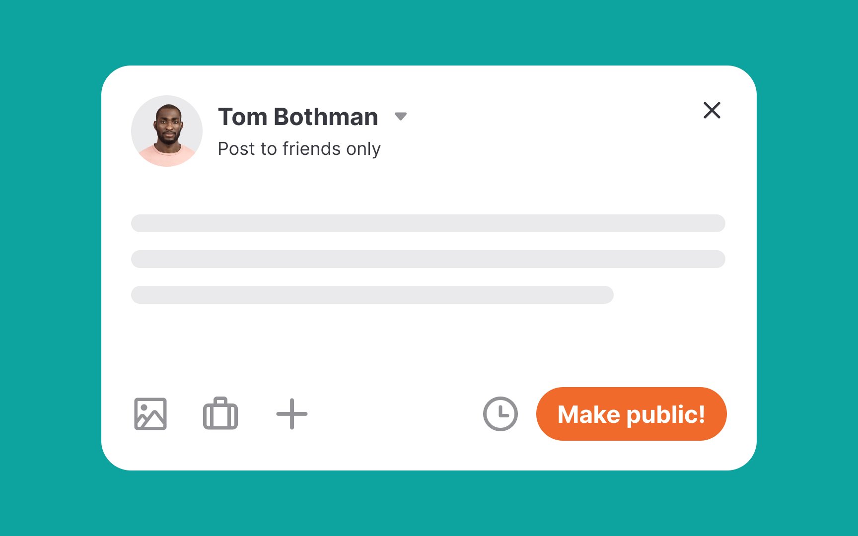
- Contextual: Clear
UX writing is exceptionally contextual and drives users to take action. For example, which button doesn't create any confusion and engages users to publish a photo/video to their feed — "Share" or "Submit"? Obviously, Submit is too ambiguous in this case. - Concise: Review, cut, and review again until your copy is short but informative. In his book Don't Make Me Think, Steve Krug expertly articulates this idea — write like you're writing for a billboard. Imagine your users are driving at 128 kmph and can only catch a few words of copy.
Pro Tip: How do you know your copy is clear? Test it early with your users — before launch or during user testing — to see if they understand the message and know what to do next.
Mark Twain was remarkably right when saying, "Writing is easy. All you have to do is cross out the wrong words."
It's not just that users' attention capacity requires
Pro Tip: Remember that words also get accompanied by icons and visuals that convey information faster than words. So make sure they work in tandem and deliver the message without any fluff.
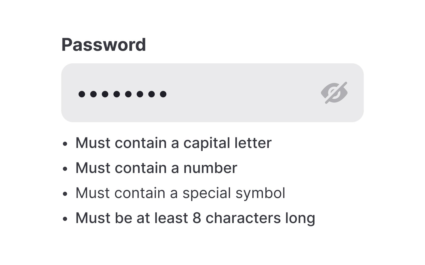
Scannability is about structuring
This is because even brief text can be overlooked if it's not well-organized. By using typography tools — such as subheadings, bullet points, numbered lists, bold, and italics — you can make your copy easy to scan and engaging. The more scannable your content, the faster users find what they need, leading to smoother navigation and better engagement.
References
- Plain Language Is for Everyone, Even Experts | Nielsen Norman Group
- How to Write Conversationally: 10 Useful Tips | Enchanting Marketing
- Aim for 5th to 8th grade readability | Content Design
Top contributors


Topics
From Course

Share


Similar lessons

Intro to UX Copy

What is UX Writing?
