Guide to Designing Pagination
Split large datasets into pages users can navigate and control
Large datasets need structure. Displaying thousands of search results or product listings on a single page overwhelms users and slows performance. Pagination breaks content into manageable chunks, giving users clear boundaries and a sense of progress through the full set. The psychology of pagination supports decision-making. When users can see where a list begins and ends, they're more likely to engage with the content and make choices. Infinite scrolling, by contrast, can feel endless, leaving users uncertain about how much remains or whether they've seen everything relevant.
Pagination isn't always the better choice though. Browsing-oriented experiences often benefit from continuous scrolling. Task-driven activities, where users search for something specific, tend to work better with paginated results. Understanding user intent guides which approach fits. The controls themselves require careful design. Users need clear ways to move forward and backward, jump to specific pages, and understand where they are in the sequence. Page counters, input fields, and items-per-page options all contribute to giving users control over how they navigate through content.
This approach not only enhances the user experience by making information easier to navigate but also improves page load times, as only a portion of the content is loaded at one time. Additionally, pagination is beneficial for SEO purposes, as it helps search engines better understand and index website content.
Use
In
Pagination also improves performance by loading content in chunks, which can be less overwhelming for users and more efficient in terms of loading times and data usage. It’s a user-friendly choice for cases where precision and order are important, and where users benefit from a clear beginning and end.[2]
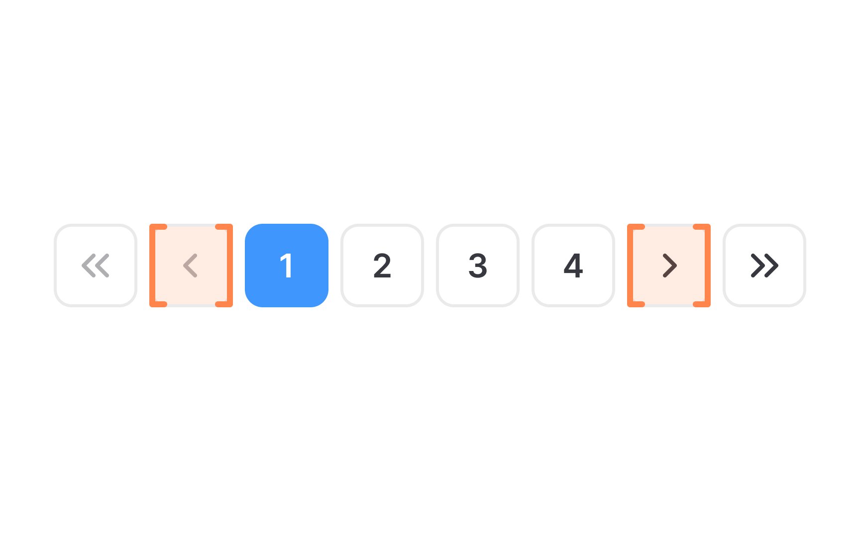
The first and last
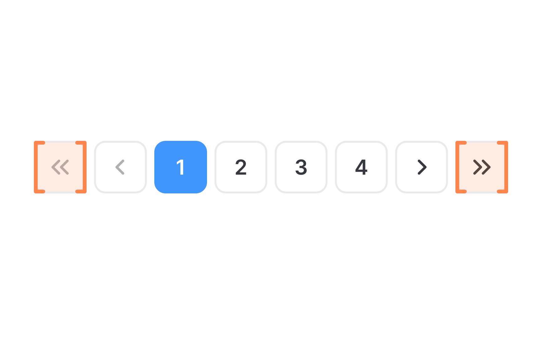
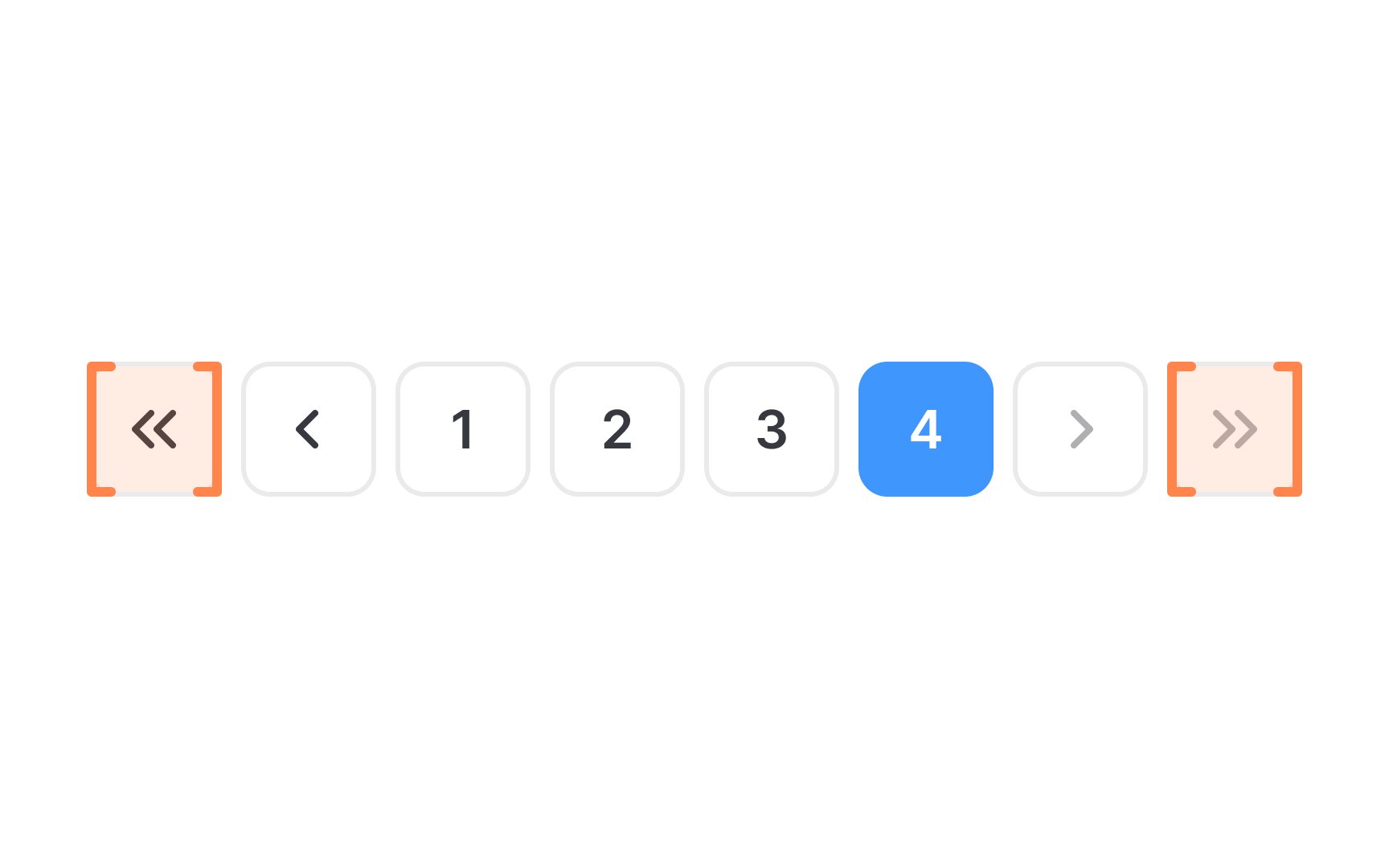
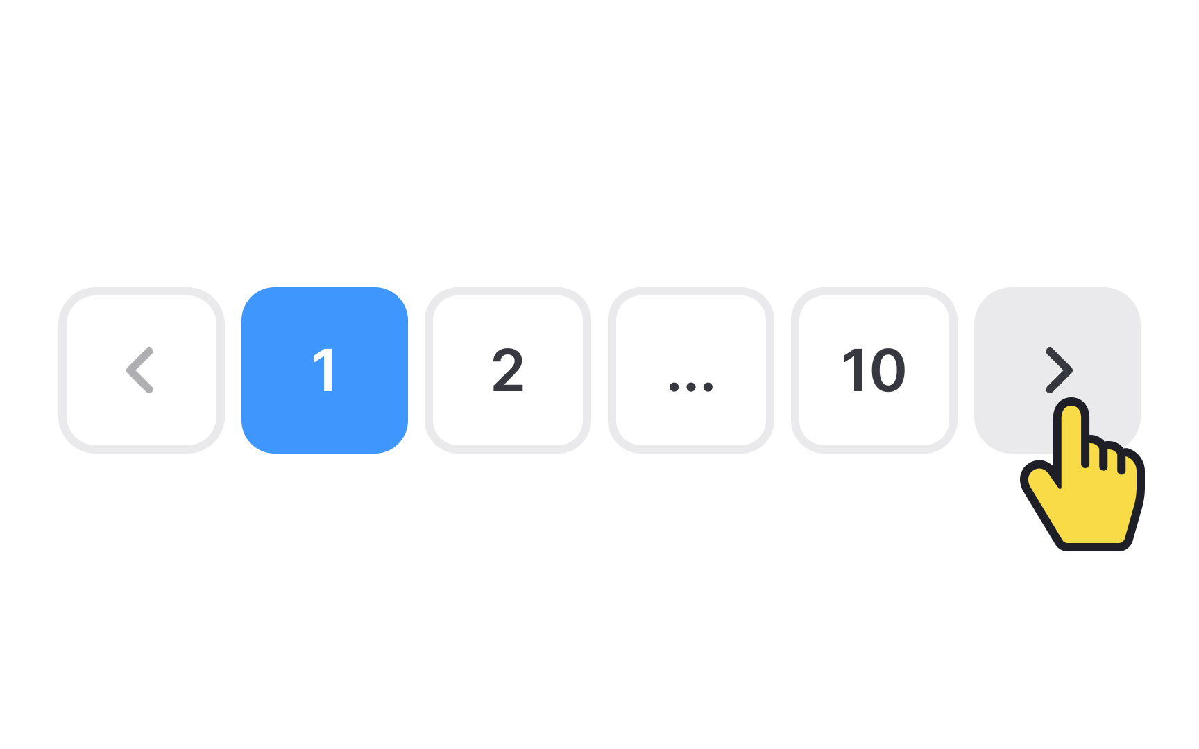
The first page control is typically represented by a double arrow pointing left («) or the word "First,” and allows users to jump to the first page. Similarly, the "Last" control, often symbolized by a double arrow pointing right (») or labeled "Last," allows users to jump straight to the final page.
When styling these controls, ensure they are visually distinct and intuitive. Use
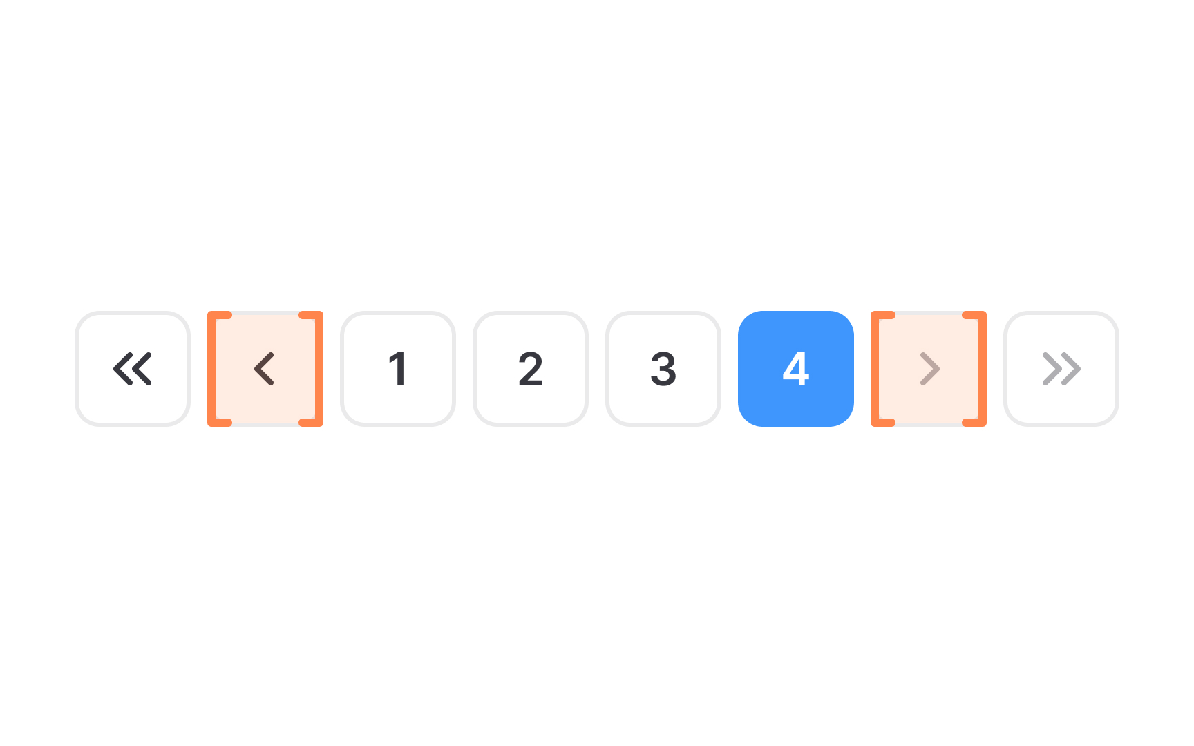
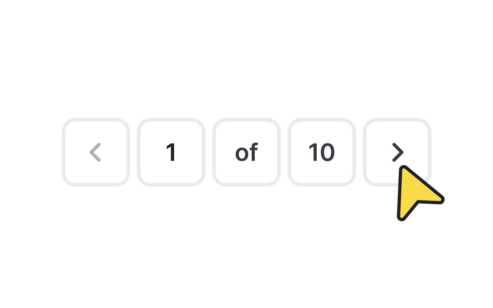
The previous and next
The next page control, usually symbolized by a right-pointing arrow (>) or the word "Next," enables users to proceed to the page directly following the current one. This is useful for continuous reading or browsing through
Pro Tip: Disable the previous page link if there's no previous page to go to.
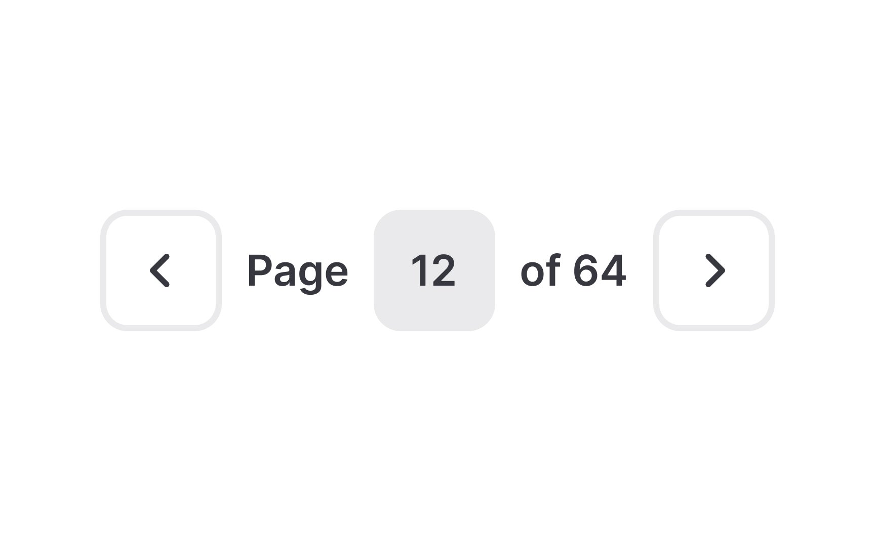
The manual
To use it, a small input field is provided, typically located near the pagination controls. Users can type in the page number they desire and hit enter or click a go button, which then takes them straight to that page.
When designing this control, make it easily identifiable and simple to use. The input field should be prominent enough to be noticed, but not so large that it disrupts the overall design.
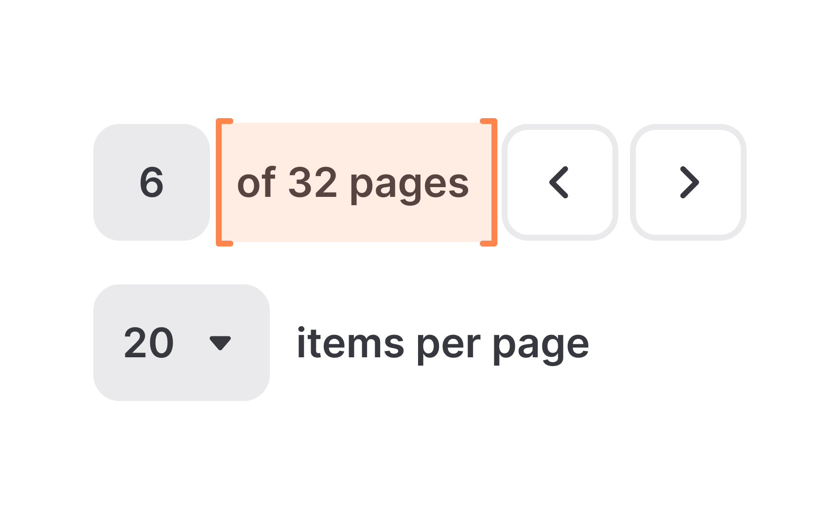
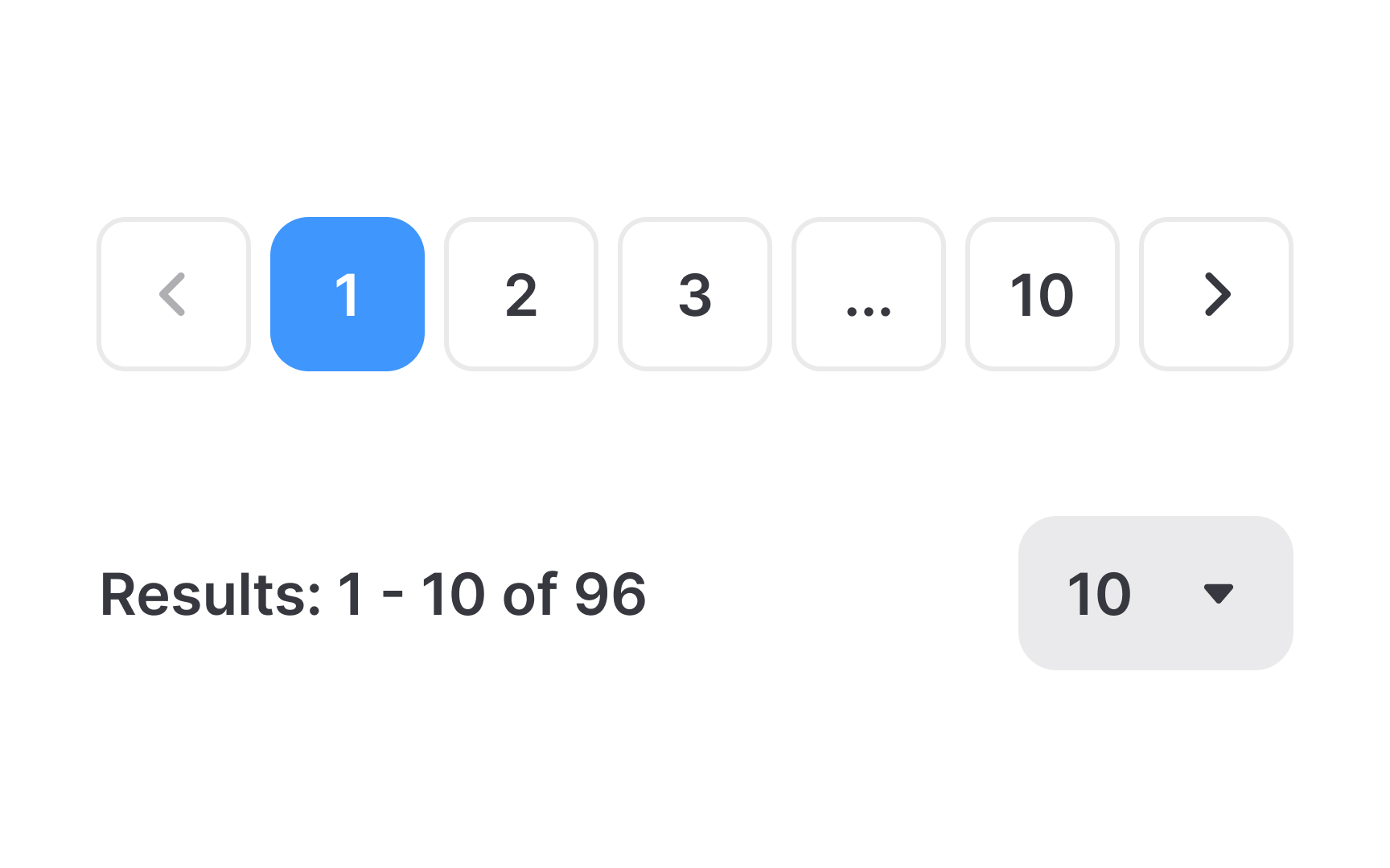
The
The page counter is typically located near the pagination controls and should be designed for easy visibility. This feature is most beneficial in contexts where users need to keep track of their progress, such as in lengthy articles, reports, or catalogs.
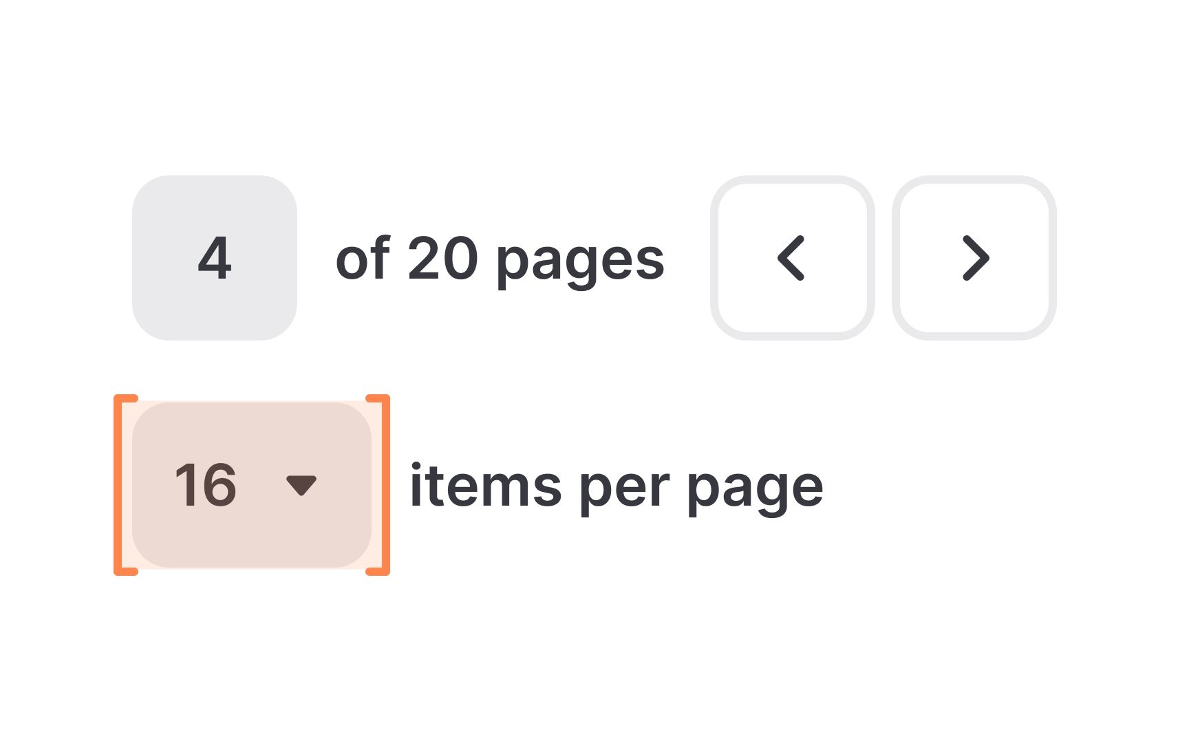
Provide a control that allows users to select how many items they want to view on a single
Here's how it works — a dropdown menu or a set of fixed options is provided, typically labeled with different quantities, such as 10, 20, 50, or 100 items per page. Users can choose an option that suits their preference for browsing or reading. This control gives users flexibility and enhances their experience by allowing them to manage the volume of information they view at one time.
When implementing this feature, ensure that the control is easily accessible, clearly labeled, and placed near the top or bottom of the content list.
Styling
Here are some styling tips:
- Use colors that
contrast with thepage background for the paginationbuttons . This helps them stand out as clickable elements. Different colors or shades can be used to distinguish between active and inactive buttons. - Implement hover effects, like a
color change or shadow when the cursor moves over the controls. This interaction indicates to users that the element is interactive and clickable. - Change the cursor to a pointer when hovering over clickable elements. This is a universal sign indicating an interactive element.
Positioning
In some cases, especially on longer pages, it can be helpful to place an additional set of pagination controls at the top. This allows users to navigate to another


Similar lessons

Common UI Components Part I

Image Terminology
