Analytics Storytelling
Understand how to transform product metrics into compelling narratives that drive decisions and inspire action
Data without context is just numbers on a screen. Effective analytics stories highlight key insights, establish clear relationships between metrics and business outcomes, and guide audiences through data-driven discoveries. By combining quantitative evidence with qualitative context, these narratives make data accessible and actionable for diverse audiences — from executives to engineers.
Analytics storytelling elevates product metrics beyond dashboards and spreadsheets, creating memorable experiences that influence strategy, validate hypotheses, and build consensus around product decisions. This essential skill helps product teams communicate the "why" behind the numbers, turning data points into compelling arguments for product innovation and optimization.
A narrative structure can transform complex analytics data into a clear, compelling story that guides stakeholders through your insights and recommendations.[1] Use this approach whenever you need to explain data findings, justify decisions, propose changes, or drive action based on analytics insights — from daily team updates to board presentations, incident reports to success stories, and any situation where you need others to understand and act on your data.
Here's how to apply it:
- Begin with a clear problem statement or business question. For example, "We noticed a 25% decrease in daily active users over the past month."
- Present relevant background data and context. "Historical data shows stable growth until December, when we launched the new UI."
- Build tension by revealing key metrics and trends. "Session duration dropped 40%, and user feedback mentions confusion with navigation."
- Highlight the main insight or discovery. "The new menu structure is creating friction for core user workflows."
- Connect findings to business impact. "This engagement drop could lead to $100K monthly revenue loss."
- Close with specific, data-backed recommendations. "Propose reverting to the previous menu layout while testing alternative designs with focus groups."
This structured approach transforms raw analytics into an actionable story that resonates with both product and business stakeholders.
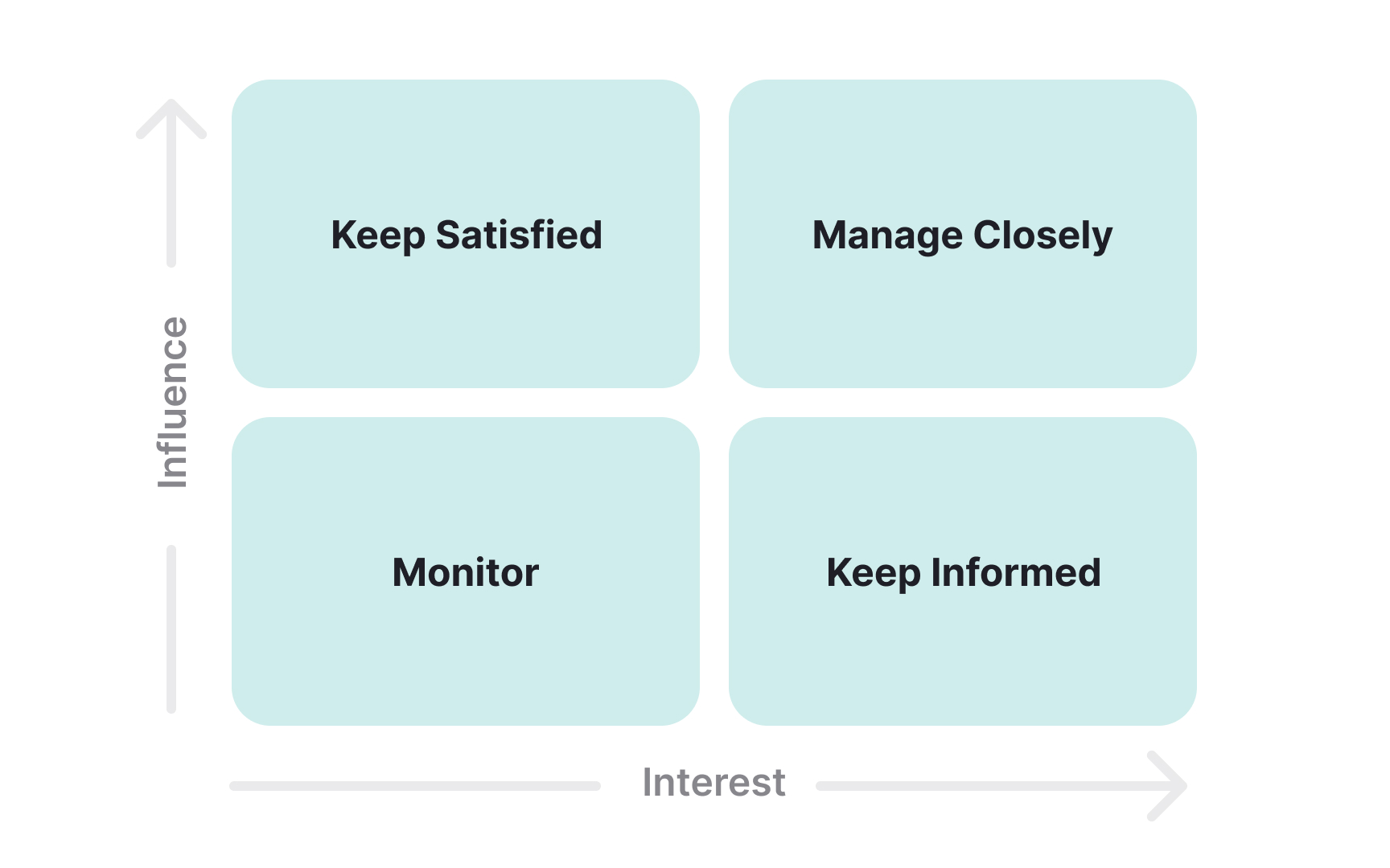
Every analytics story begins with understanding who needs what data and why. Start by listing all potential data consumers in your organization: executives track business health metrics, product managers monitoring feature performance, engineers need technical insights, marketing teams track campaign effectiveness, customer support monitors user satisfaction, and finance measures
Place these stakeholders in a power-interest matrix to prioritize your analytics delivery. High power, high interest stakeholders (like executives and product leaders) require comprehensive analytics with clear business impact — they need monthly strategic insights connecting user behavior to revenue. High interest, lower power stakeholders (like product teams and customer success) need regular operational data — weekly
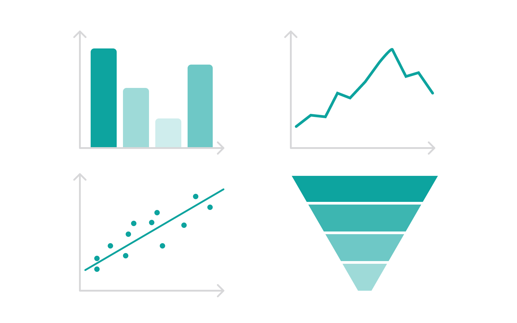
Clear and effective data presentation ensures analytics insights drive understanding and action. Make data meaningful by choosing appropriate visualization types — use bar charts for comparisons, line graphs for trends, scatter plots for correlations, and funnel charts for conversion analysis. Each visualization should highlight key insights while maintaining simplicity and clarity.
When presenting data, also:
- Consider your audience's data literacy and analytical needs. For example, when presenting product analytics to executives, focus on high-level trends and ROI metrics, while engineering teams may need detailed technical breakdowns.
- Choose visual elements that support rather than distract from your message.
- Break complex patterns into clear, understandable chunks through strategic use of color, size, and grouping.
- Create a consistent visual hierarchy that guides viewers through your data story. Start with an overview before revealing supporting details.
- Use annotations to highlight significant findings and provide context.
- Remove unnecessary decorative elements that don't contribute to insight communication.
Pro Tip: Follow the "5-second rule" — if viewers can't grasp the main message of your visualization within 5 seconds, simplify it.
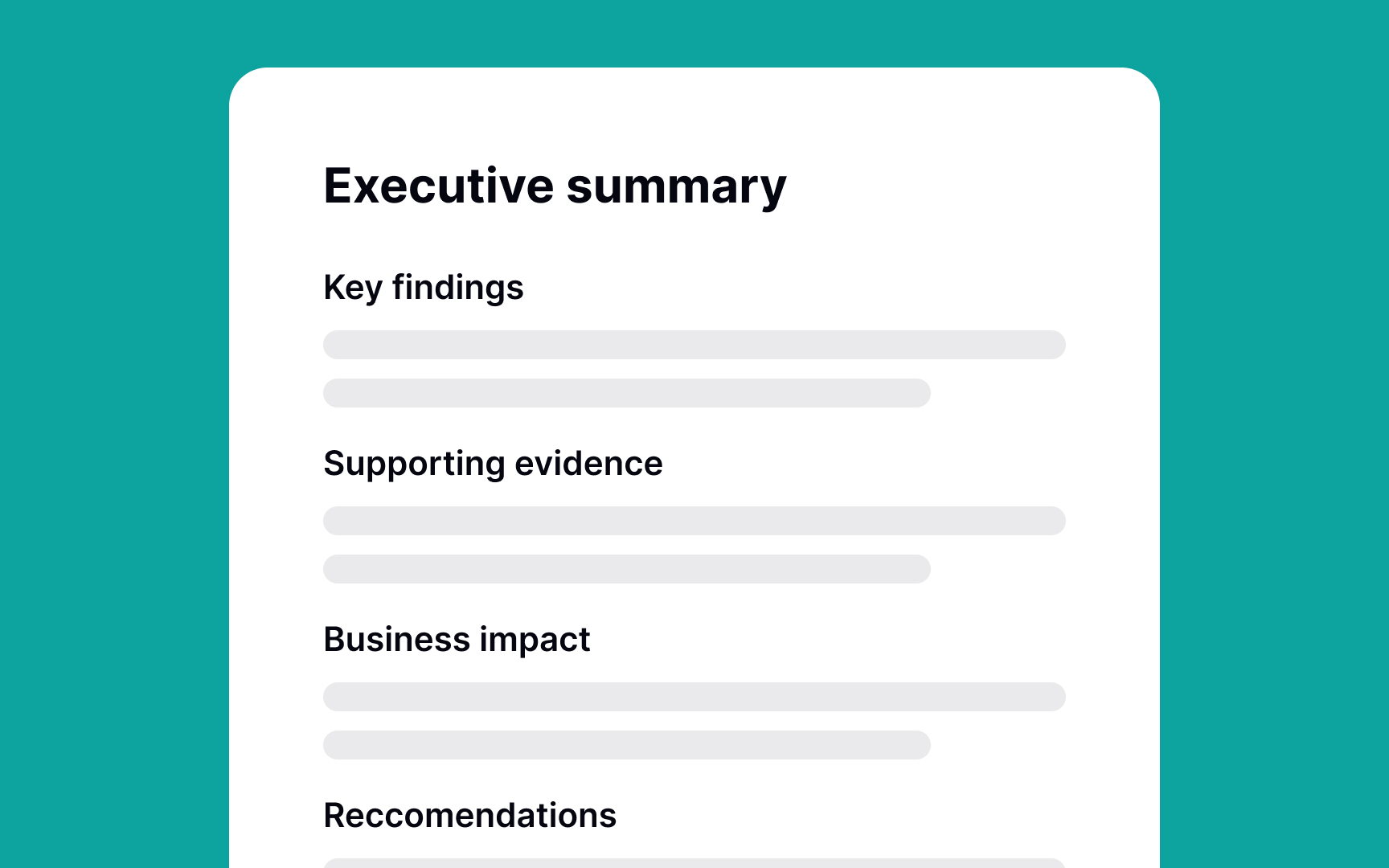
Executive summaries distill complex analytics insights into clear, actionable briefings for senior stakeholders. They focus on business impact, key findings, and strategic recommendations rather than technical details or methodology.
Here are some best practices for writing them:
- Structure your summary with clear sections: the key finding, supporting evidence, business impact, and recommended actions. For instance, if user engagement drops 25% after a feature launch, start with this metric, show its
revenue impact, explain key factors identified through analysis, and recommend specific solutions with expected outcomes. - Keep the language concise and free of technical jargon. Present metrics in business terms — instead of "DAU decreased by 15%," say "we lost 10,000 daily users, representing $50,000 in monthly revenue."
- Include visuals sparingly, choosing only those that emphasize crucial patterns or trends.
- Always end with clear next steps and required decisions.
Pro Tip: Test your executive summary by asking "So what?" after each statement. If you can't connect it directly to business value, leave it out.
Recommendations transform analytics insights into actionable strategies that drive business outcomes. Each recommendation should connect directly to data findings and align with business objectives.
Frame recommendations using the "insight-impact-action" structure:
- Start with the data insight (User onboarding drop-off increased 30%)
- Connect it to business impact ($200K monthly
revenue loss) - Propose specific actions (Simplify email verification, reduce form fields)
Include implementation complexity and resource requirements to help stakeholders evaluate feasibility. Also, support each recommendation with success metrics and measurement criteria. Instead of vague suggestions like "improve user experience," specify "reduce onboarding steps from 7 to 4 to increase completion rates by 25%." Anticipate potential obstacles and include mitigation strategies. When presenting multiple options, clearly indicate the preferred solution based on data-driven criteria.
Every data-driven recommendation needs a clear path to implementation. Take your analytics recommendations and break them down into concrete actions with owners, timelines, and success metrics. For example, if you recommend reducing
Create a simple action table listing each task, the expected impact based on data, and implementation time. Prioritize quick wins — changes that take minimal effort but show measurable results. When data shows a critical issue, like a 40% drop in conversions, break down the solution into immediate fixes and long-term improvements.
Track progress using simple metrics everyone understands. Instead of complex KPIs, use clear numbers: "increase signup completion from 60% to 75%" or "reduce load time from 5 seconds to 2 seconds." Set weekly check-ins to review progress and adjust plans based on new data. If something isn't working, your tracking will show it early.
Result attribution connects analytics findings to specific actions, showing exactly what worked and why. When tracking improvements, identify which changes led to which outcomes. For example, if conversion rates improve after multiple updates, determine whether it was the simplified form, faster load time, or better error messages that made the biggest impact.
Set up proper measurement from the start by using A/B tests with control groups (comparing results between users who received a change and those who didn't) and staggered feature releases. If you add both social
Keep a clear record of all product changes and their measured impact. Note both wins and misses — knowing that removing phone number validation increased form completion but also increased fraud attempts is valuable learning. Share these insights across teams to build institutional knowledge about what works. Use these findings to validate assumptions and improve future feature decisions.
Context building helps stakeholders understand the full story behind your analytics data. Instead of just showing numbers, explain the market conditions, user behavior patterns, and business factors that influence your metrics. For example, don't just report a 30% drop in mobile engagement — note that it coincided with a major competitor launch and seasonal holiday patterns.
Look at both internal and external factors that affect your metrics. Internal context includes product changes,
Present relevant benchmarks and historical patterns to help frame current performance. If
References
Topics
From Course

Share


Similar lessons

Analytics Strategy & Planning
Data Collection & Tracking
