Basics of Mobile Onboarding
Learn how to get users familiar with a new interface using flows and elements that don't cause irritation or overwhelm.
Onboarding is the process of getting users familiar with a new interface using flows and elements that aren't a part of the regular app interface. Surprisingly, the best type of onboarding is the one that isn't there!
Users download an app to achieve a particular goal and the faster they can achieve it, the more satisfied they are. An onboarding flow adds many steps that users need to take to successfully complete their tasks. This makes the conversion funnel longer, giving more chances for potential users to drop off.
Your resources are better spent on making the UI more usable. However, some apps require separate onboarding flows. These flows can involve one or more of the following components:
- Feature promotion
- Customization
- Instructions
When creating onboarding flows, always consider whether your app really needs it.
Most mobile apps are designed in a way that allows users to learn the interface by using it. There are only a few situations where
- When the app is complex. In this case, it's better to explain how to use features as users discover them instead of an instructional tutorial that can overload them with unnecessary information.
- When you need user information to get started. For instance, users of banking apps may need to create an account and confirm their identity.
- When the application functionality is tailored to users' context and preferences. For example, a fitness app might need to know a user's height, weight, blood pressure, etc.
- When important app features or workflows are unique, unfamiliar, or different from standard UI patterns. For example, car-sharing apps that have onboarding flows to explain how to use their service.
If you're unsure whether your app needs onboarding, user test the app without it. Do users struggle to use it for the first time? If yes, consider whether you may be able to make some changes to the app design first to make it more user-friendly. If that's not possible, prototype an onboarding flow and test it.
Feature-based
Avoid feature-based onboarding at the first launch. By the time users have installed the app, they usually have a pretty good idea of what it does, and this onboarding will likely be skipped. Instead, promote features on the app store page or highlight them through contextual help while users are in the app.
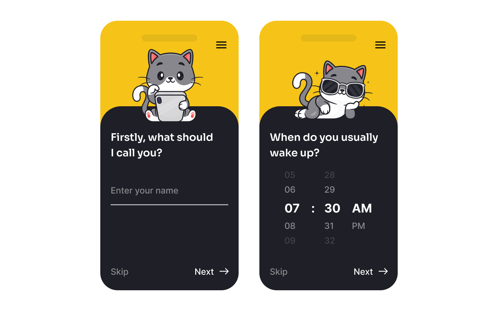
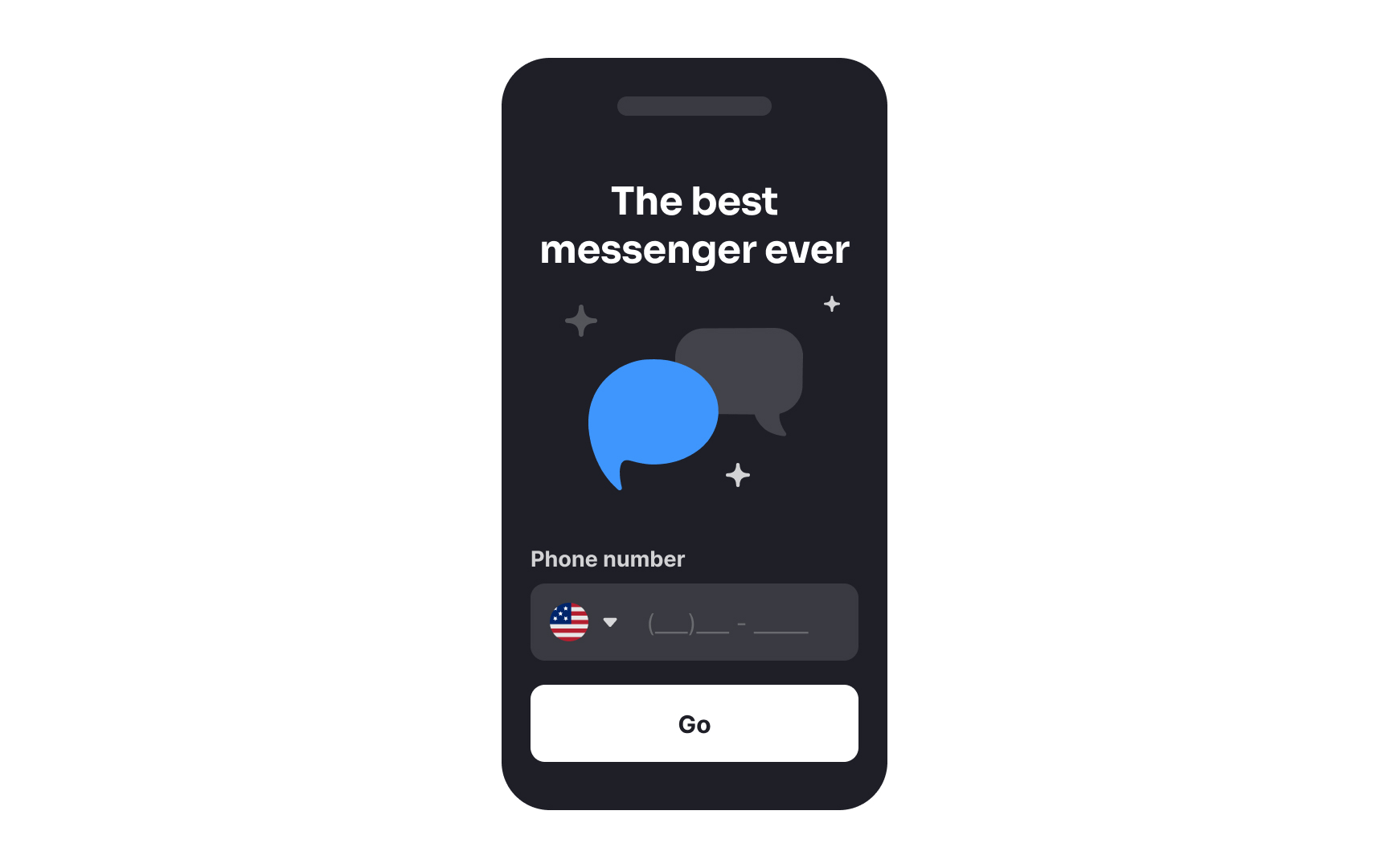
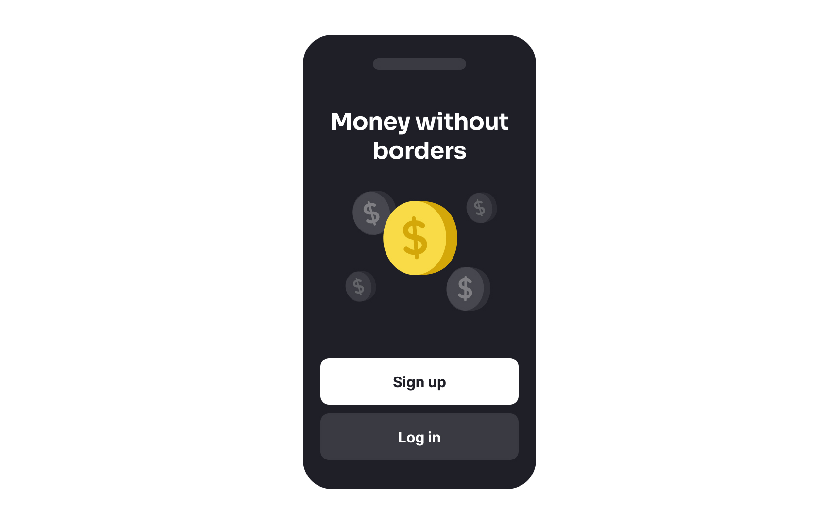
Customization
When asking for user information, explain why you need it. If you can't identify why you require such data at launch, the information should probably be gathered later, as needed.
Avoid visual design customization at first launch — for example, choosing a color scheme. At this point, users don't know enough about how the app looks to decide. Moreover, research shows that people usually stick with defaults.[1]
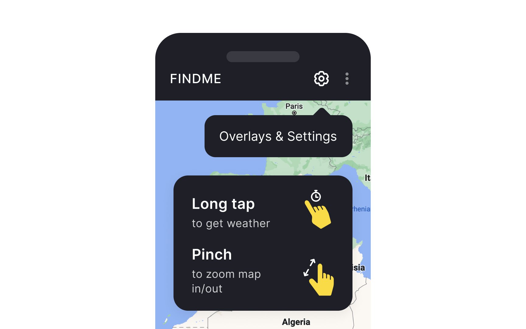
Instructional
Instructional onboarding comes in many forms such as:
- Deck-of-cards tutorials
- Contextual help
- Interactive walkthroughs[2]
Most mobile apps don't need instructional onboarding — resources are better spent on making a
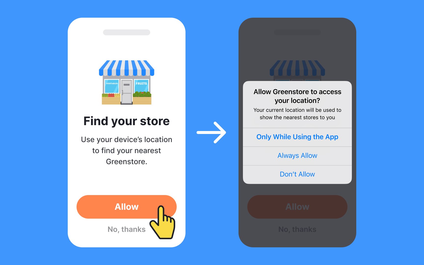
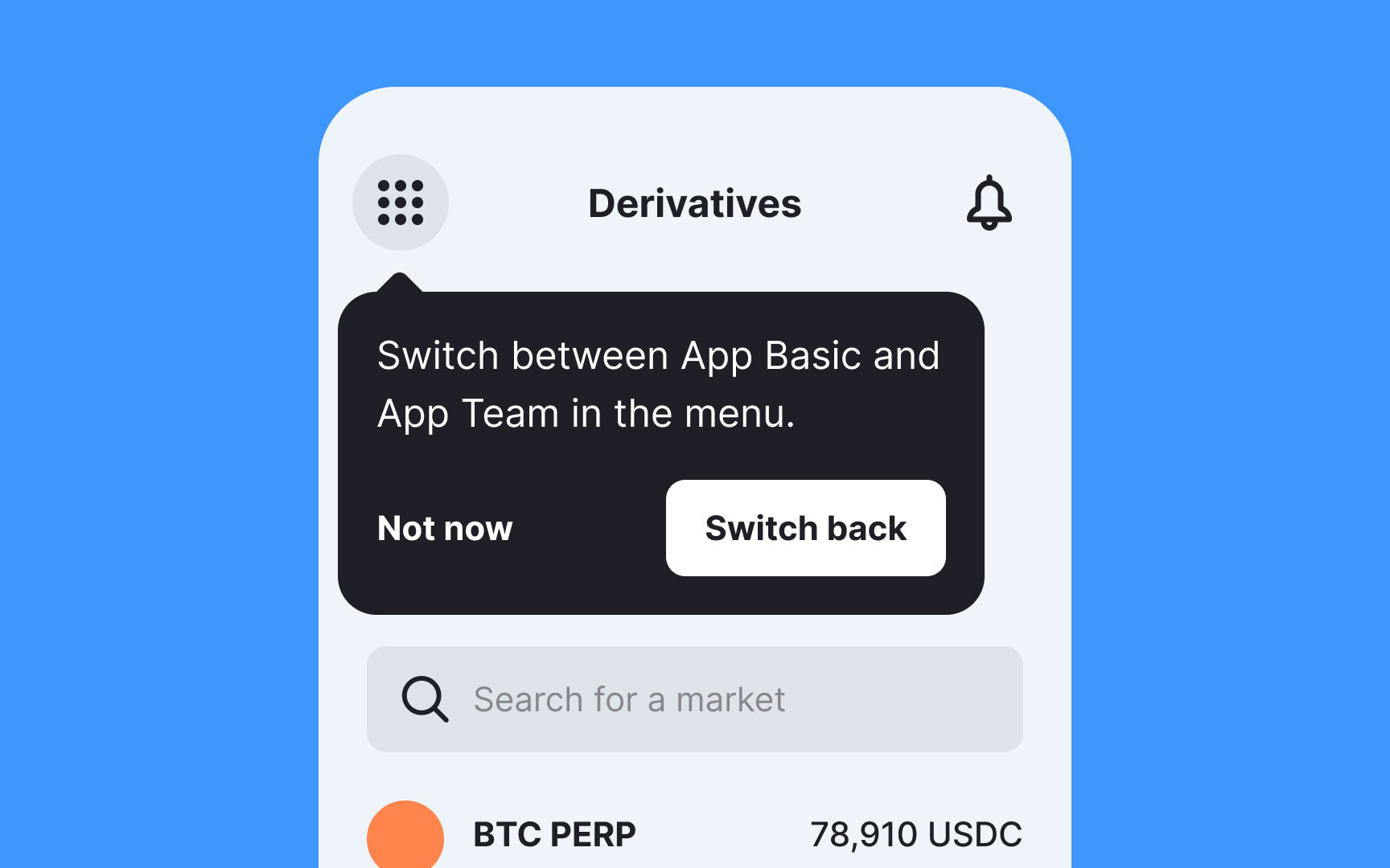
Permission priming refers to screens that prepare users before they see system permission requests. But why do we need to ask for permission twice?
When encountering a system popup, most users instinctively close it without reading. A permission priming screen captures users' attention and explains the value of granting access.
To create effective permission priming screens:
- Clearly explain why you're asking for access and how users will benefit.
- Integrate it into the
onboarding flow — for example, Dropbox requests Gallery permission as part of syncing photos. - Ask for access in context — for instance, Instagram requests photo access only after users open the camera.[3]
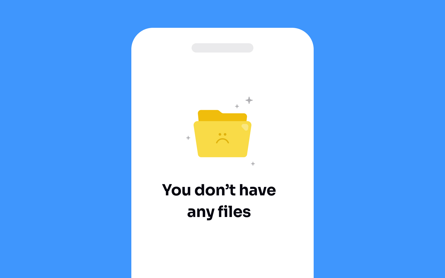
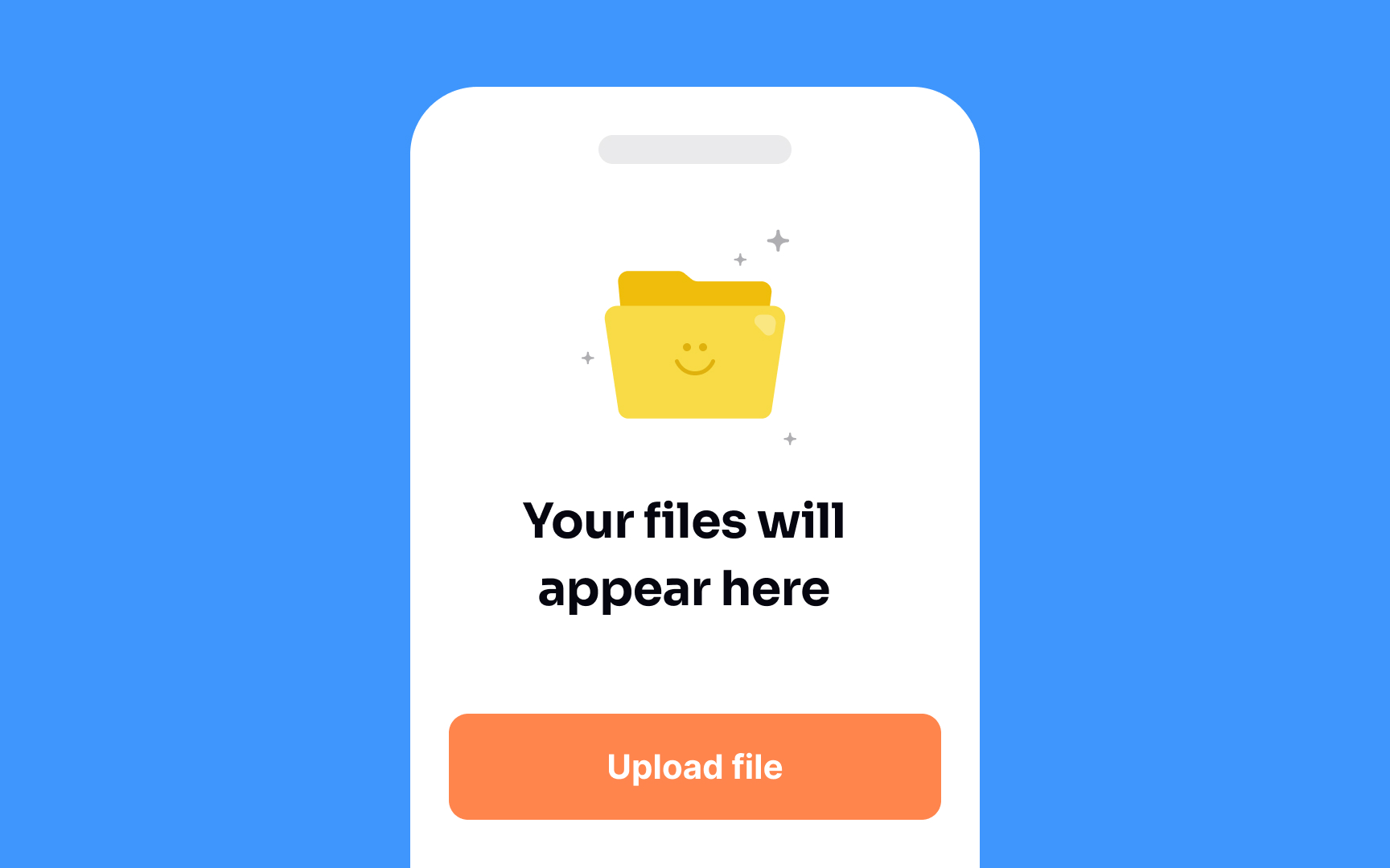
Empty states are the places in the user journey where a user might not have added or generated any
What kind of information can you fill an empty state with?
- Educational material — instructions on how to use the product or what the space might look like to a power user.
- A call to action — for example, "Start adding new photos to your timeline” with a button for uploading or taking photos.
- Brand-building personality — for example, brand illustrations.
The most important thing is that you provide helpful information to users at the right time. This way, well-designed empty states can become a critical part of onboarding.[4]
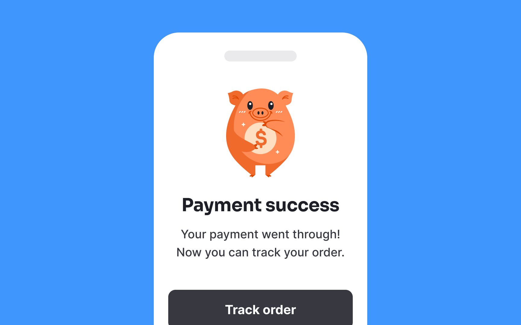
Success states are the opposite of error states — they let users know that what they're doing is working. This is a great moment to create a positive emotional connection between them and your app.
The timing of this moment is critical. Success states encountered early in the process increase the retention rate. If users achieve their first success quickly, they are more likely to stay.
A success state is the first conversation that users have with your product. The messages you can include can be broadly divided into 3 types:
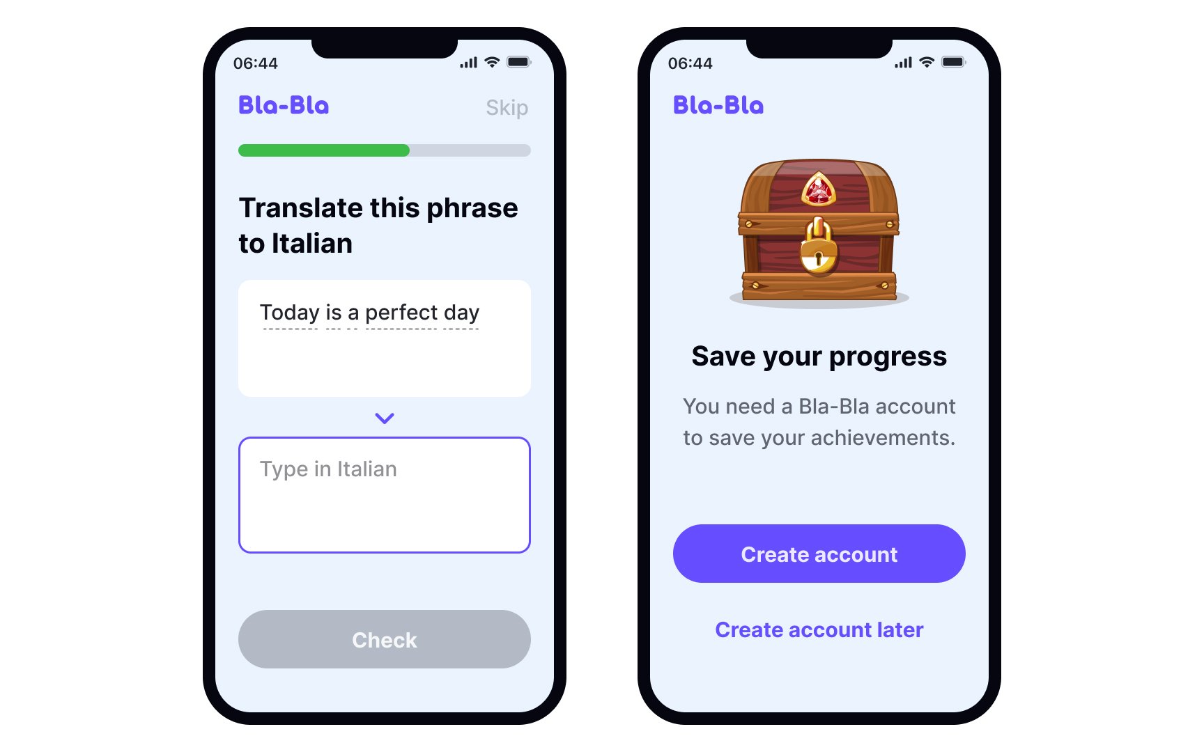
Front-loading value in
For example, after completing Duolingo's onboarding, users leave with two real sentences in their chosen language. This small accomplishment provides immediate value and builds excitement. It’s not just about teaching; it’s about showing users they’re already on the path to achieving their goals.
How to implement front-loaded value:
- Prioritize early wins: Include steps that deliver immediate benefits, such as helping users accomplish something meaningful, rather than showing features or settings.
- Capitalize on motivation: Users come into your app with some excitement. Build on this by making the first steps active and engaging, not passive tours or instructions.
- Separate achievement from activity: Don’t confuse busywork, like filling out forms, with progress. Only include steps that genuinely benefit users and help them reach their goals.[6]
While it may seem best to get users registered immediately,
The goal of gradual engagement is to show users the value of the service before asking for their commitment. By letting them see how they can use the app and why it’s worth their time, users are more likely to register later.
The psychology behind this is simple: offering real value upfront helps users feel invested in the service. When users get something useful early on, they’re more likely to stay loyal and complete the registration, making them more engaged and committed in the long run.

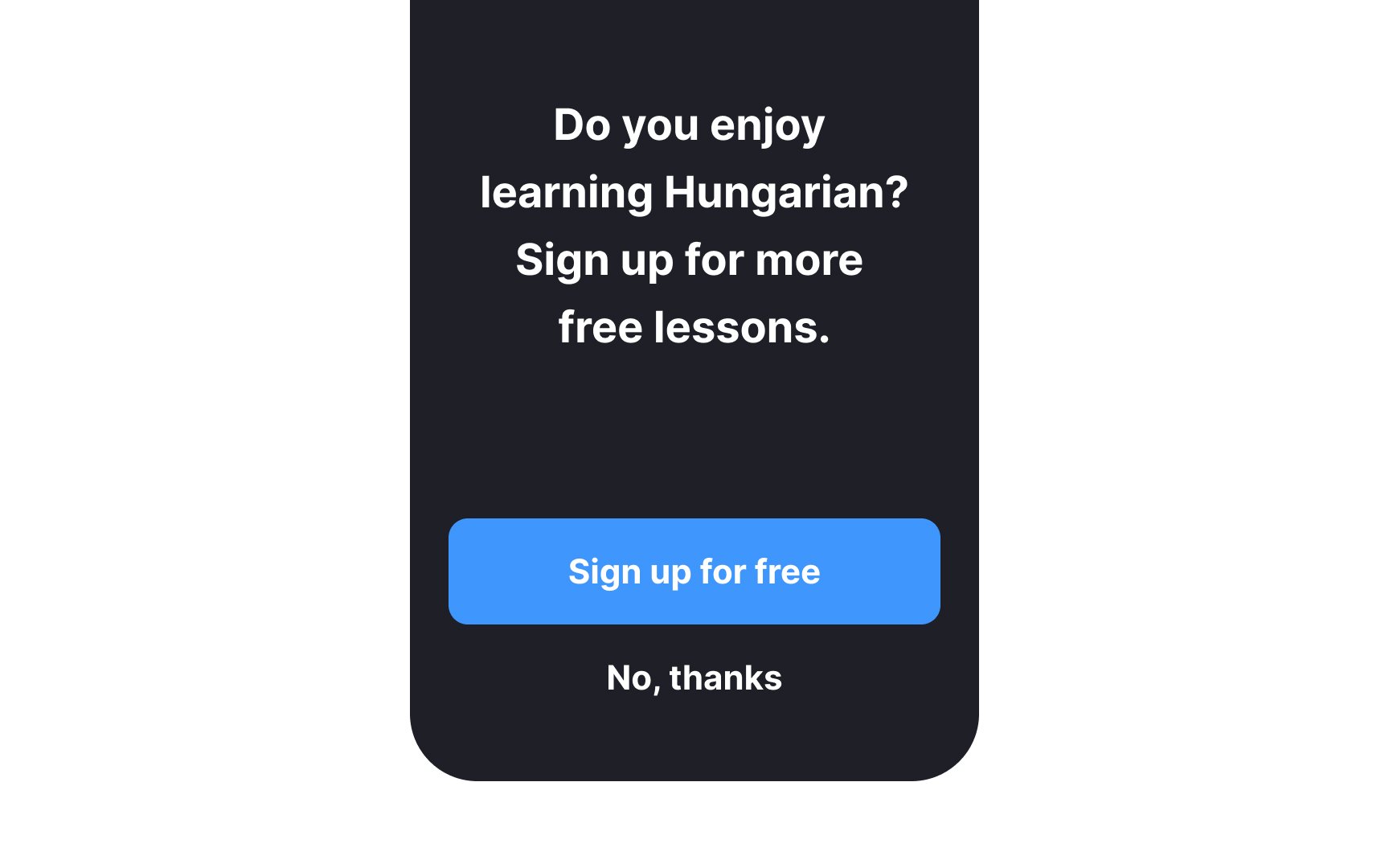
Include a clear and compelling call-to-action (CTA) at the end of the
While users may be motivated to take the first step on their own, a well-placed CTA increases the chances of them following through. It acts as a gentle nudge, making it easier for users to know what to do next and enhancing their overall experience.[8]
References
- The Power of Defaults | Nielsen Norman Group
- Mobile-App Onboarding: An Analysis of Components and Techniques | Nielsen Norman Group
Top contributors


Topics
From Course

Share


Similar lessons

Designing for Mobile Interfaces

Responsive vs. Adaptive Design
