Geometric Perception and Design Composition
Understand the way different shapes are perceived and how they can influence user behavior
The way users perceive different geometric shapes and their properties can have a profound effect on your compositions. Which shapes attract the most attention? Why do some designs — just like some smells — make users feel uncomfortable? What makes users group some elements together and not others?
Understanding the way different shapes are perceived and how they can influence user behavior is vital to designing effective compositions. Pay attention to things like shape, color, and grouping when creating UI designs.
An element's shape is one of the first things we notice. Primitive shapes are found everywhere around us, in both natural and manmade objects, in all different sizes and configurations. Shapes are recognizable at a glance and, in design especially, users can often immediately identify common components by shape alone.
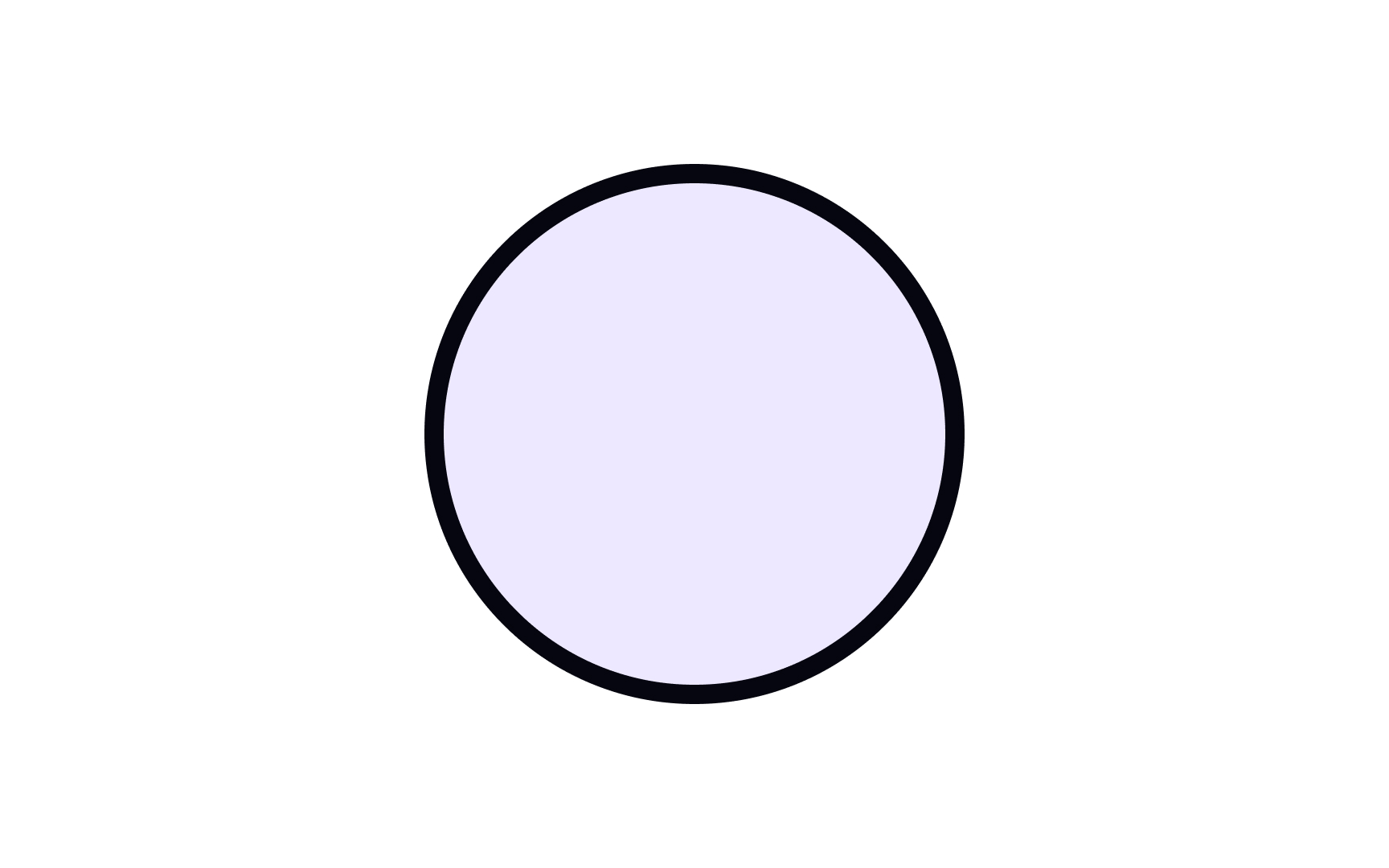
Active shapes are those that attract and keep our attention. Shapes with rounded edges, such as circles or many organic and abstract shapes, are perceived by users as more active. Those with straight lines and right angles, such as squares and rectangles, are more passive.
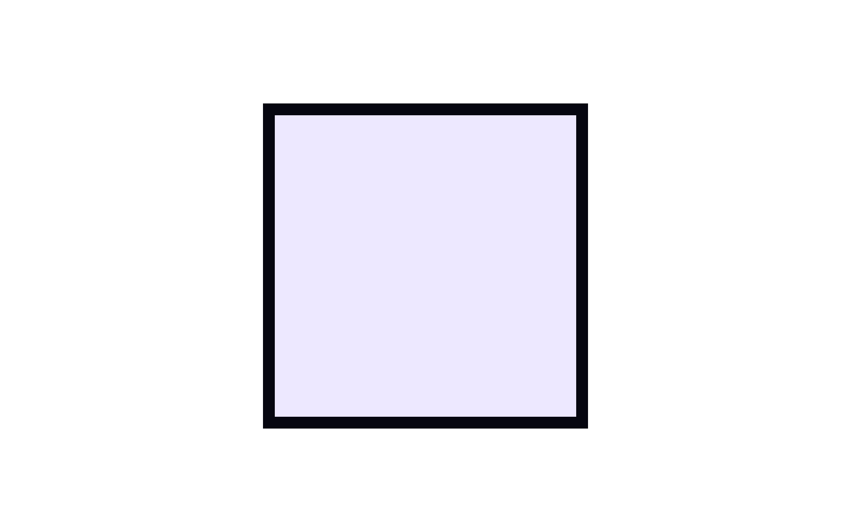
Passive shapes are the opposite of active ones — they lurk in the background and stay out of the limelight. Most geometric shapes are passive. Squares are considerably less engaging than circles or organic shapes. They feel deeply grounded in their surroundings — think of how much more difficult it is to move a square, angular object than it is to move a round one. Squares produce the impression of stability and firmness.
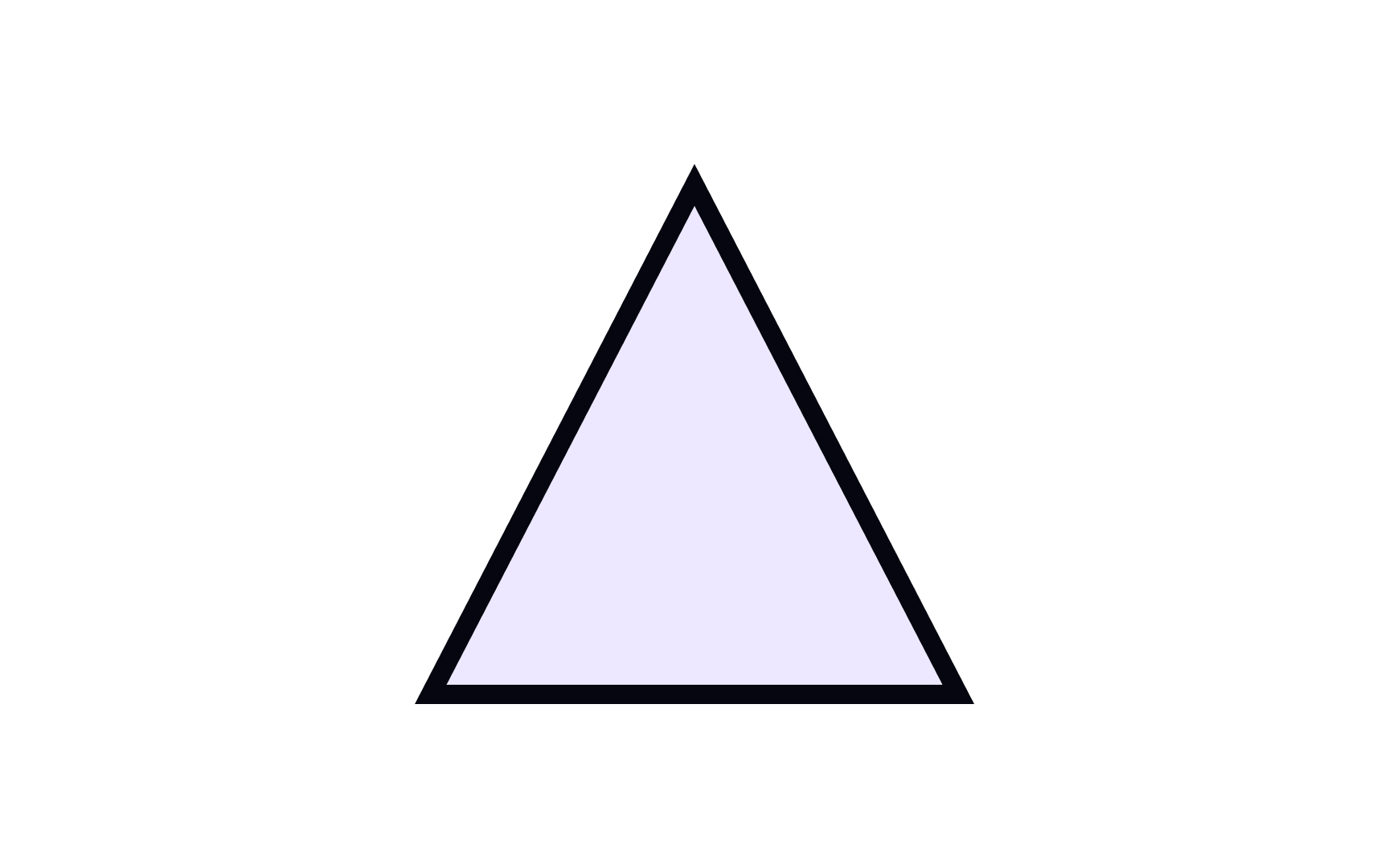
Subconsciously, we compare design elements to real-world objects. Stable shapes are those that we perceive as well-grounded and difficult to topple. A triangle is a versatile shape — it can be either stable or unstable, depending on which direction it's pointing. A triangle pointing up looks solid and well-balanced — it would be difficult to tip over — similar to a pyramid in the physical world.
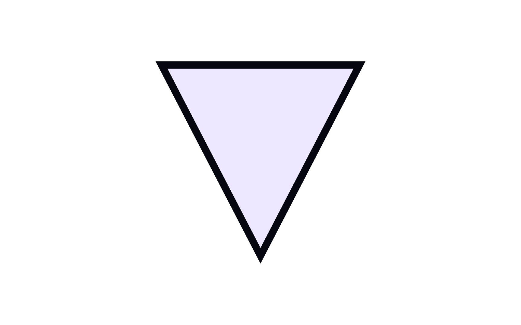
Unstable shapes look like they’re about to tip over. They can give users an uneasy, and even uncomfortable, feeling. A downward-pointing triangle is one such example. In the real world, it would be difficult to balance such a shape so it would stay upright. The same goes for rhombuses or squares rotated to stand on one corner.
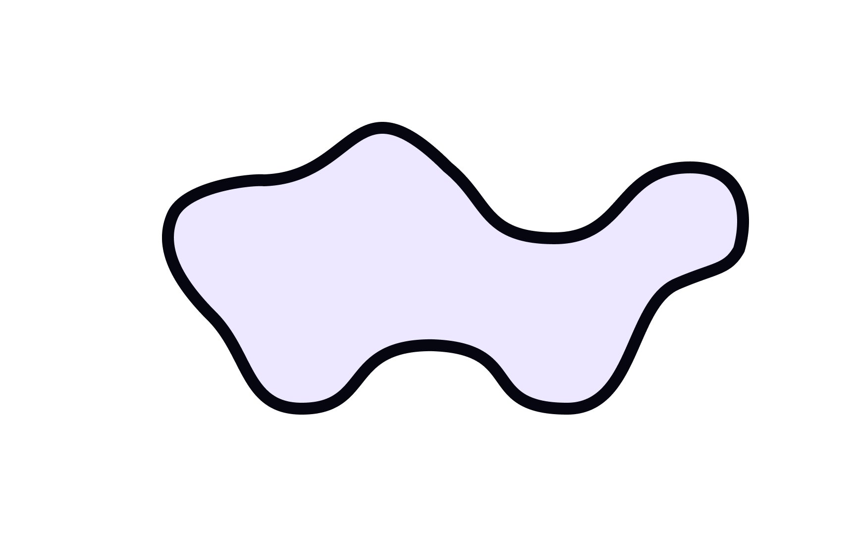
Organic shapes resemble shapes you’d find in nature — leaves, clouds, flowers, and the like. They’re irregular and often asymmetric.[1] Depending on how they’re used, organic shapes can appear more active than most geometric shapes due to their fluid lines or they can be made to blend into their surroundings.
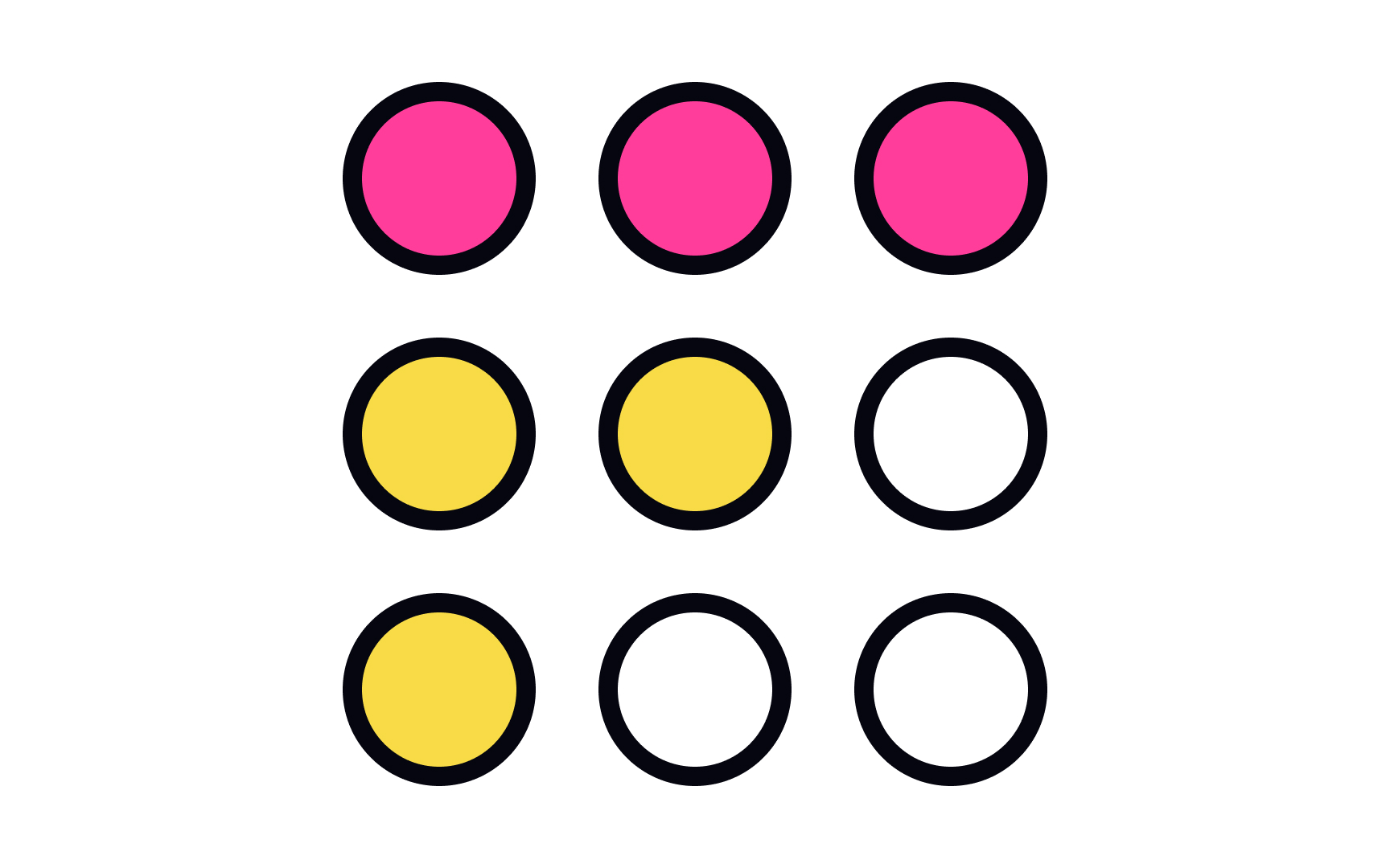
Our brain has a perception threshold — it can’t simultaneously perceive more than 7 elements at once. When there’s more, we automatically try to organize and group elements similar in size, shape, or
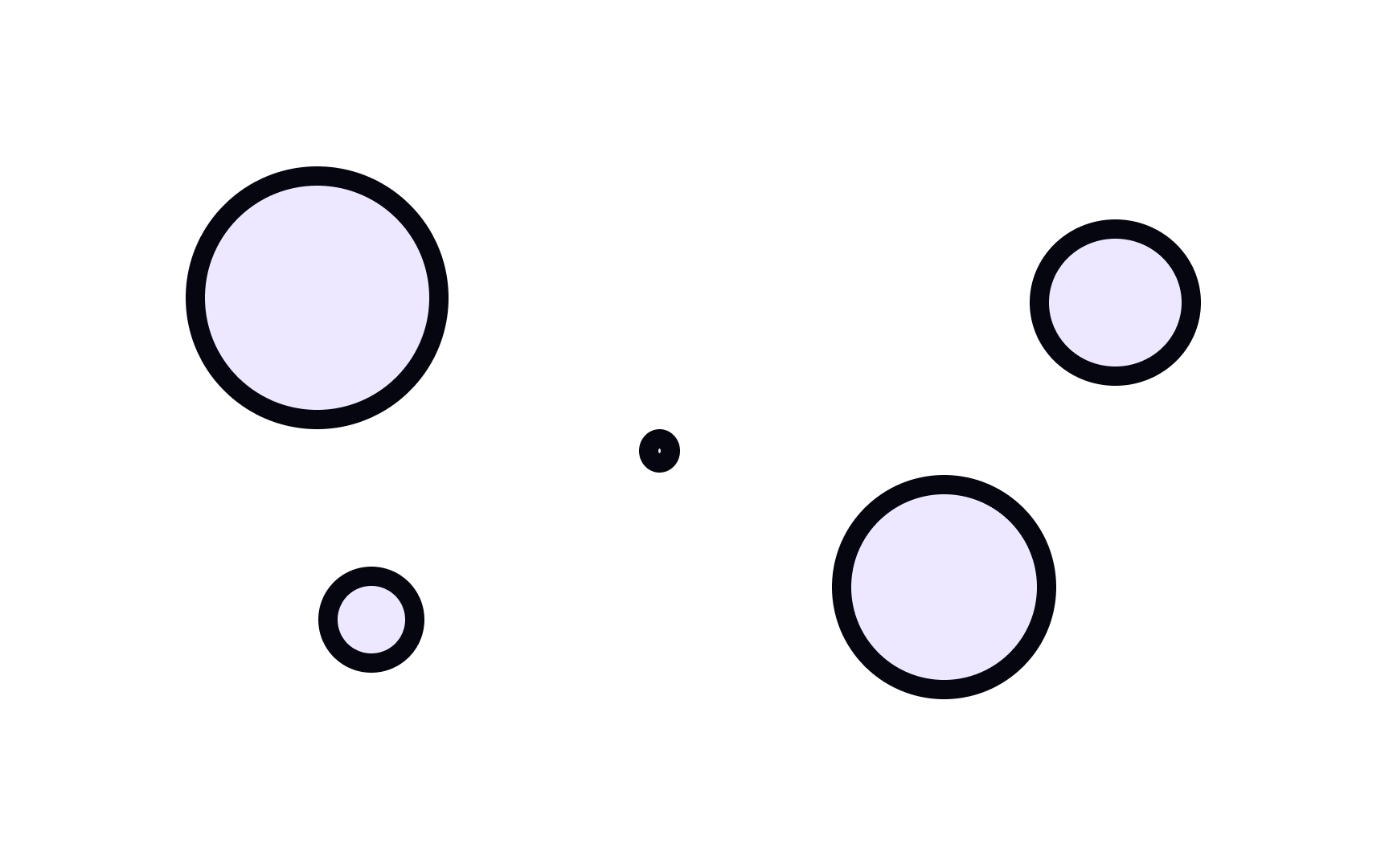
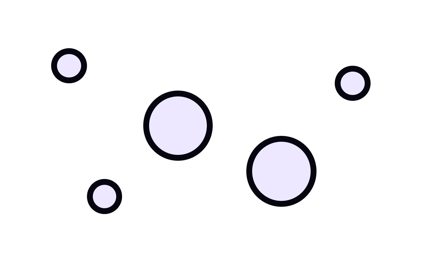
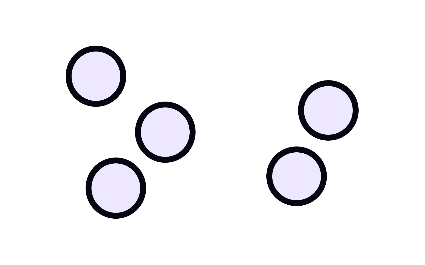
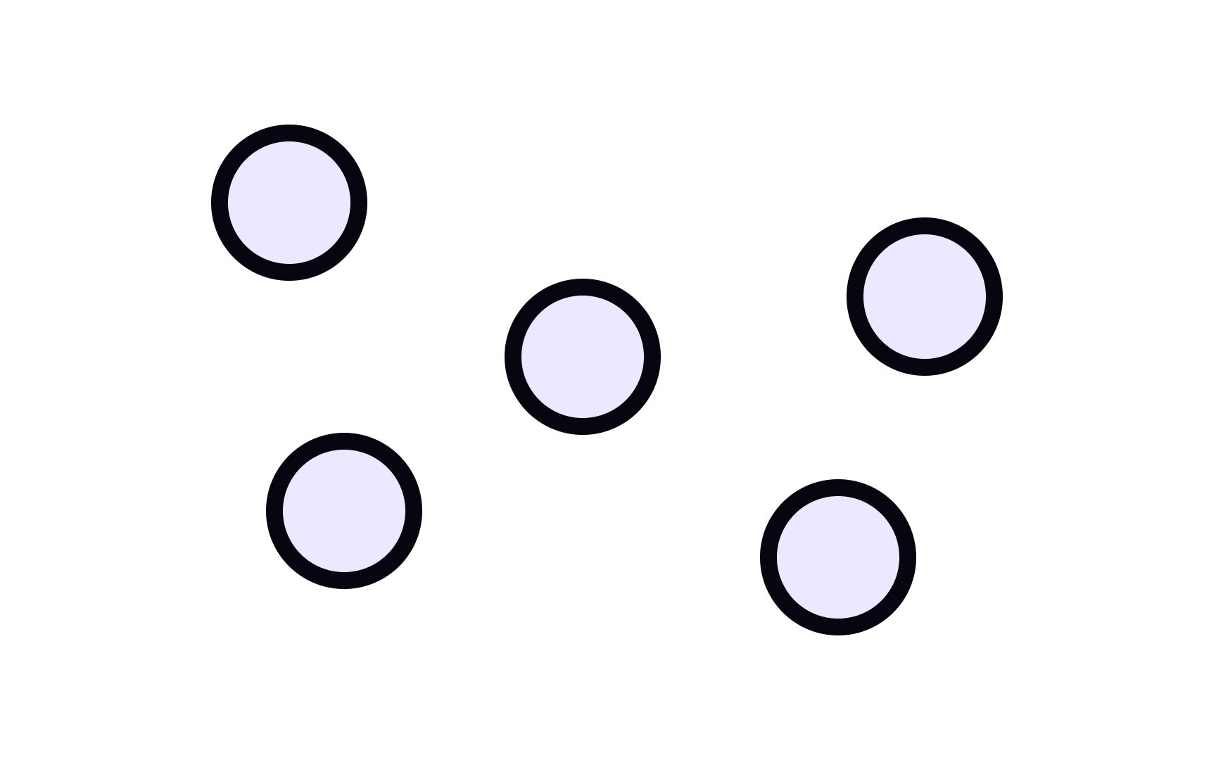
Objects with similar sizes are perceived to be related to one another — they form a group. Elements that are larger or smaller than those in a group will stand apart, which can be used to your advantage. But if you want certain elements to be perceived as related, ensure they’re of similar size.
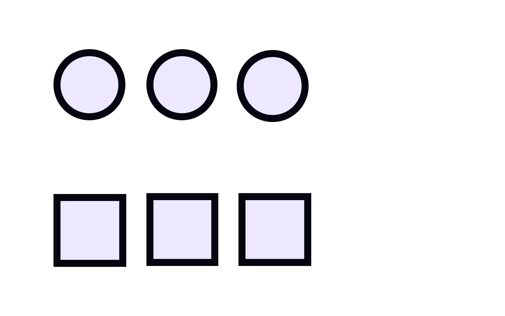
Shape can help differentiate between groups of objects that are of similar sizes. For example, in a
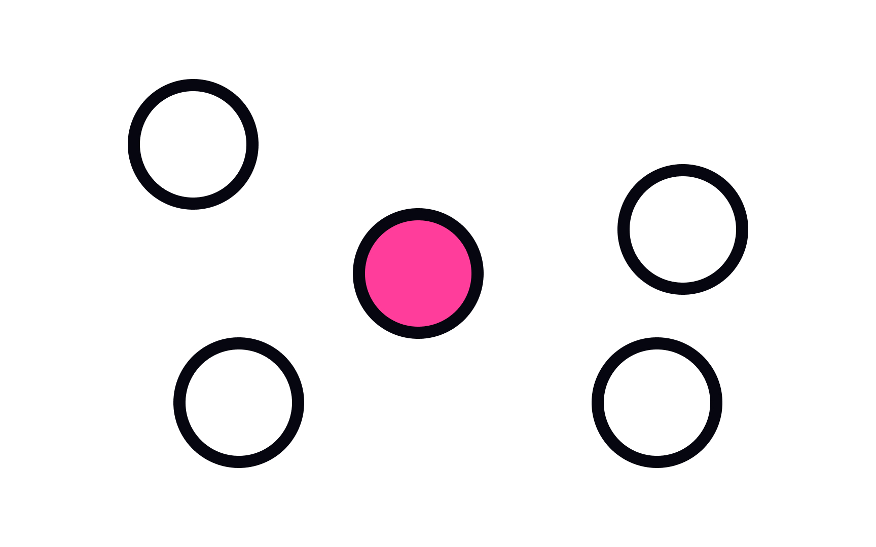
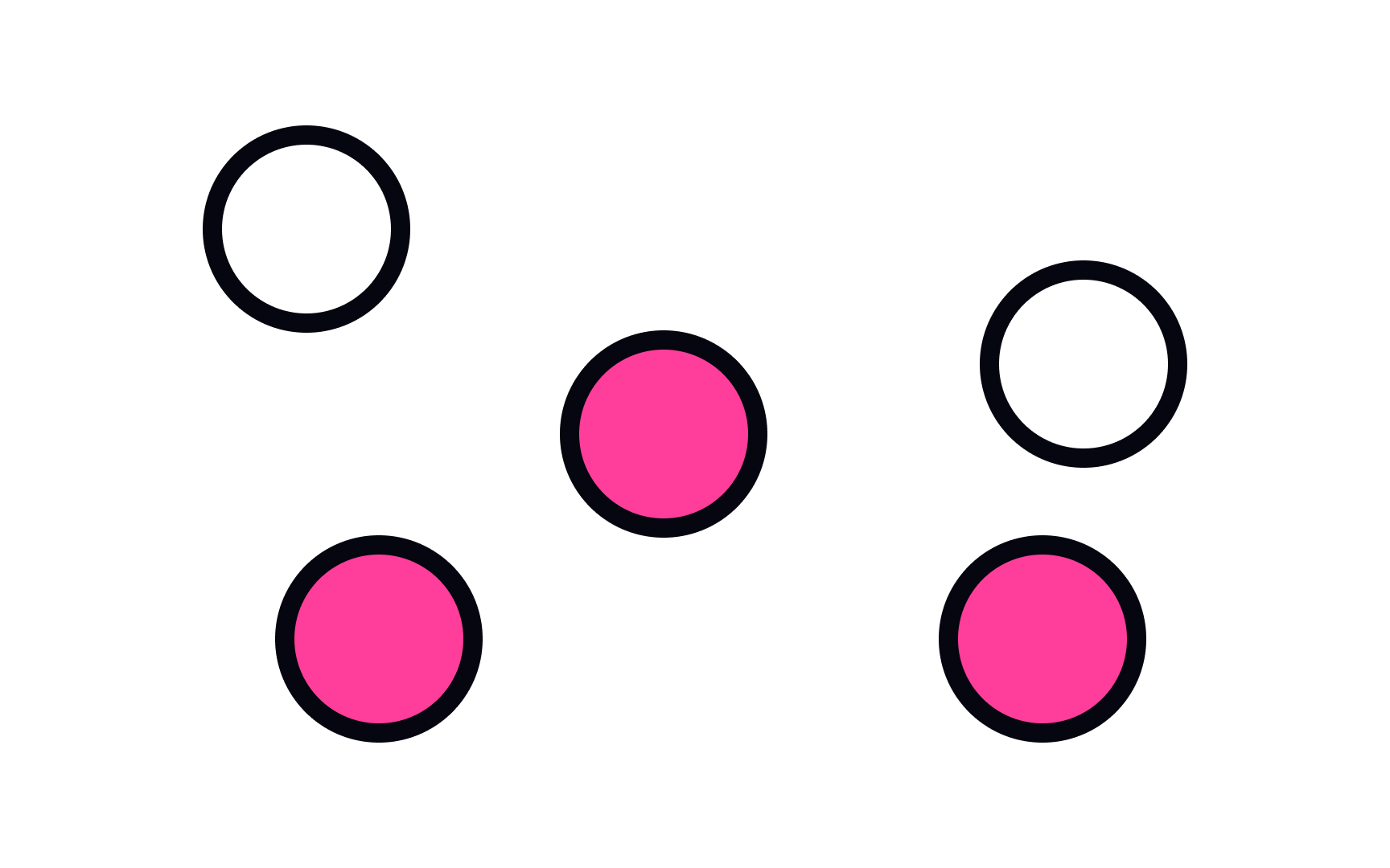
We perceive elements of the same
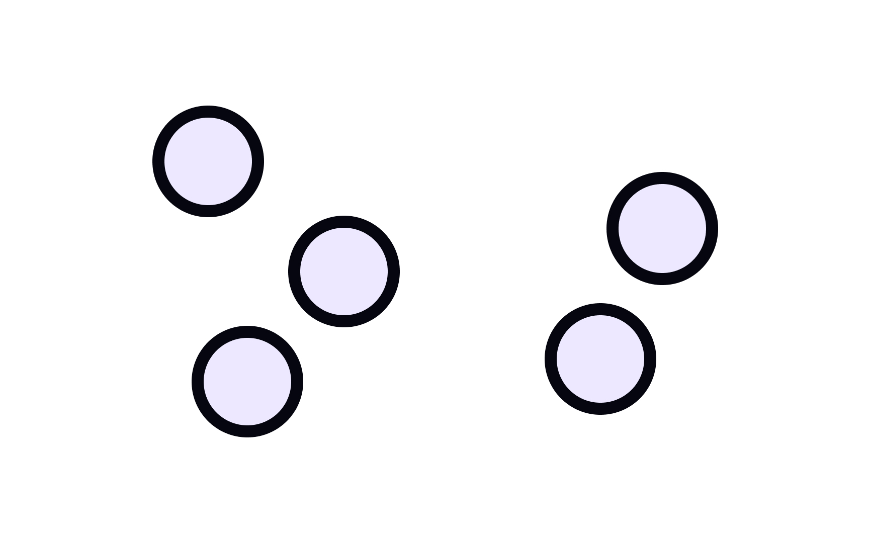
One effective way of grouping objects is to put them in close proximity to each other.[2] Just like a long queue to get into a nightclub, closely positioned elements are often viewed as one, even if they’re different sizes, shapes, and
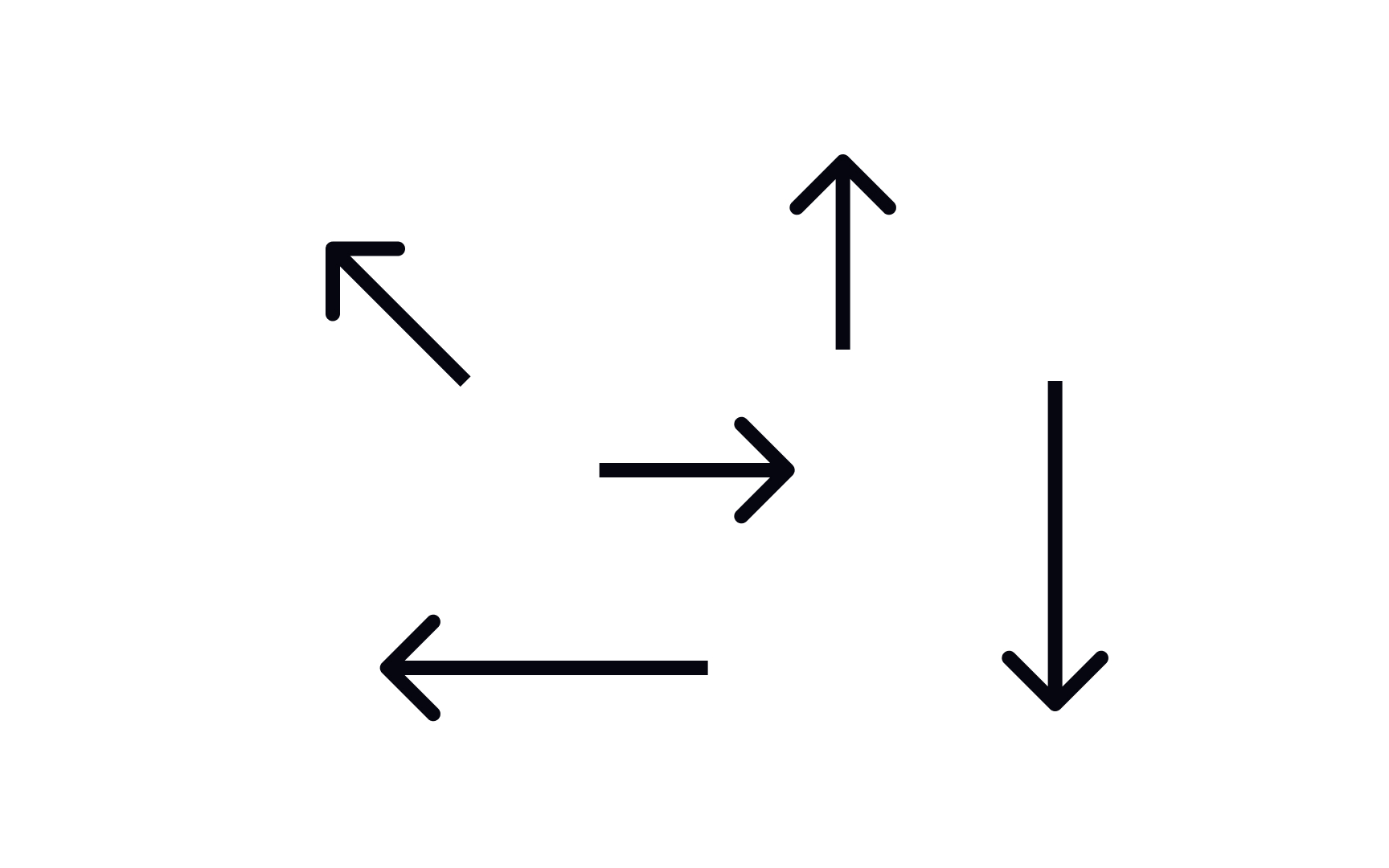
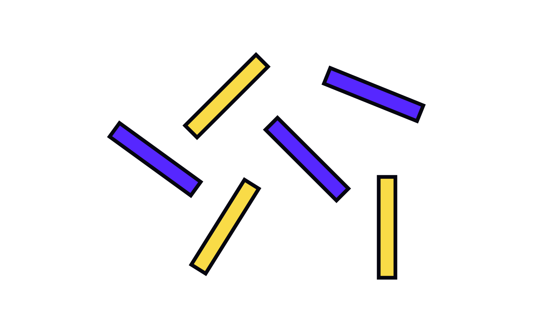
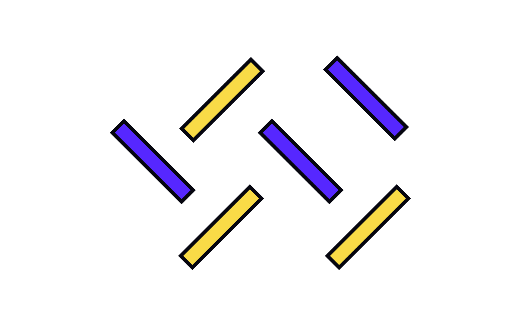
Objects facing the same direction are naturally perceived as related. Like a crowd facing the stage at a concert, they appear as a single group. In contrast, objects facing various directions, such as people scattered around a park looking in different directions, are perceived as separate and unrelated.
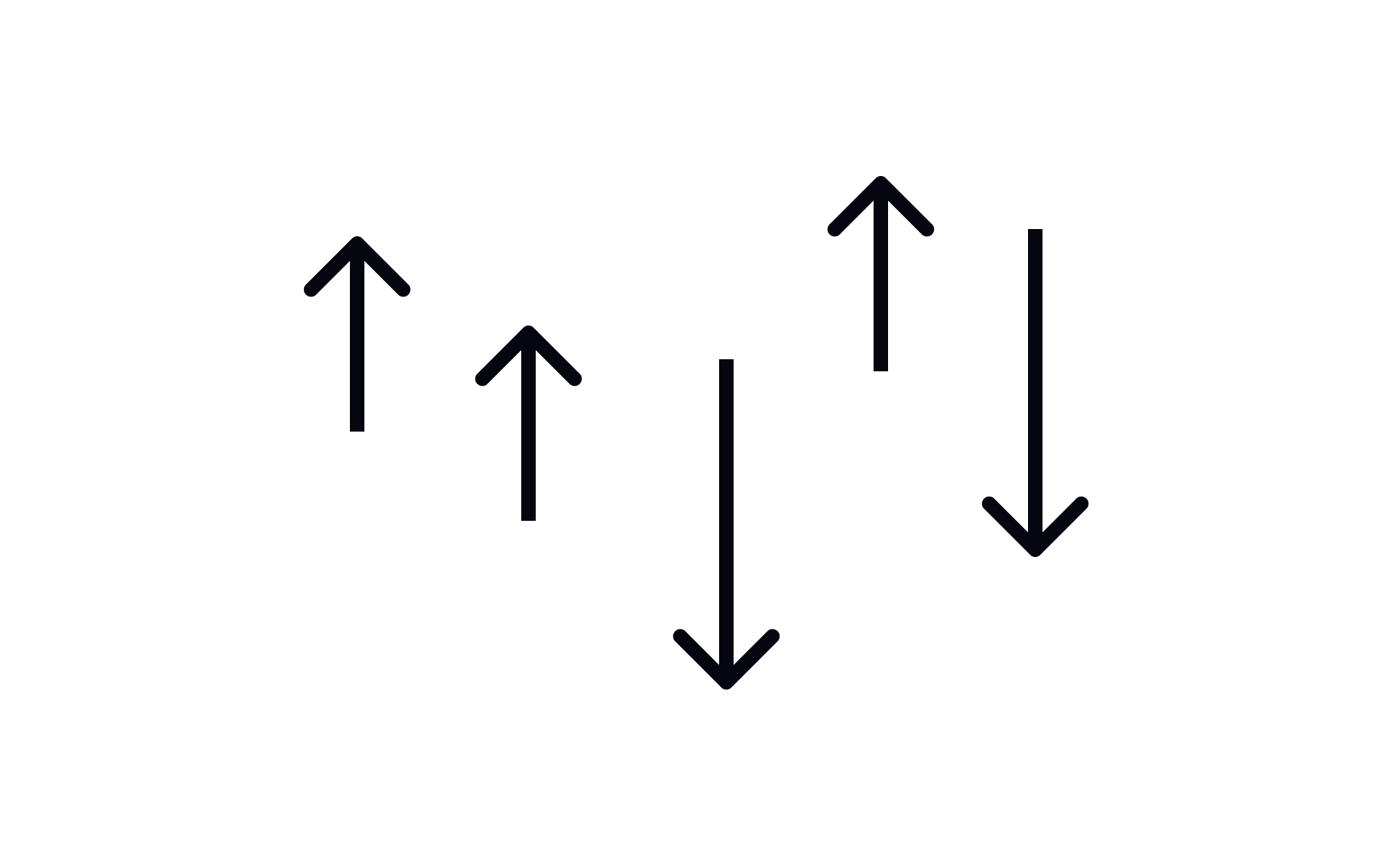
Elements moving in the same direction look more uniform and closely related than those moving randomly. Think of how the German Autobahn’s traffic looks more structured than chaotic traffic in India or Southeast Asia.
References
- Proximity Principle in Visual Design | Nielsen Norman Group
Top contributors

Topics
From Course

Share


Similar lessons

Intro to Design Layouts

Intro to Design Grids
