Balancing Data-Driven and Design-Driven Decisions
Explore ways to combine data insights with design intuition for stronger product decisions
Data and design often appear to be at odds in product development, creating tension between quantitative metrics and qualitative user experiences. Successful products emerge from the sweet spot between these two approaches — where hard numbers meet human-centered design thinking. Finding this balance requires product teams to recognize when to lean on analytics and when to trust design expertise.
Analytics reveal user behaviors, conversion rates, and engagement patterns, providing concrete evidence for decision-making. Meanwhile, design thinking uncovers emotional resonance, usability improvements, and innovative solutions that numbers alone might miss. Both methodologies contribute unique perspectives: data highlights what users do, while design research reveals why they do it. The key lies in leveraging both approaches strategically throughout the product development cycle. Teams that master this balance create products that not only perform well metrics-wise but also deliver meaningful, delightful experiences that keep users coming back.
Quantitative research provides numerical data to support design decisions through systematic investigation. For example, a survey measuring user satisfaction with a checkout process might ask users to rate ease of use on a 1-5 scale, revealing that 67% of users find address entry frustrating. Surveys, questionnaires, and structured interviews generate measurable user insights that can be statistically analyzed.
Statistical analysis transforms raw data into meaningful insights. Proper
Research validation techniques ensure findings accurately represent user populations. For example, an e-commerce study might use surveys to collect feedback across age groups and shopping frequencies, then validate findings by comparing it to actual purchase behavior. This methodical approach supports informed design decisions with statistical confidence.
Analytics tools track how users interact with digital products, collecting data about their actual behavior. Imagine having a detailed map of every path users take through your product. For instance, analytics can show that 70% of users who visit your e-commerce site immediately use the search bar rather than browsing categories, or that most users abandon their shopping cart when they reach the shipping information page.
A/B testing works like a digital experiment where you show two different versions of a design to different groups of users. Version A might be your current "Add to Cart" button in blue, while Version B shows the same button in green. The analytics tool tracks which version leads to more purchases. For example, if the green button (Version B) results in 100 purchases while the blue button (Version A) leads to 80 purchases from similar-sized user groups, you have concrete evidence that the green button performs better.
Visualization tools help make sense of user behavior data. Heat maps show where users click most frequently on your pages using colors — red areas indicate many clicks, blue areas fewer clicks. Session recordings work like a DVR for user visits, showing exactly how people move through your site. Funnel analysis tracks user progress through important tasks, like purchasing a product, showing where users drop off. For instance, you might see that out of 1000 users who add items to cart, 700 begin
Qualitative research helps us understand the human side of product usage by listening to and observing users directly.[1] In user interviews, researchers have conversations with individuals about their experiences, feelings, and needs. For instance, asking a user "Walk me through how you last ordered groceries online" might reveal that they always check product reviews first because they've received spoiled produce in the past — an important insight that numbers alone wouldn't show.
Contextual inquiry is like following someone during their normal routine. Instead of asking users to come to a lab, researchers observe them in their natural environment. For example, watching someone shop online from home might show they constantly switch between multiple browser tabs to compare prices — a behavior they might not think to mention in an
Methods like diary studies ask users to document their experiences over time. Imagine asking users to keep a log of their food delivery experiences for two weeks — they might note their frustrations, celebrations, and decision-making moments. One user's diary might reveal they abandon orders late at night when estimated delivery times are too long, while another might show they only order when they can track their delivery in real-time.
Successful product development requires seamlessly weaving together findings from both quantitative and
Data synthesis workshops can help teams identify patterns across different
Also consider creating a living insights repository where team members can easily access and contribute findings from both quantitative and qualitative research on an ongoing basis.
Choosing the right metrics ensures teams measure what truly matters for both business success and user satisfaction. Key performance indicators (KPIs) should align with product goals while avoiding vanity metrics that look impressive but provide little actionable insight.
Here's an example of vanity metrics versus meaningful metrics:
- Vanity metric: Total number of app downloads — looks impressive but doesn't tell you if users are actually engaging with your product
- Meaningful metric: Monthly active users or retention rate — shows how many people actually find value in and continue using your product.
Product teams often also make the mistake of tracking too many metrics, creating noise that obscures meaningful signals. Core metrics like retention rates, task completion times, and user satisfaction scores provide a foundation for measurement. Secondary metrics like bounce rate and feature adoption rate can then be chosen to dive deeper into specific aspects of the product experience.
Also, remember that different product stages require different metrics focus. Early-stage products might prioritize activation and engagement metrics, such as sign-up rates or feature usage. In contrast, mature products focus more on retention and revenue metrics, such as churn rate or average revenue per user. Regular metric review sessions help teams adapt their measurement strategy as products evolve and business priorities shift.
Pro Tip: For each metric you track, ask "What decision would we make differently based on changes in this number?" If you can't answer clearly, consider dropping it.
Design intuition represents the culmination of experience, pattern recognition, and deep user understanding that designers develop over time. While seemingly subjective, this intuition stems from extensive exposure to user behavior, repeated problem-solving, and understanding of design principles. Strong design intuition helps teams anticipate user needs and potential issues before they appear in data.
Developing design intuition requires continuous exposure to user feedback and systematic reflection on design outcomes. Regular design critiques, user testing sessions, and post-launch analysis help designers refine their instincts. This deliberate practice transforms individual experiences into reliable gut feelings that can guide early design decisions.
Teams should create space for design intuition to complement data-driven decisions rather than compete with them. Early design phases often benefit from intuitive exploration before narrowing options through data validation. This allows teams to leverage both creative insights and research-backed evidence throughout the design process.
Decision matrices are tools that help teams make choices between different design solutions by comparing them systematically. Think of them as sophisticated pros-and-cons lists where each option is scored against important criteria. For instance, when choosing between design solutions, you can create a table where rows represent different options (like "add
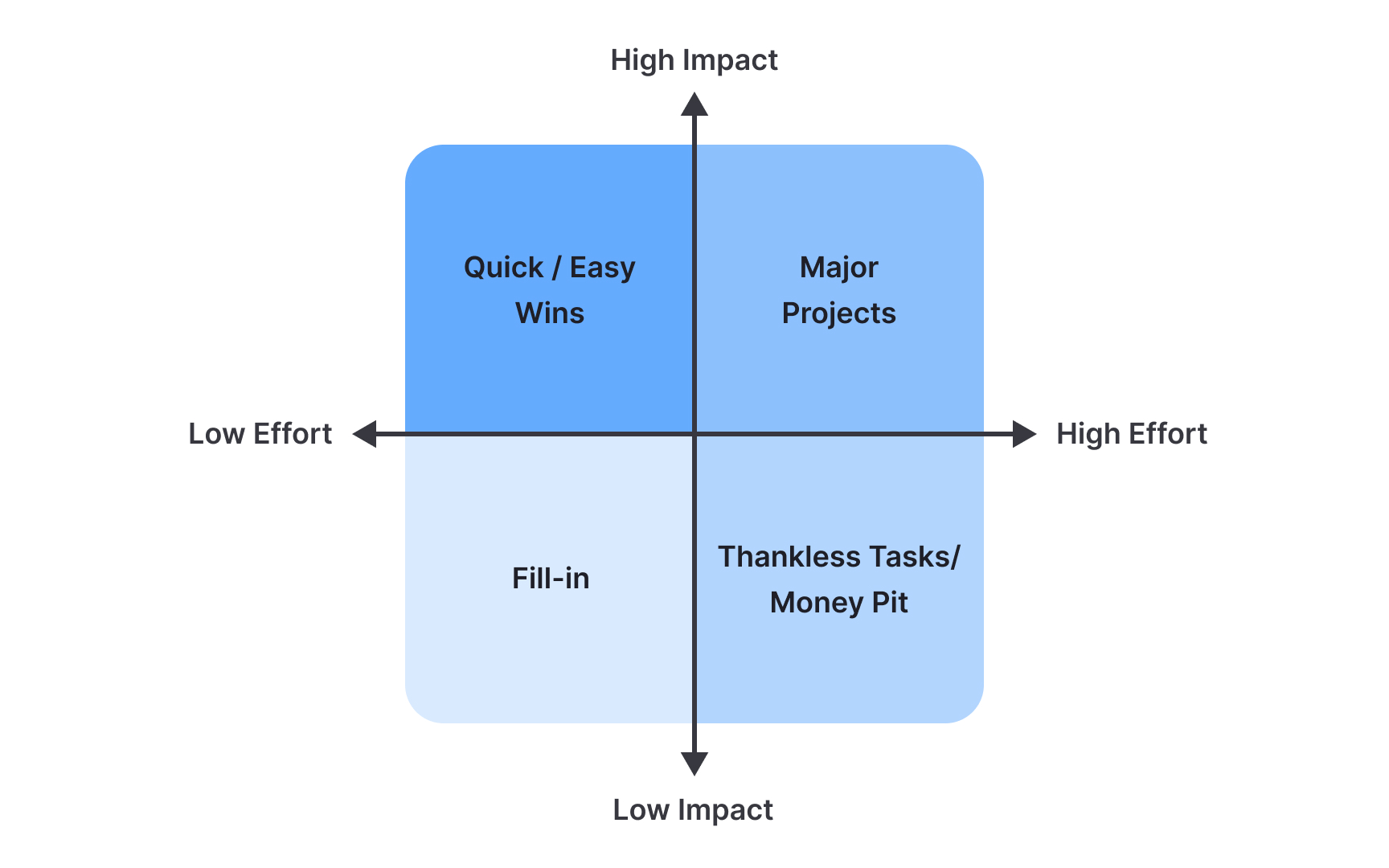
Another simple but highly effective decision matrix is the Impact/Effort matrix, which plots potential solutions on a two-axis grid. The vertical axis shows how much value a solution brings to users and the business (Impact), while the horizontal axis shows how much work it requires (Effort).
This creates 4 quadrants:
- Quick wins (high impact, low effort)
- Major projects (high impact, high effort
- Fill-ins (low impact, low effort)
- Time sinks (low impact, high effort)
This visual approach helps teams quickly identify which solutions deserve immediate attention. Conduct regular matrix reviews to ensure your team stays aligned on priorities and adjusts their approach based on new information or changing circumstances.
Effective communication of
Moreover, different audiences require different communication approaches.[2] Executives might need high-level metrics and business impact, while development teams need detailed user behaviors and technical implications. Tailoring the presentation of findings to each audience while maintaining consistency in core messages helps drive alignment and action.
Use research repositories and decision logs to create lasting documentation of how insights led to specific design choices. For example, a decision log entry might track how the team moved from user feedback ("65% of users struggle with account creation") through solution exploration (
References
- When to Use Which User-Experience Research Methods | Nielsen Norman Group
Topics
From Course

Share


Similar lessons

Continuous Discovery Mindset

Business Outcomes vs. Product Outcomes
